Ever since I started visiting Denmark in March 2018, there was a lot of building work going on. Well, it's a city, I suppose there always is; but in particular, the city squares Rådhuspladsen and Kongens Nytorv were something like 75% closed off and behind building hoardings. And scattered around the city, 15 more building sites, all preparing the way for something that, for me at least, was rather exciting: the creation of a whole new Metro line, with 15 new stations, and two existing stations extended to provide interchange points.
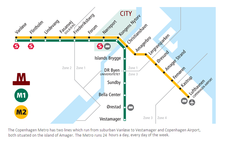
A month or so before I first visited Copenhagen, I thought one evening "I know, let's find a map of the metro network – familiarise myself with it bit before I get there". And I looked it up, and found it, and thought: is that it?
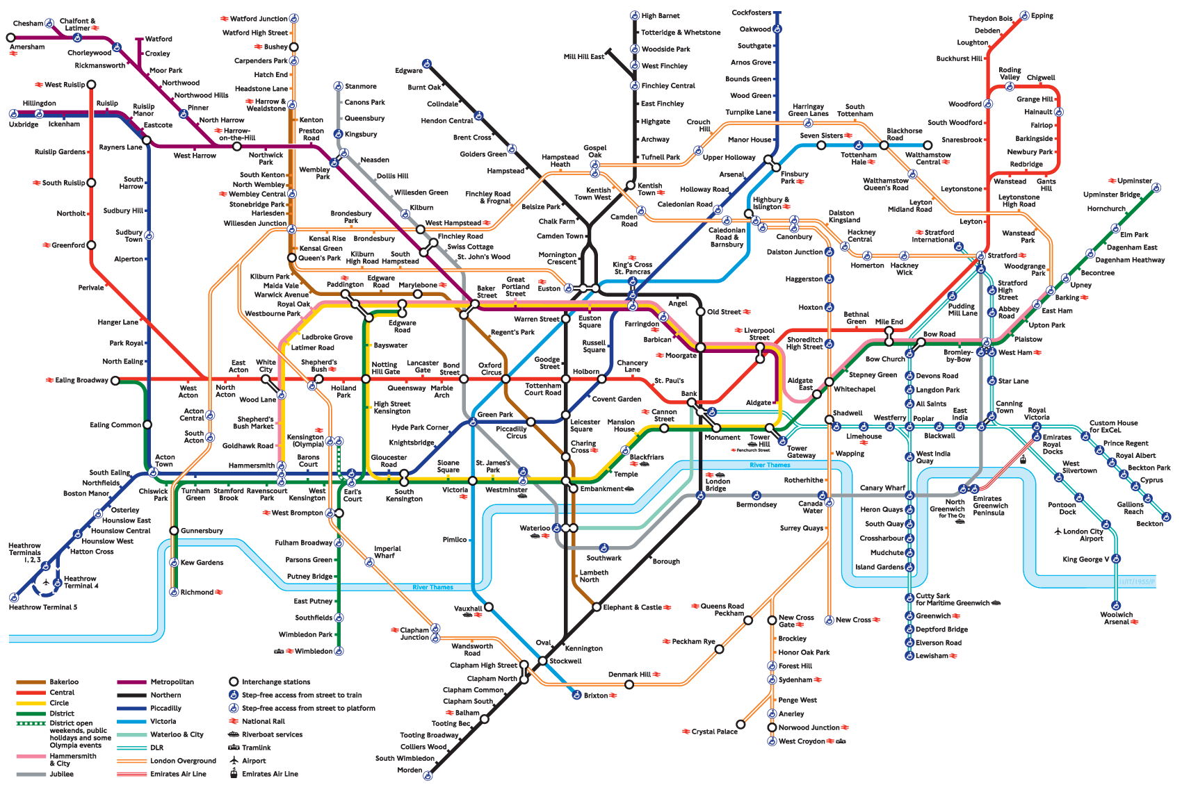
I'd been working in London for the last ten years, and London's tube network looks like this:
In fact I was part-way through my effort to visit every single one of London's tube stations - all 270 of them - and find the labyrinth in each station. I didn't quite get to complete this before I left the UK to go and live in Denmark, in January 2019; but I have now visited all 270 of London's tube stations, and found / photographed / documented the labyrinth in 267 of them (the other 3 are currently absent).
So anyway, back to Copenhagen: two lines, 22 stations. This network opened in 2002, so it's all very modern, compared to London. The trains are small and driverless, the ride is smooth, the stations are small and efficient, and it just works. Though, I have to say ... they're rather dull. After having toured London's network, I loved seeing the variety of the stations: a huge variety of architecture and character and scale and flow and ... just brilliant, I'm so glad I've visited them all! But Copenhagen's ... well, it just doesn't have the history yet. And of the M1 and M2 line stations, 13 are on the surface, and 9 subterranean. And of those 9, they are uniformly dull, and grey. Sorry, but they are.
So, back that building work: a new metro line, "M3" Cityringen. I moved to live in Copenhagen in January 2019, and throughout the course of the year, gradually the two main building sites, Rådhuspladsen and Kongens Nytorv, became smaller and smaller, as the work neared completion. And finally, on Sunday 29th of September, 2019, the line opened!
With M3 Cityringen the network grew from 22 stations to 37; in 2020 we're expecting part of the M4 line to open, with two more stations (Nordhavn and Orientkaj), with the southern part of M4 coming in (I think) 2024.
I've finally got round to visiting all the new stations – trying every corridor, every stairwell, every escalator, and therefore I now have favourites and opinions and questions.
So, shall we get started?
Frederiksberg Allé
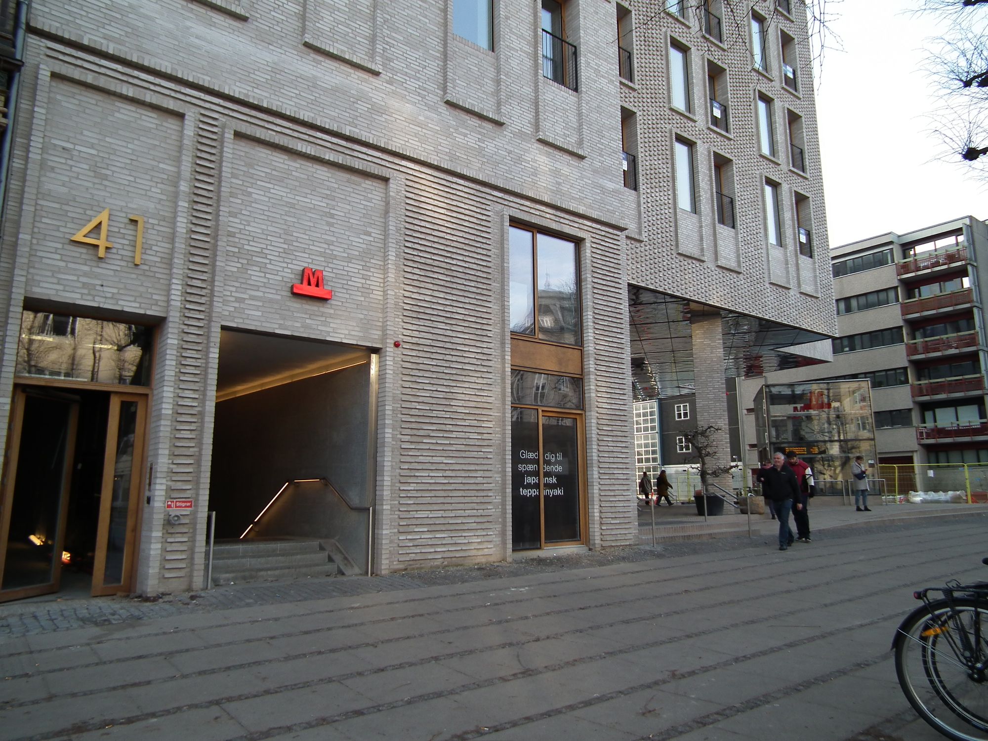
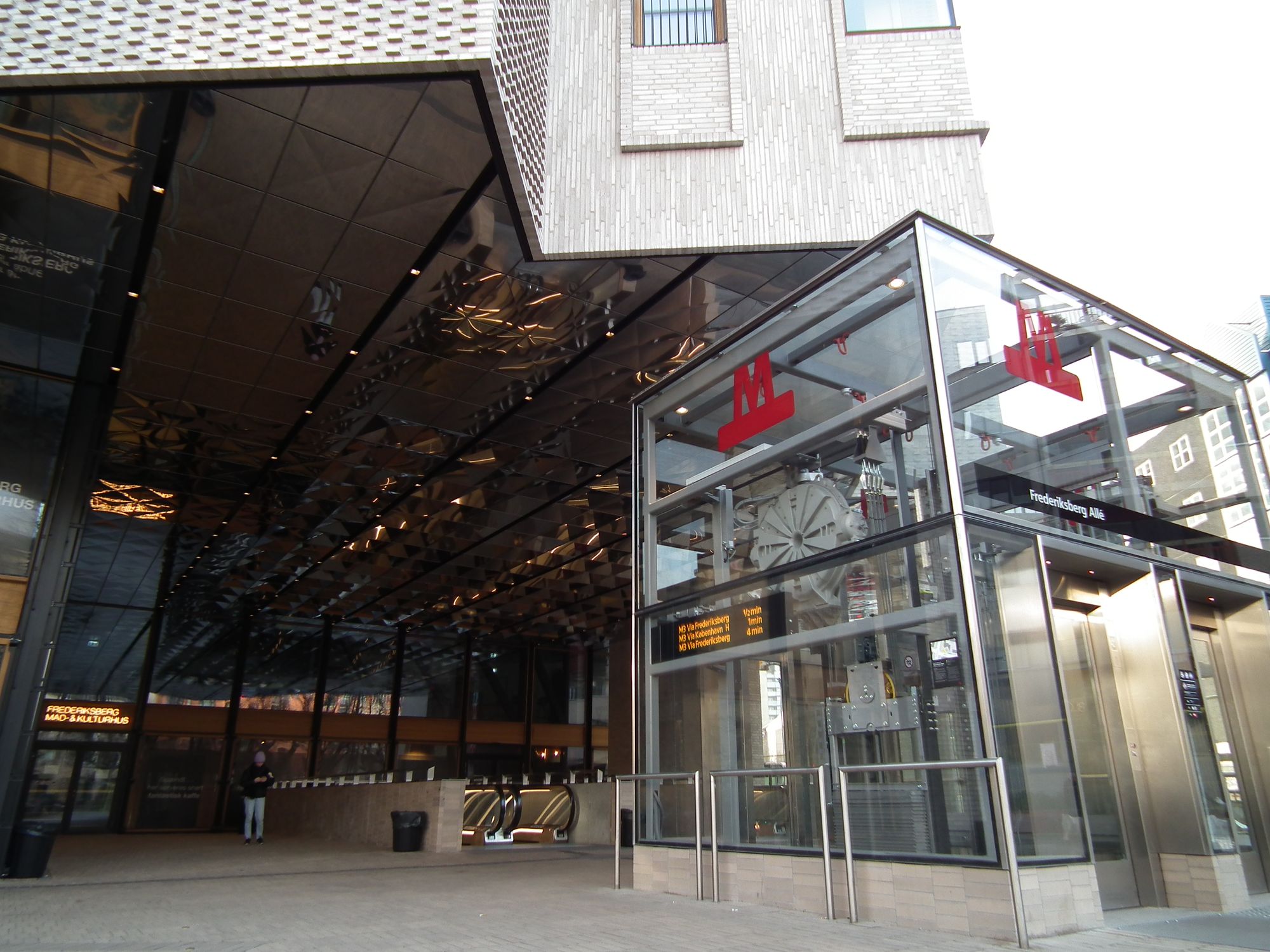
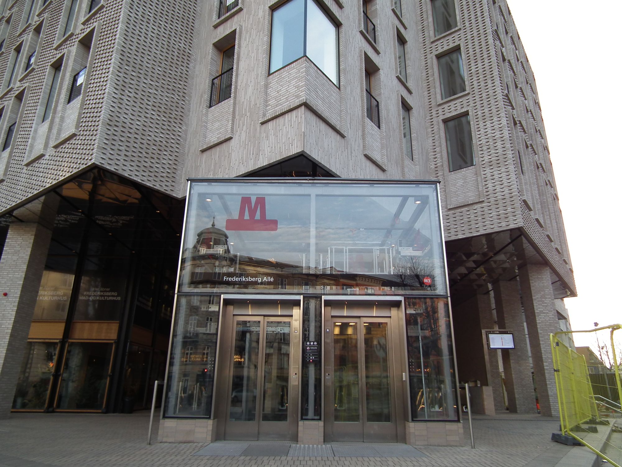
Heading down into the station, the first thing we notice (compared to the old M1 and M2 lines) is ... colour!
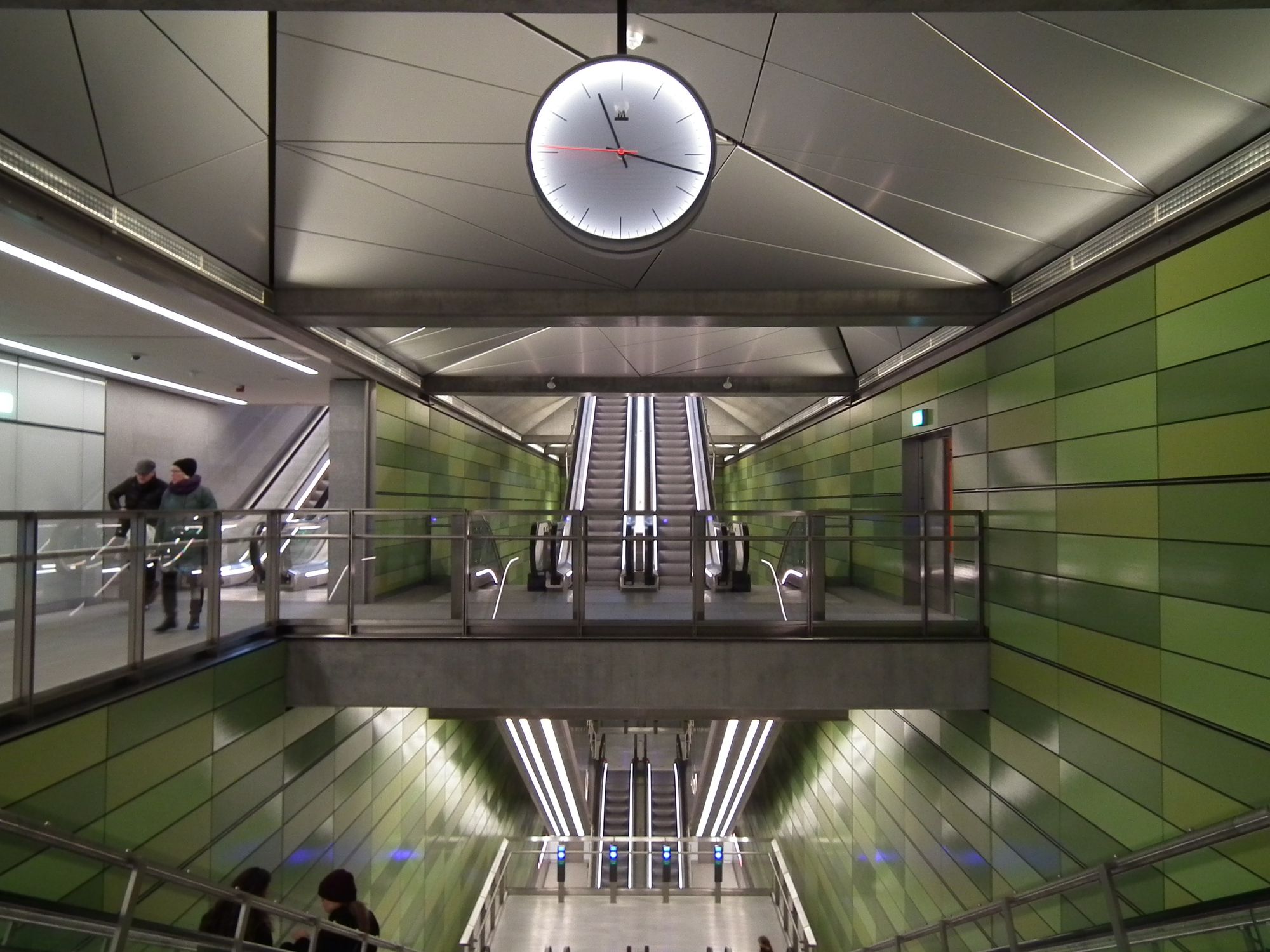
Most of Copenhagen's subsurface metro stations follow the same template, with a few variations; and Frederiksberg Allé almost does too. The stations are generally well-lit and spacious, with long lines of sight. This particular station's quirk is the entrance being offset slightly to the side.
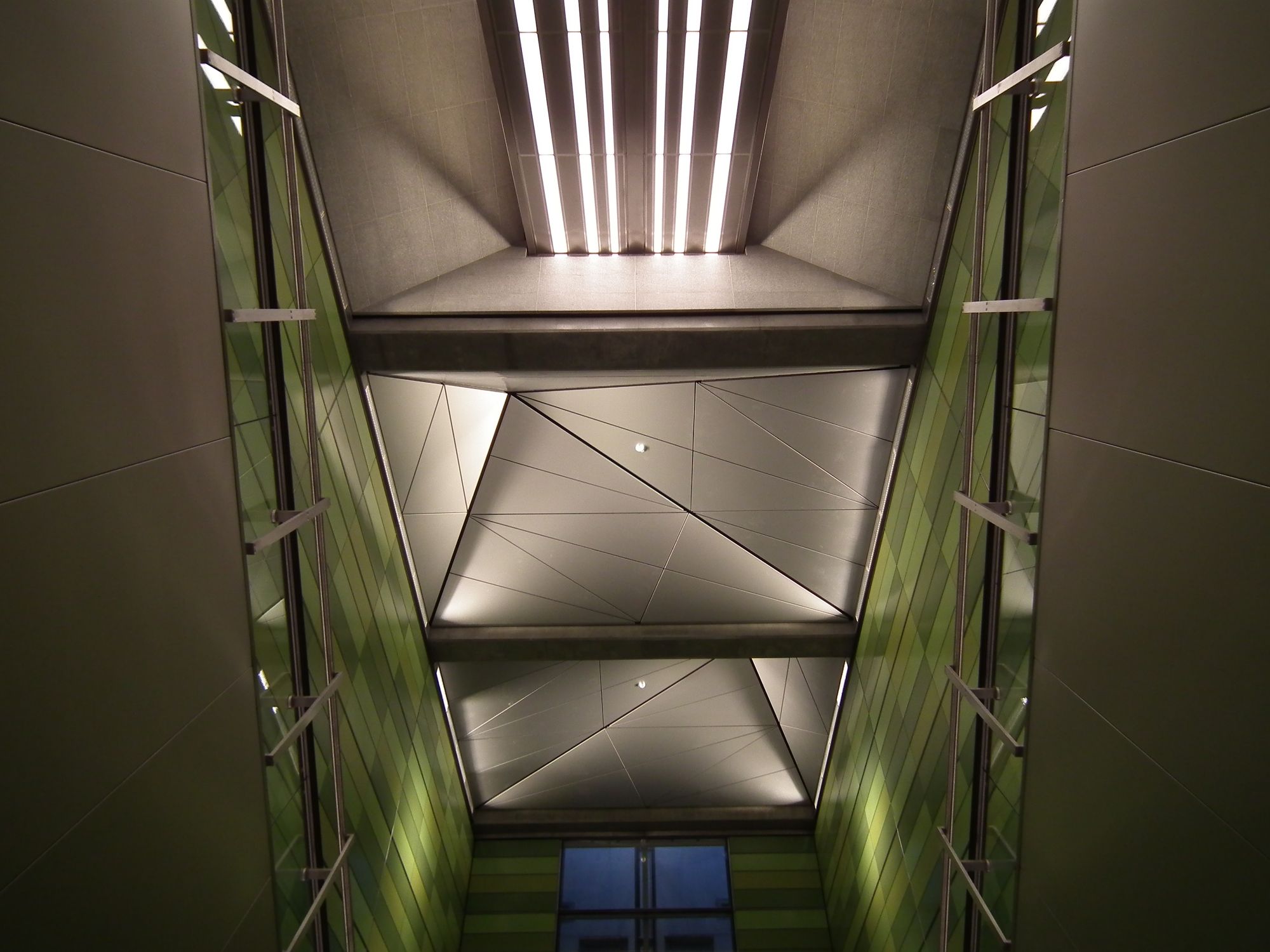
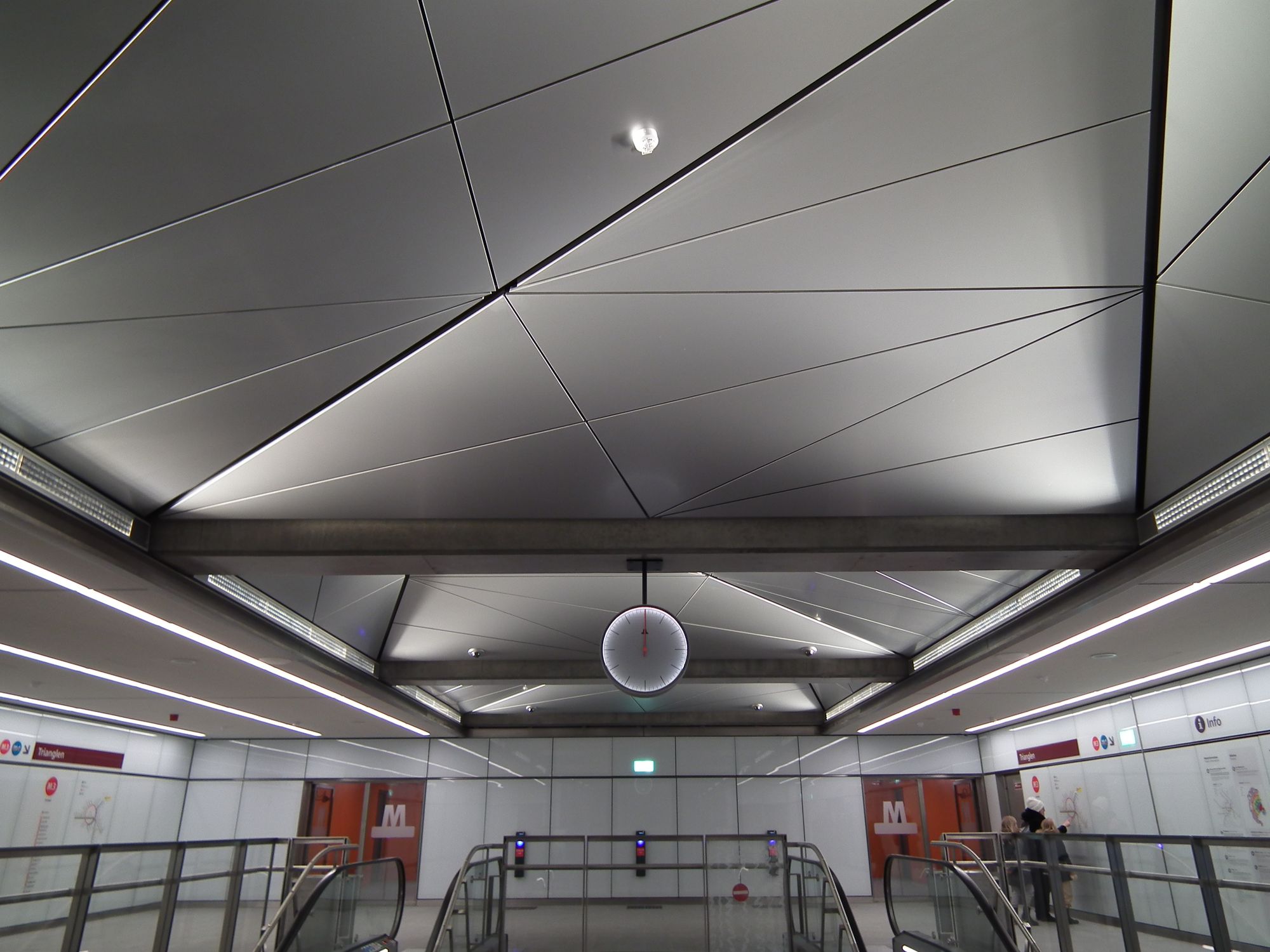
One of the interesting things to look for in each station is the roof: some of them have genuine skylights; some of them are built to look a bit like skylights, but they're fake, because there's actually a building on top. Frederiksberg Allé has the latter:
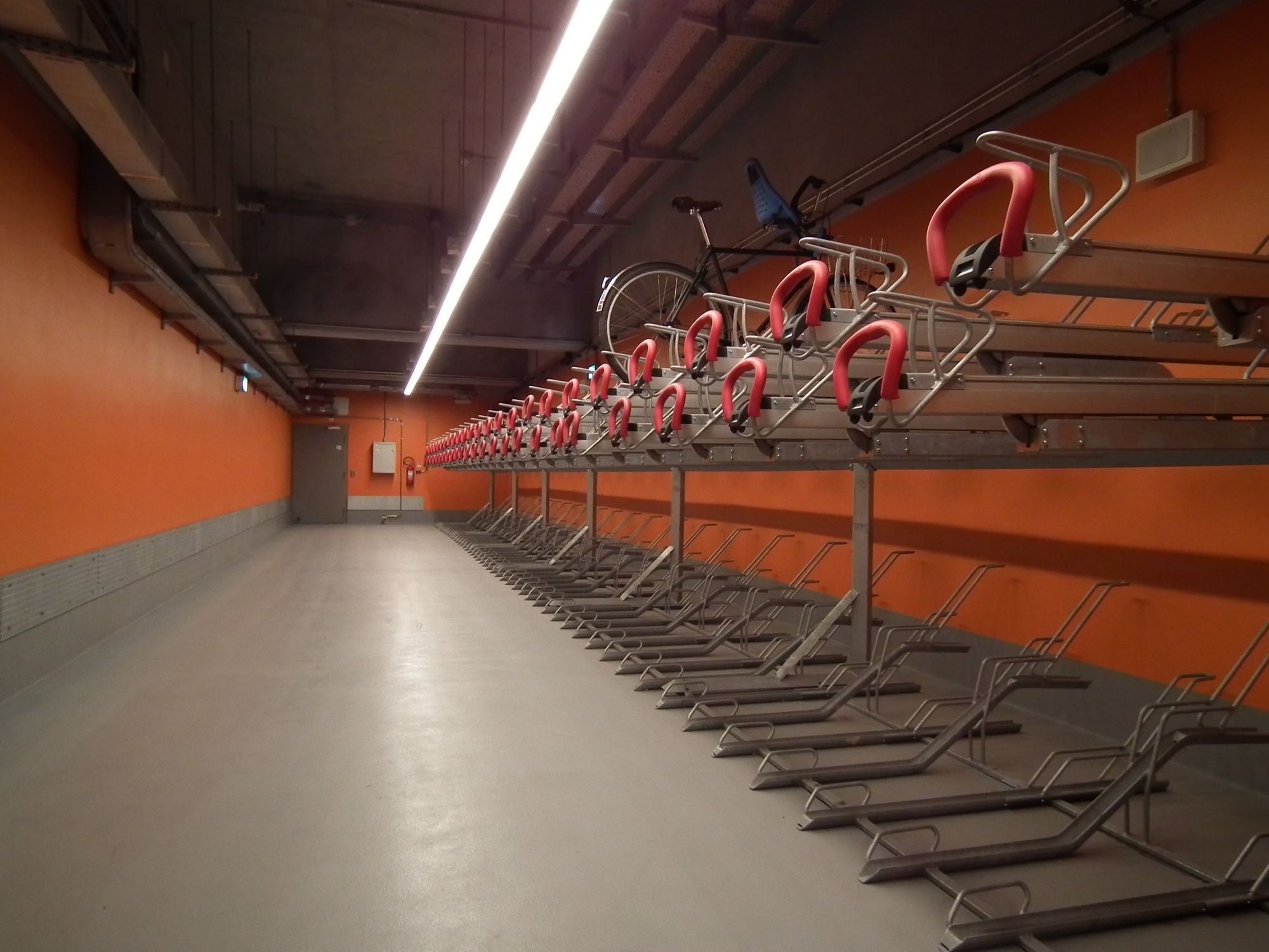
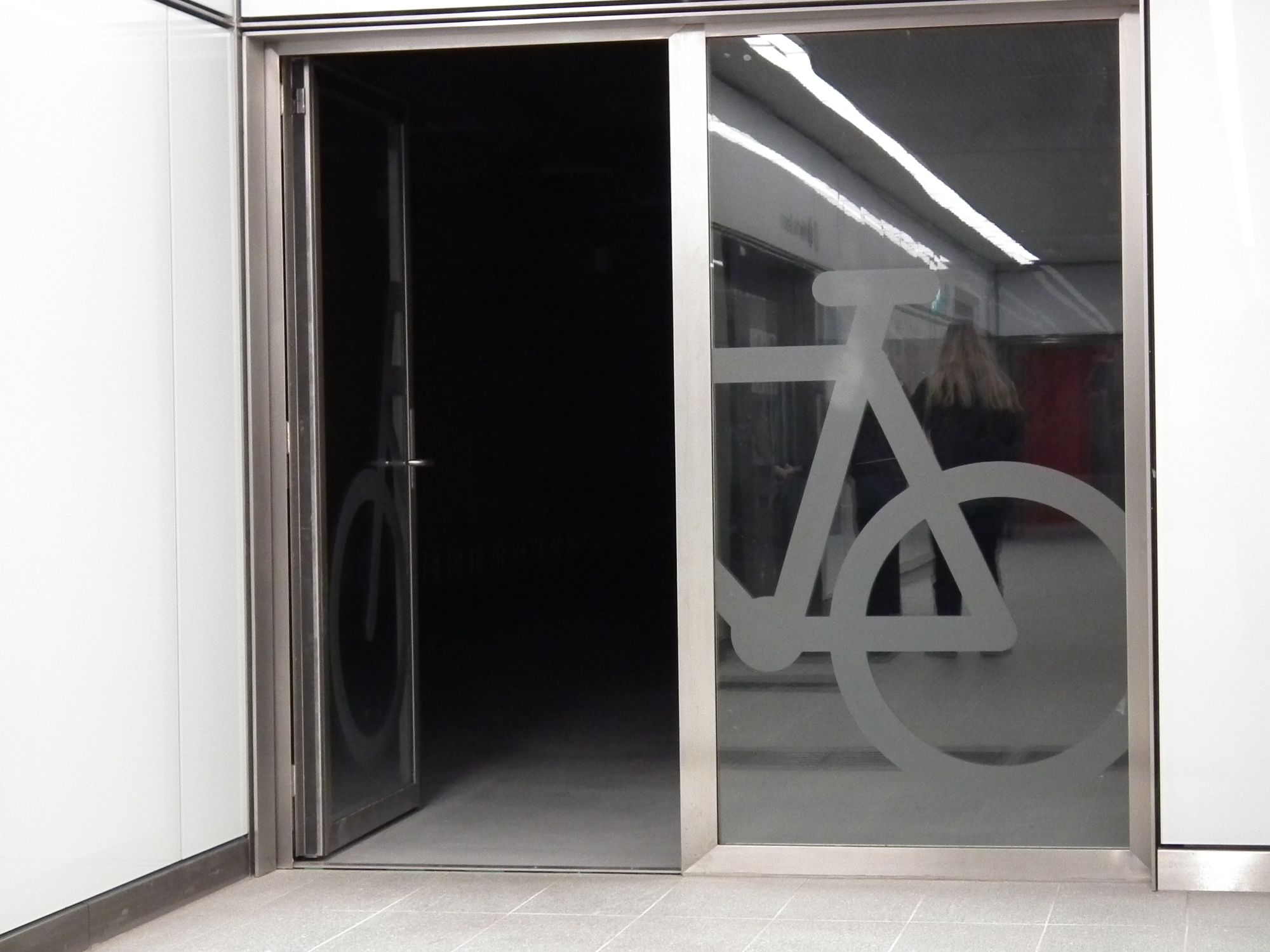
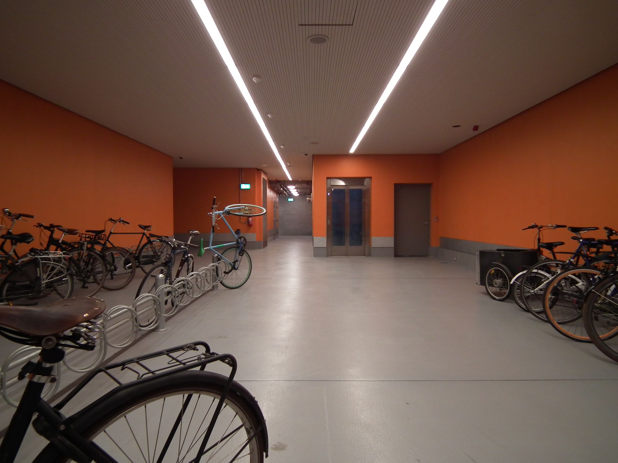
Almost all (or maybe all?) the new stations have lots of space for bikes too. Almost uniformly across Cityringen, the bike area is orange:
Frederiksberg
Frederiksberg is one of the two stations which provide interchange to the old M1/M2 lines (the other being Kongens Nytorv). So here we can easily see the old and new lines if not quite side by side, then at least very close to each other.
Frederiksberg's paneling is grey, but a much prettier and more interesting kind of grey than the old M1/M2:
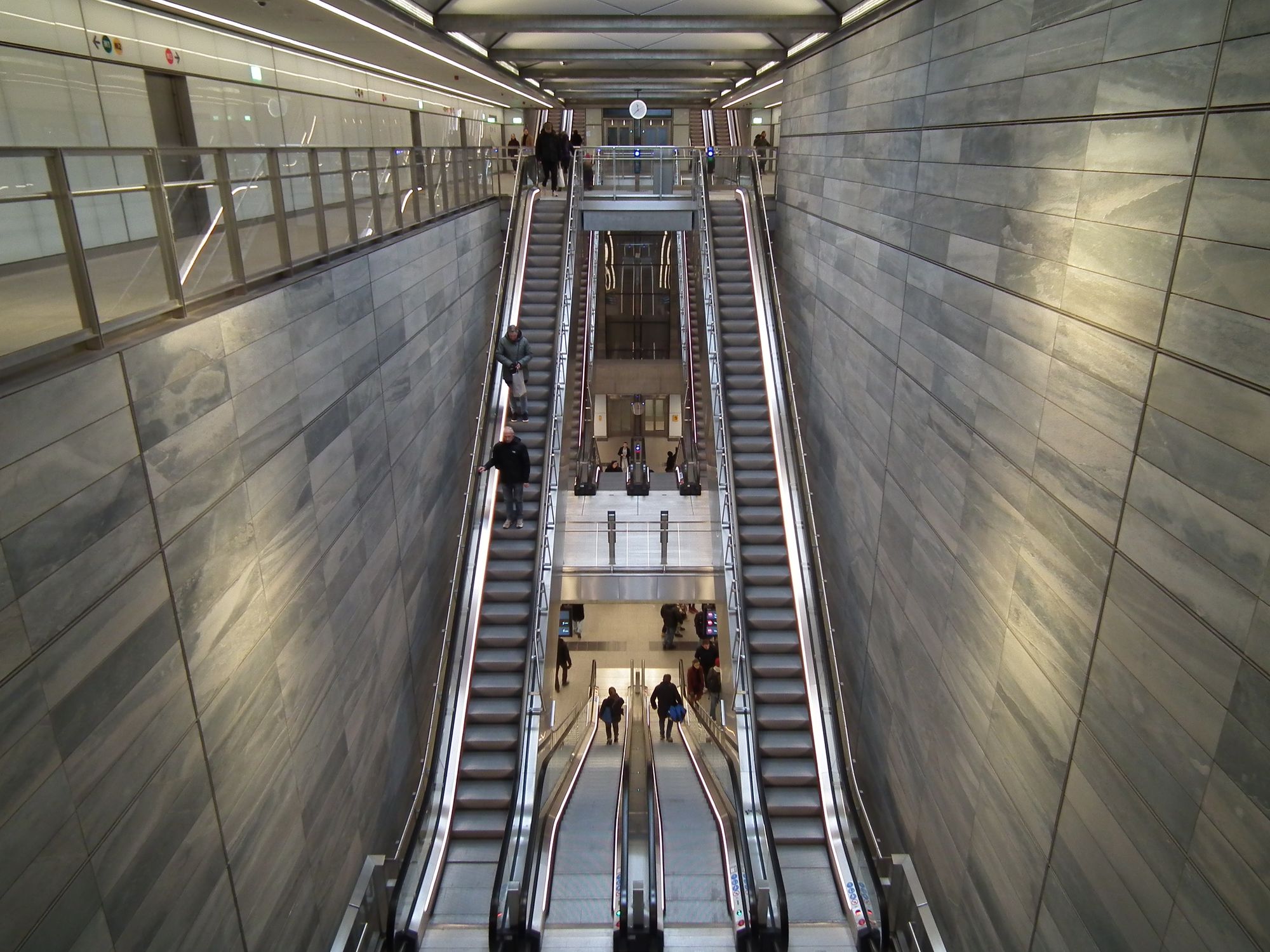
Here we see the old and new stations coming together:
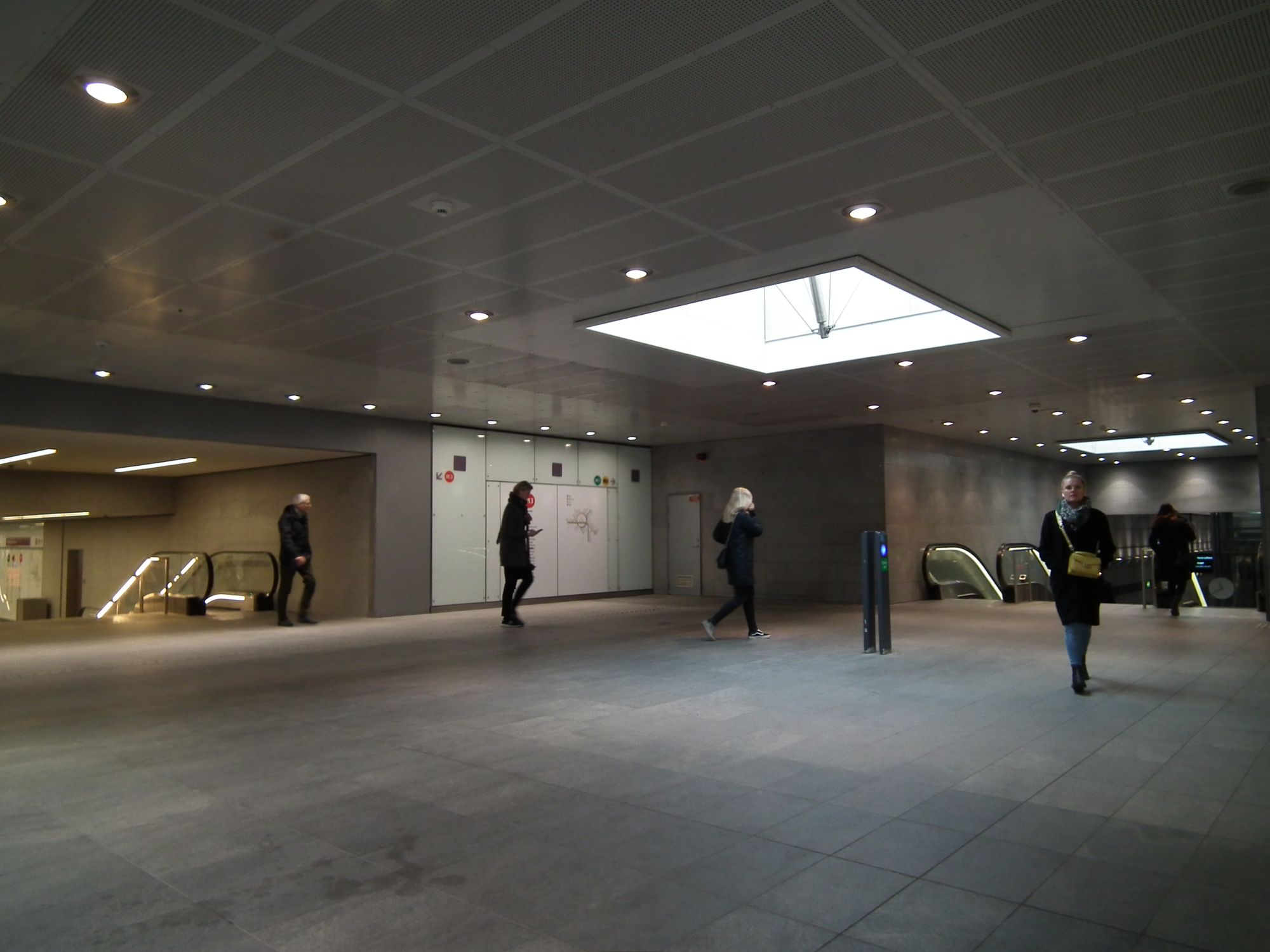
There's also an exit directly into Frederiksberg Centrum shopping centre (just like the other interchange, Kongens Nytorv, actually: that has an entrance directly to/from Magasin):
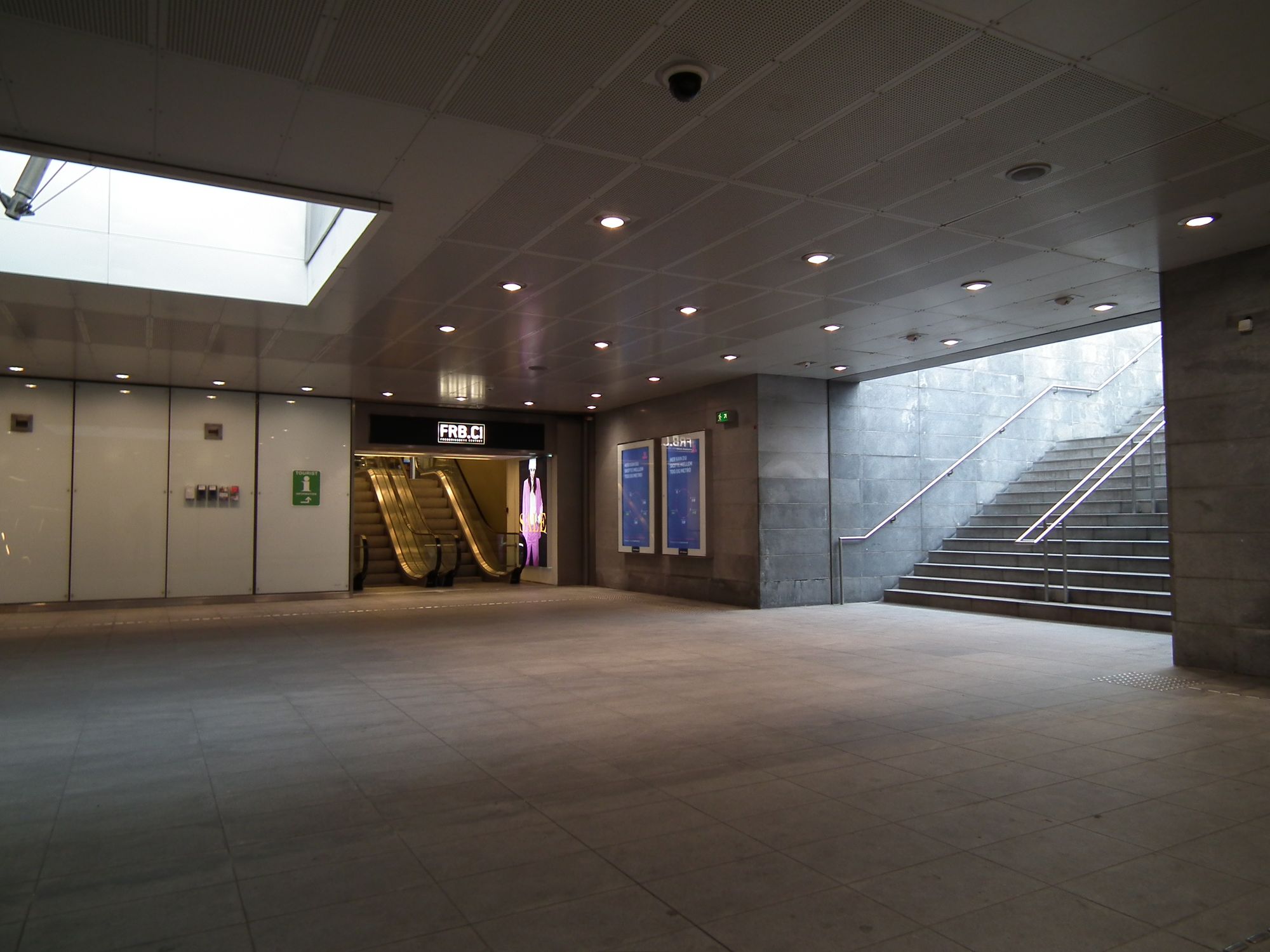
There are also proper skylights here, and the lifts, and an extra exit to the shopping center car park.
Aksel Møllers Have
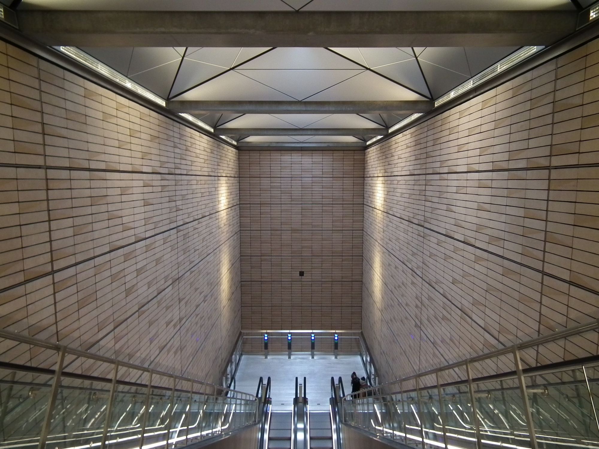
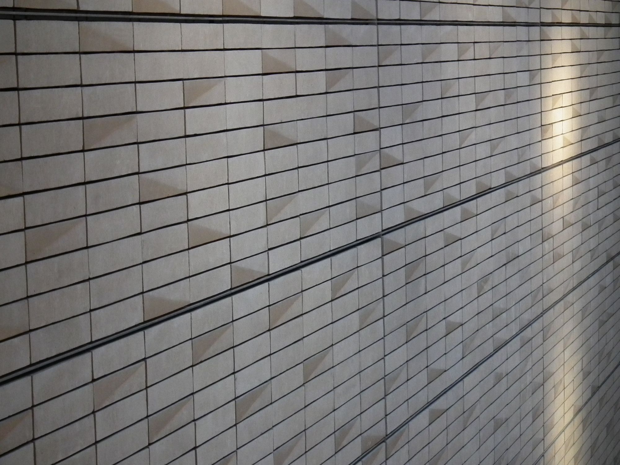
I rather like the texture of the wall paneling here. I think it's rather lovely:
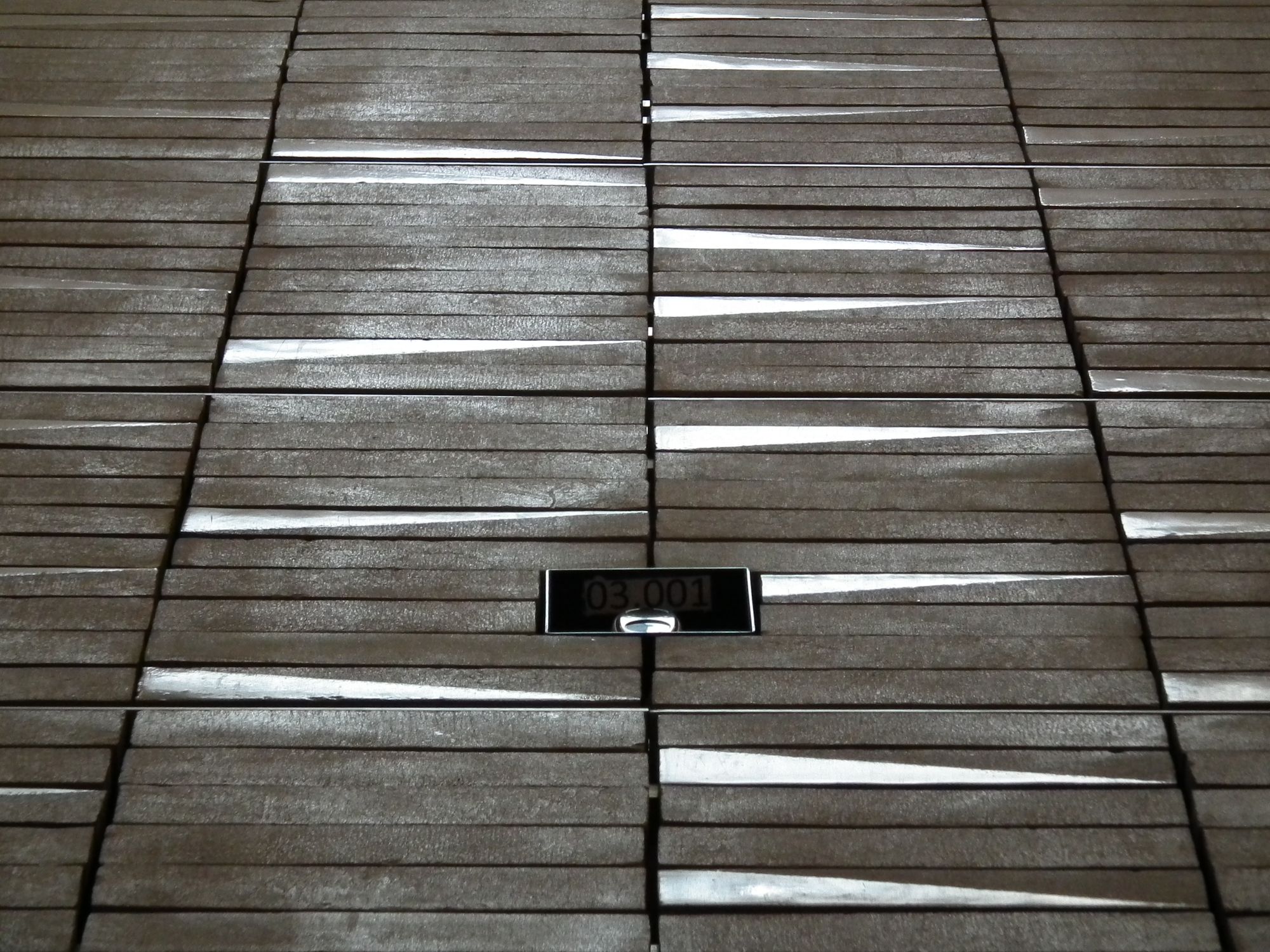
I also rather like its imperfections:
Other than that we've got the usual sort of set-up: main entrance with elevator; side entrance for bikes, wrapping round the back of the station:
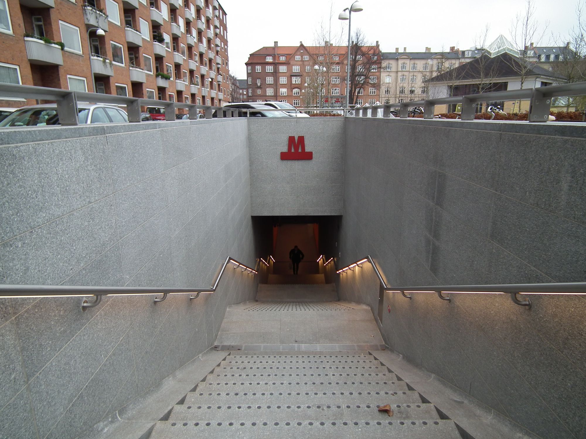
Here's a little detail I noticed here: where many older stations would have had a metal "groove" ramp next to the stairs, to slot your bike in, here it's kind of subtly built-in: a smooth, rounded edge to the stairway, so you can get your bike up and down:
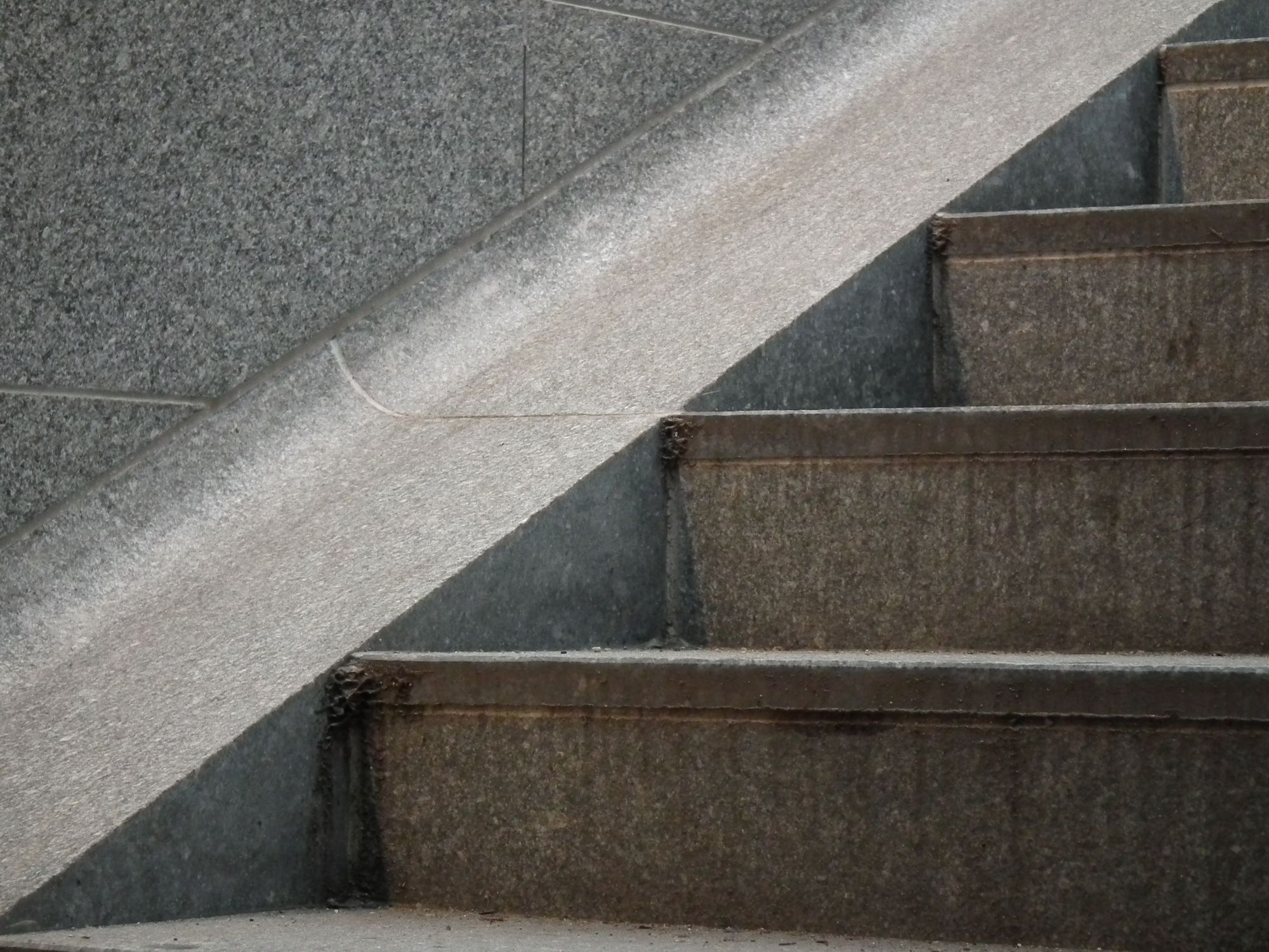
And we have rather lovely skylights here too:
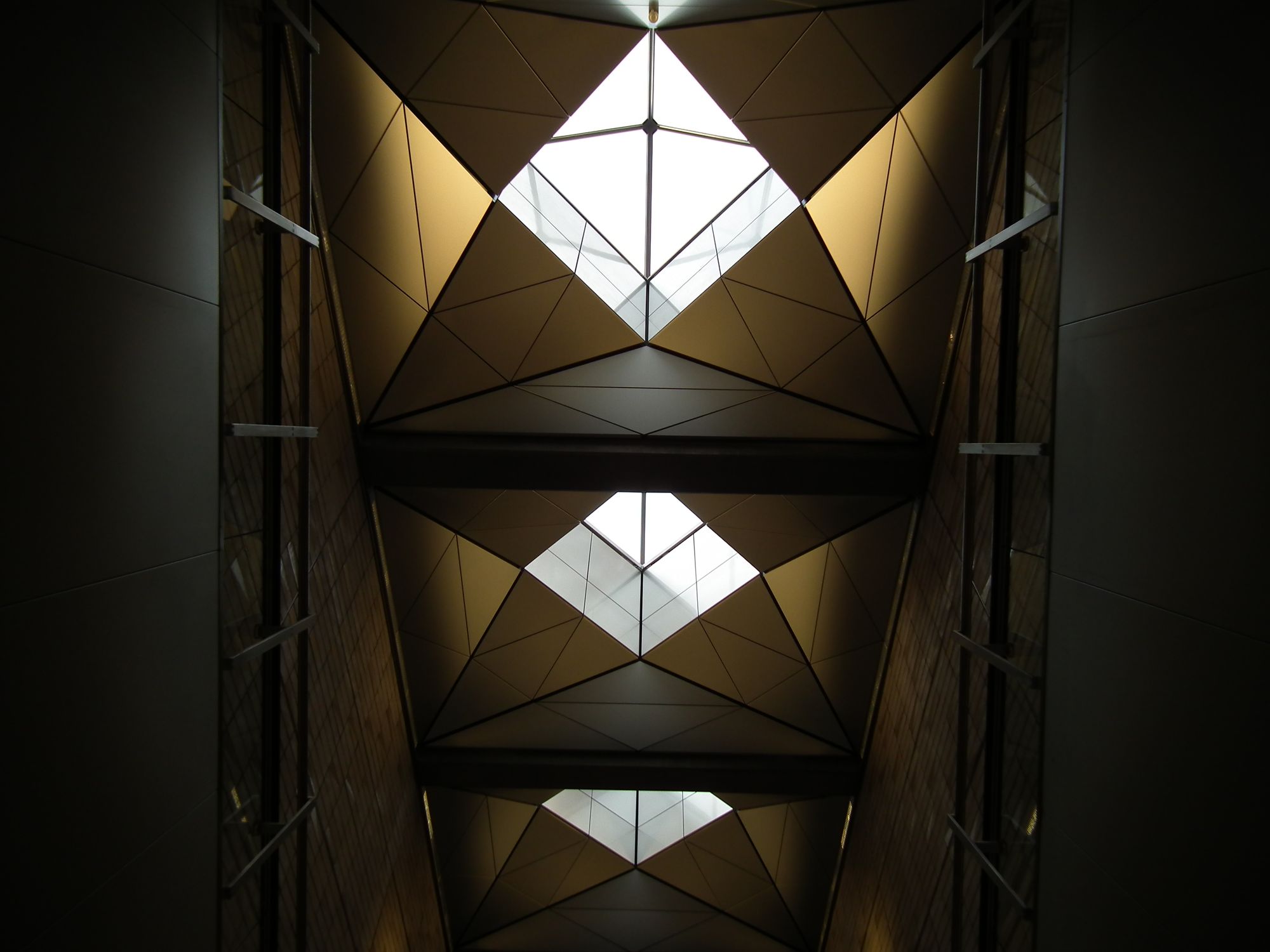
Nuuks Plads
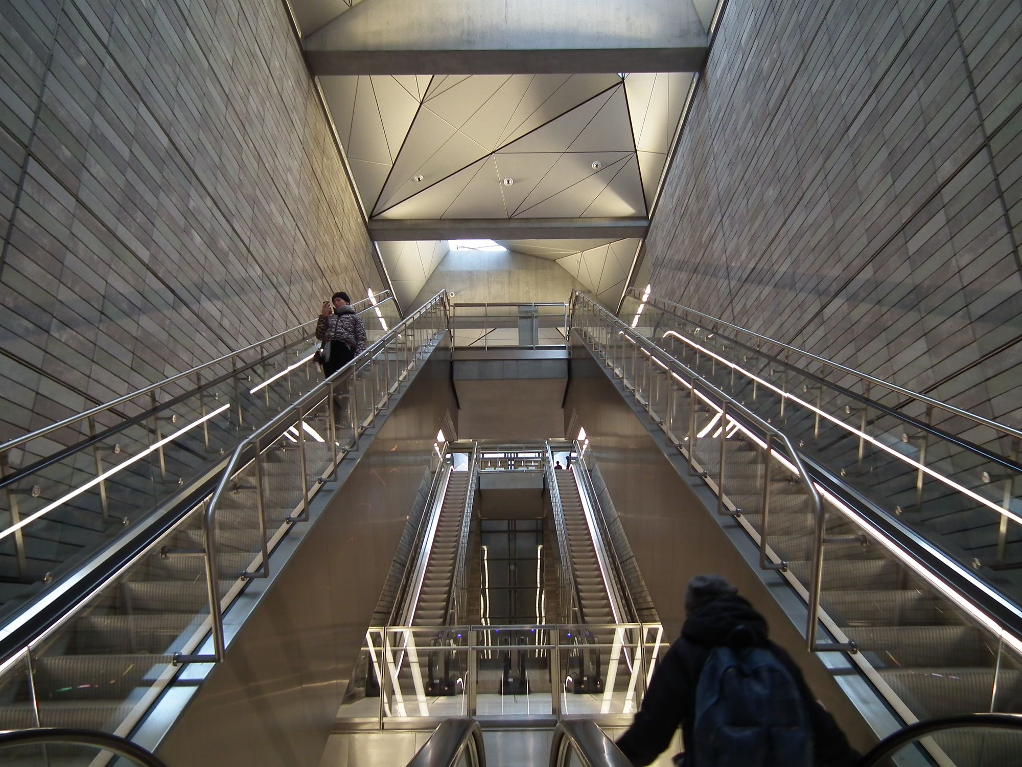
Now it has to be said ... not all of these stations are amazingly different from each other. This one felt rather similar to the last:
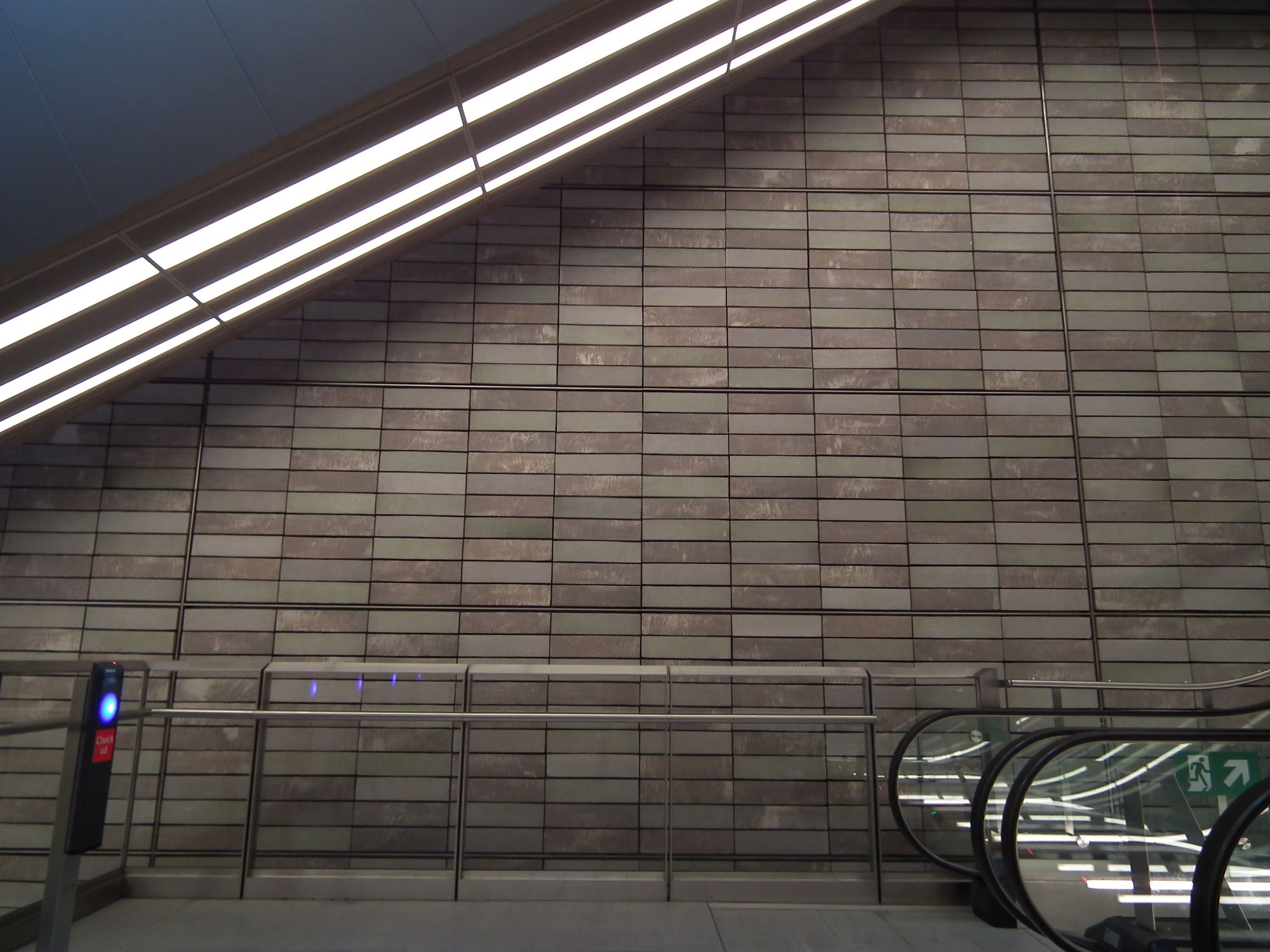
I love how light these stations can be:
Nørrebros Runddel
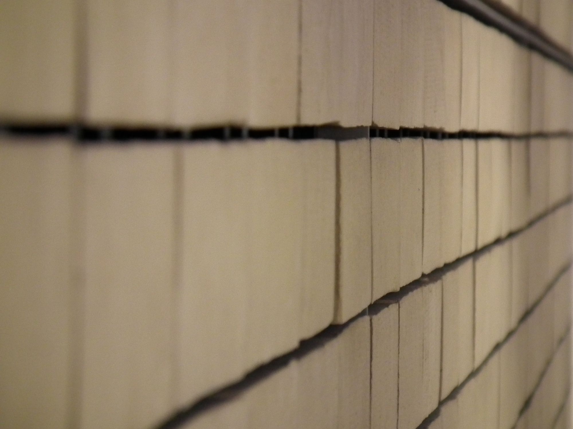
I quite enjoyed the slight irregularities in the texture of the walls here:
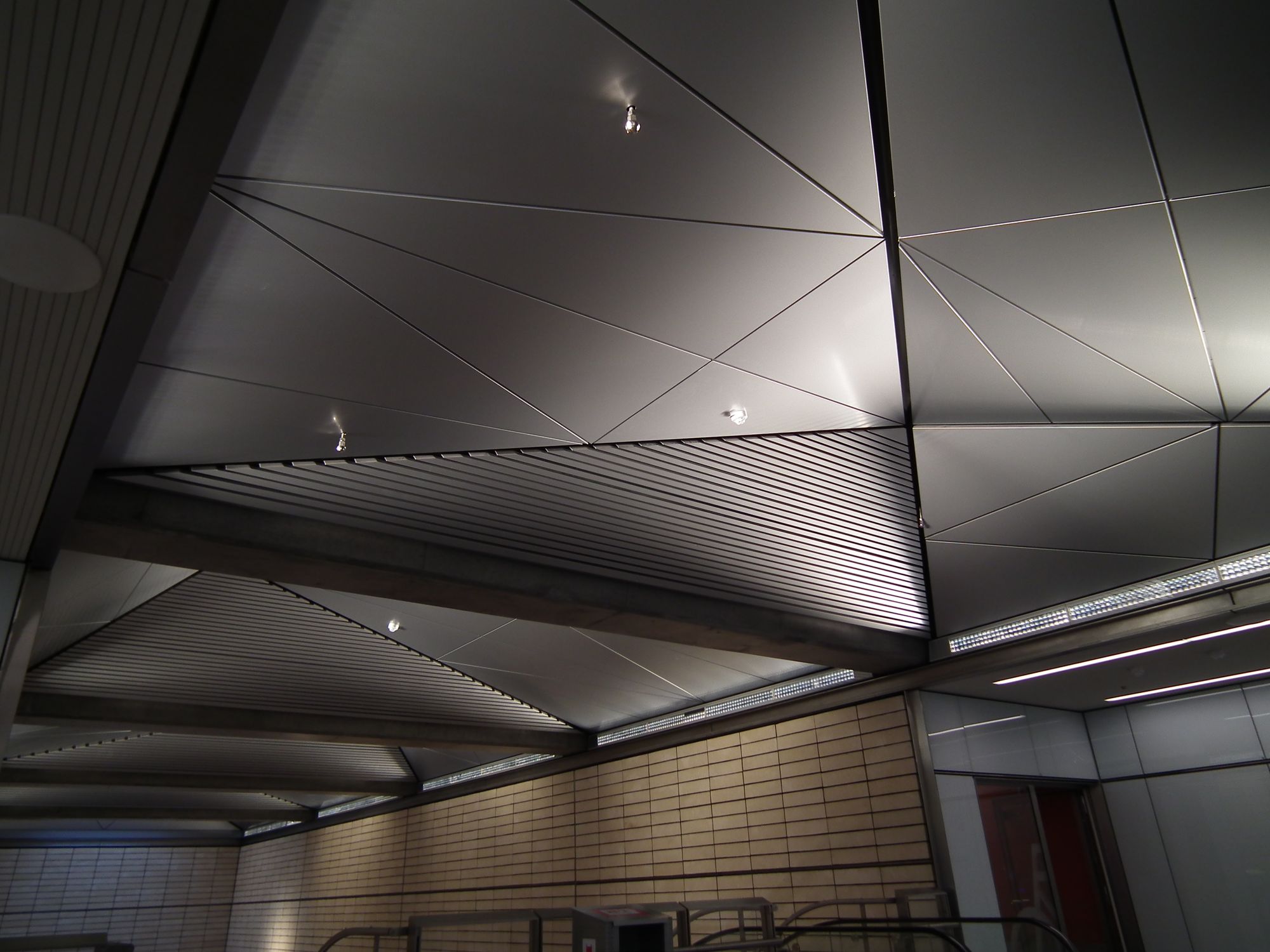
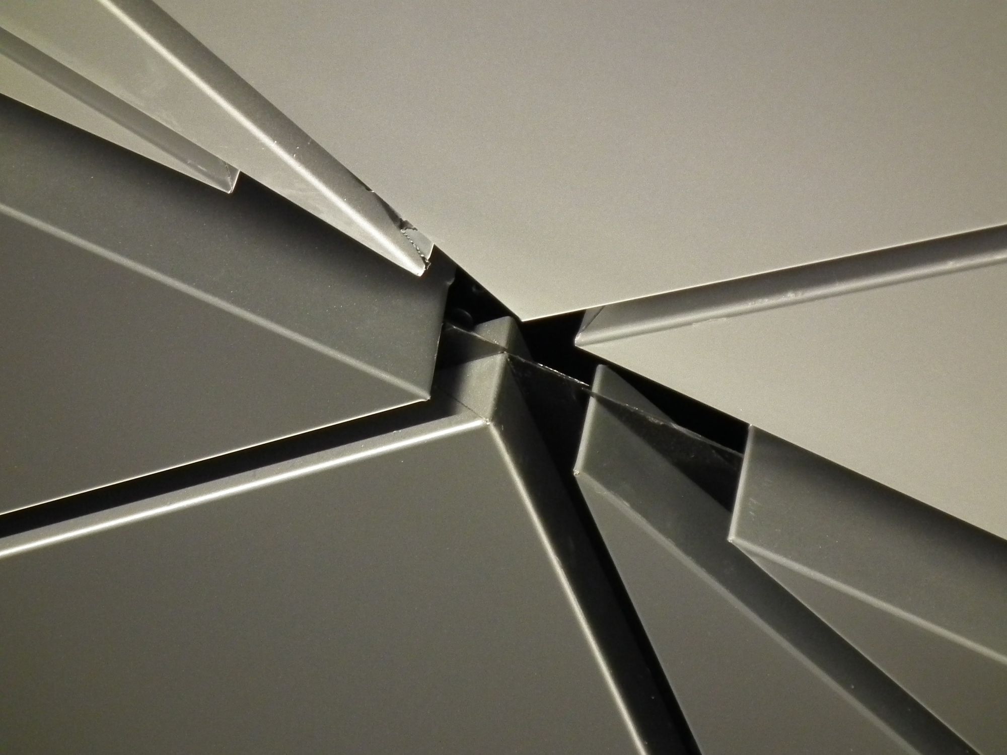
Here there's no proper skylight, so the roof is light, but not open to actual daylight:
Nørrebro
At Nørrebro we're back to colour, but more bold than before: red!
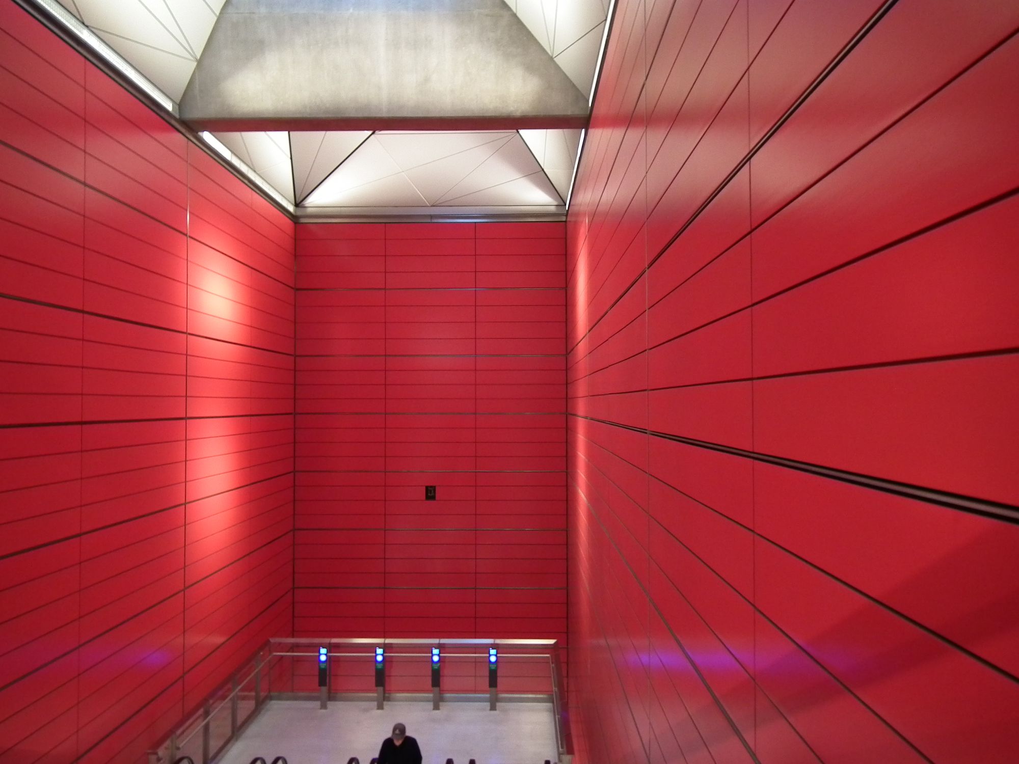
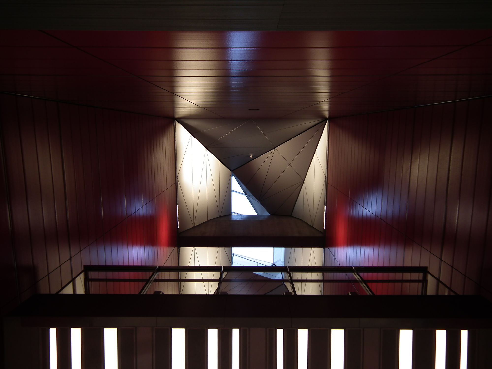
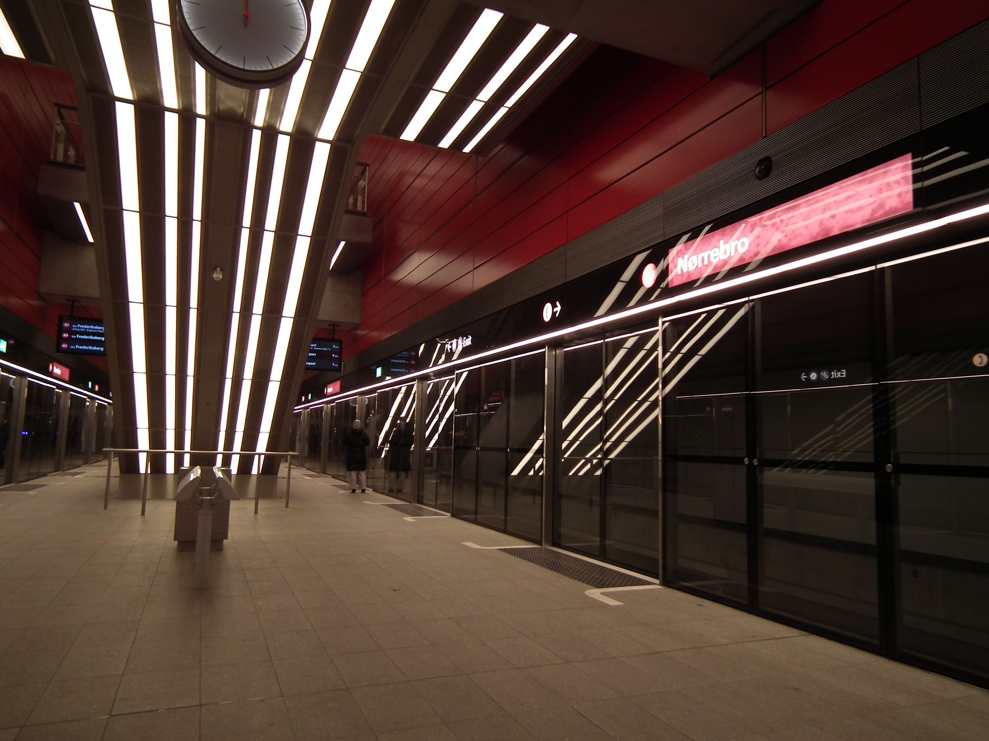
Actual daylight, too, so that's nice:
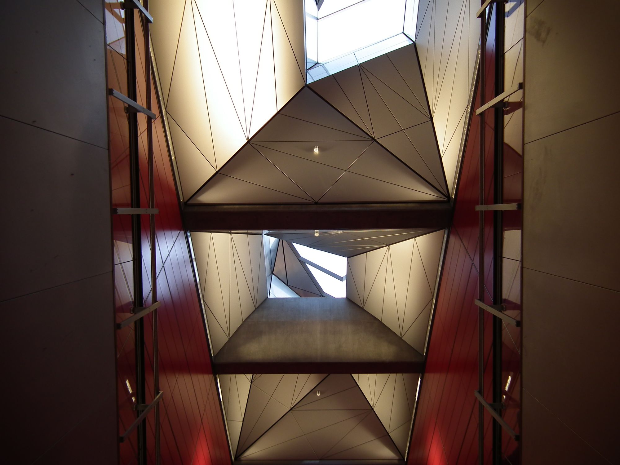
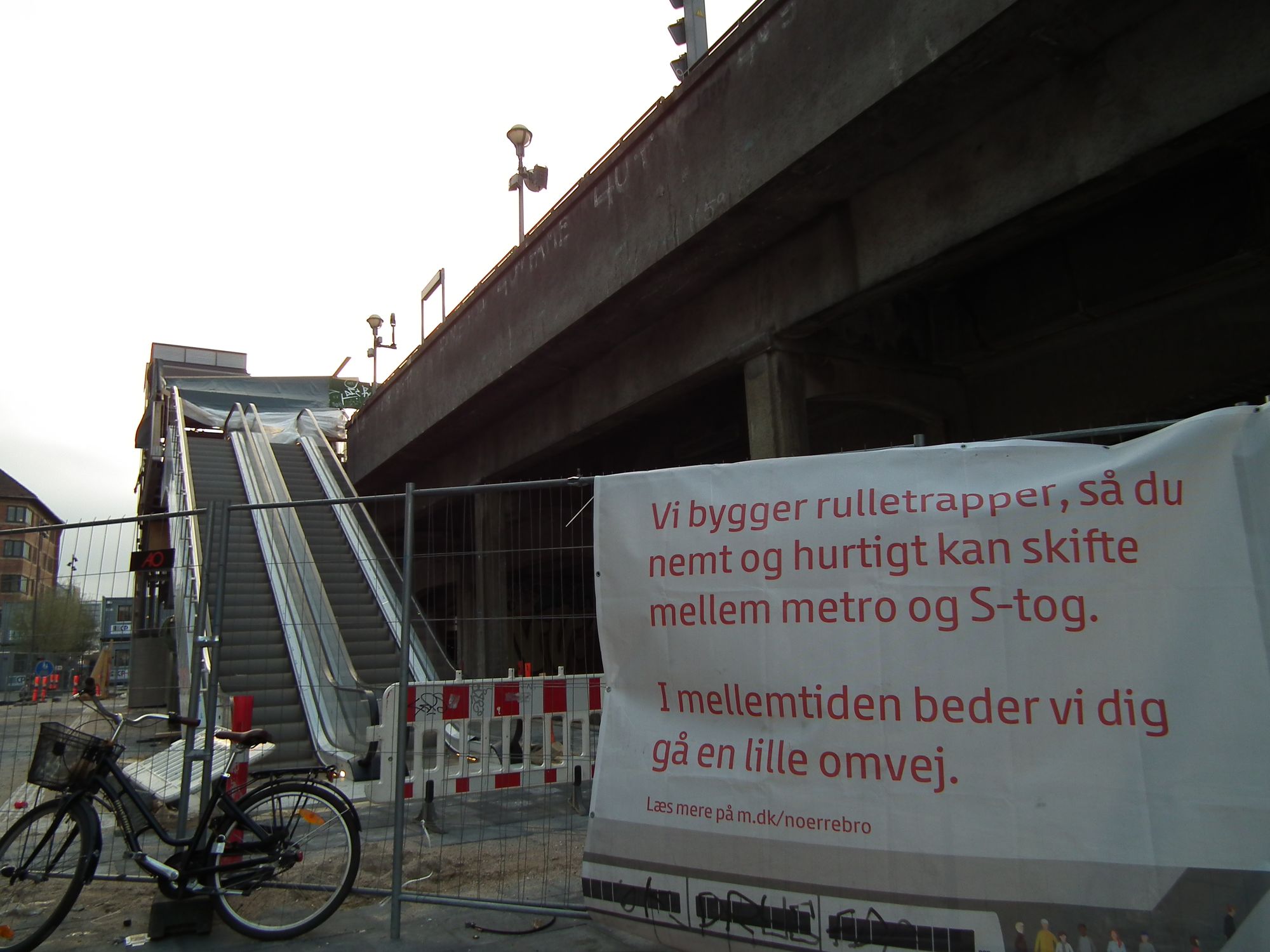
There's still a bit of building work going on though, to make interchange between the M3 metro and S-tog easier:
Skjolds Plads
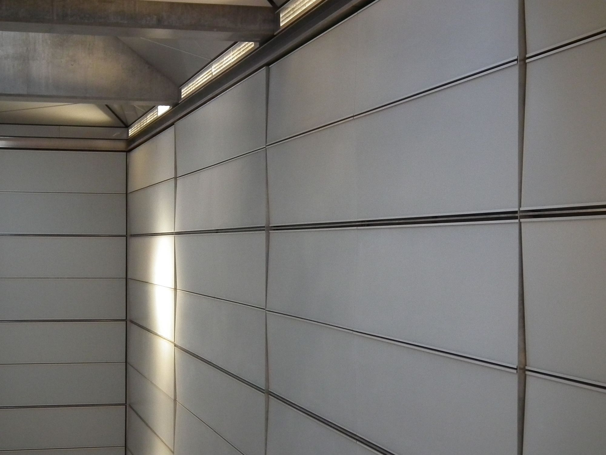
The walls are back to grey again here, but this time with an interesting "wave" texture, as they bow in and out:
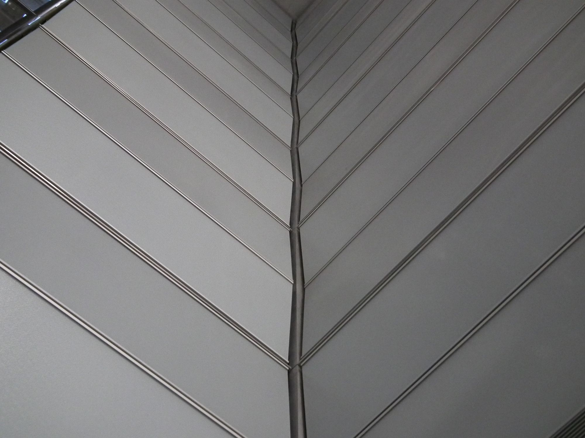
Apart from that, it's kinda the usual: skylights, spacious, back entrance for bikes. Good stuff :-)
Vibenshus Runddel
So it turns out that Vibenshus Runddel has a surprising unique feature: colours. Not just colour, but colours, plural:
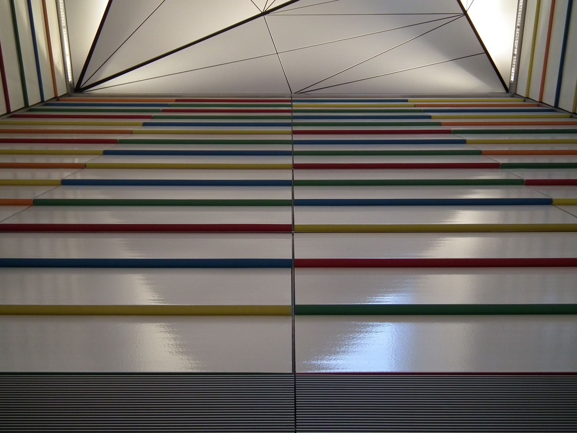
Here the wall panels tilt back slightly, so that the underside of each panel protrudes slightly, and there's where the colour is. It's rather nice actually!
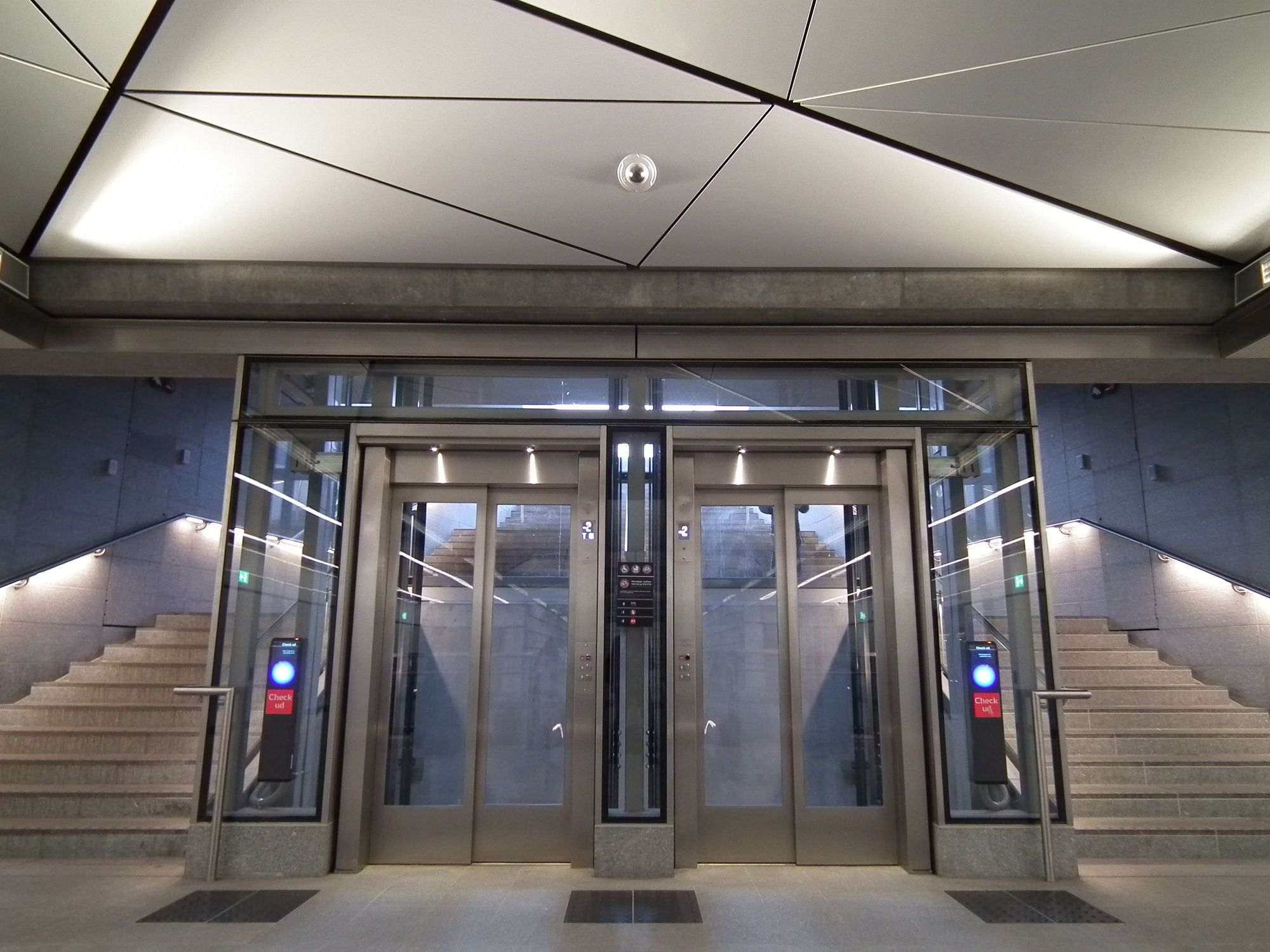
This station is in the corner of Fælledparken, so here's the main entrance:
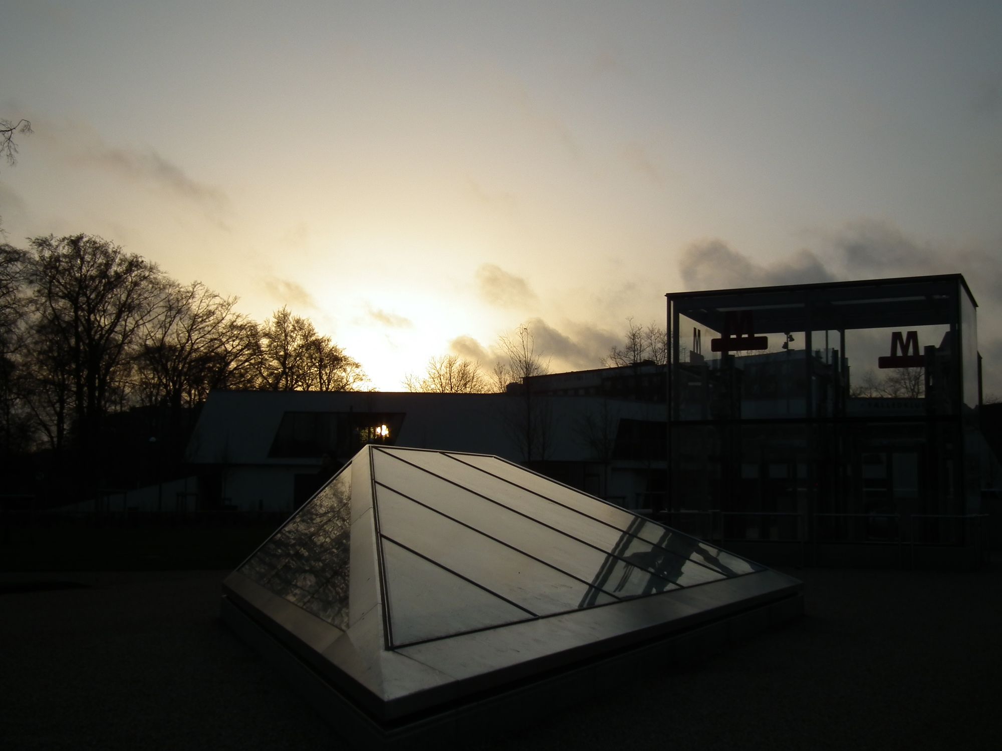
And on the surface, the skylights:
Sadly the bike area & entrance here were closed off when I visited.
Poul Henningens Plads
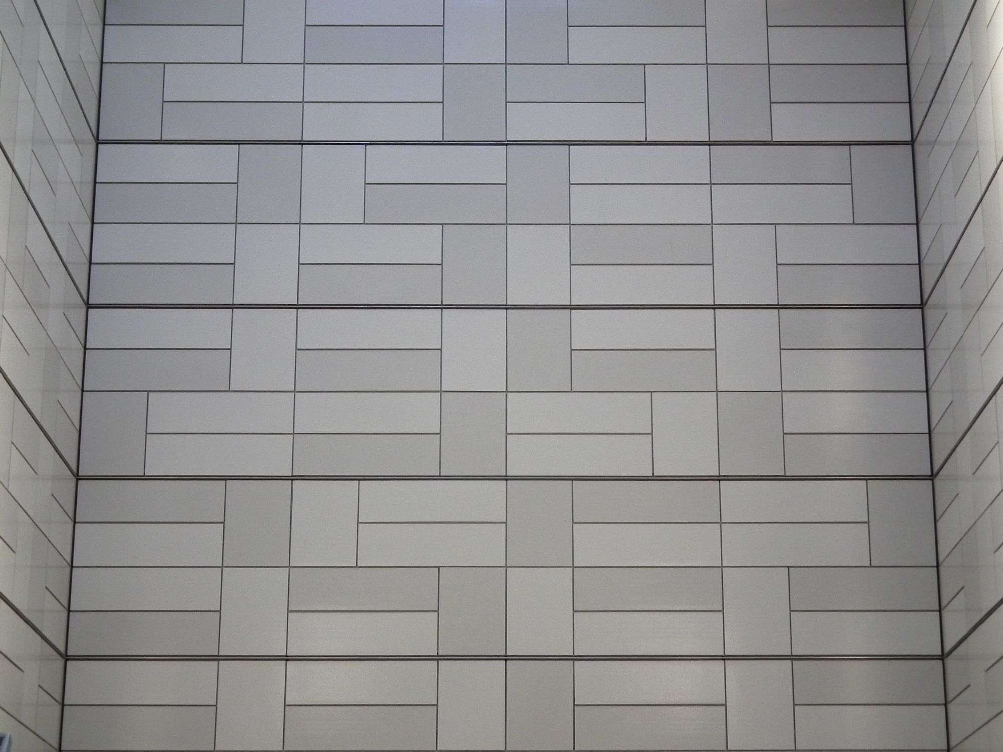
Another new feature on the walls here: an interesting horizontal/vertical rectangular pattern:
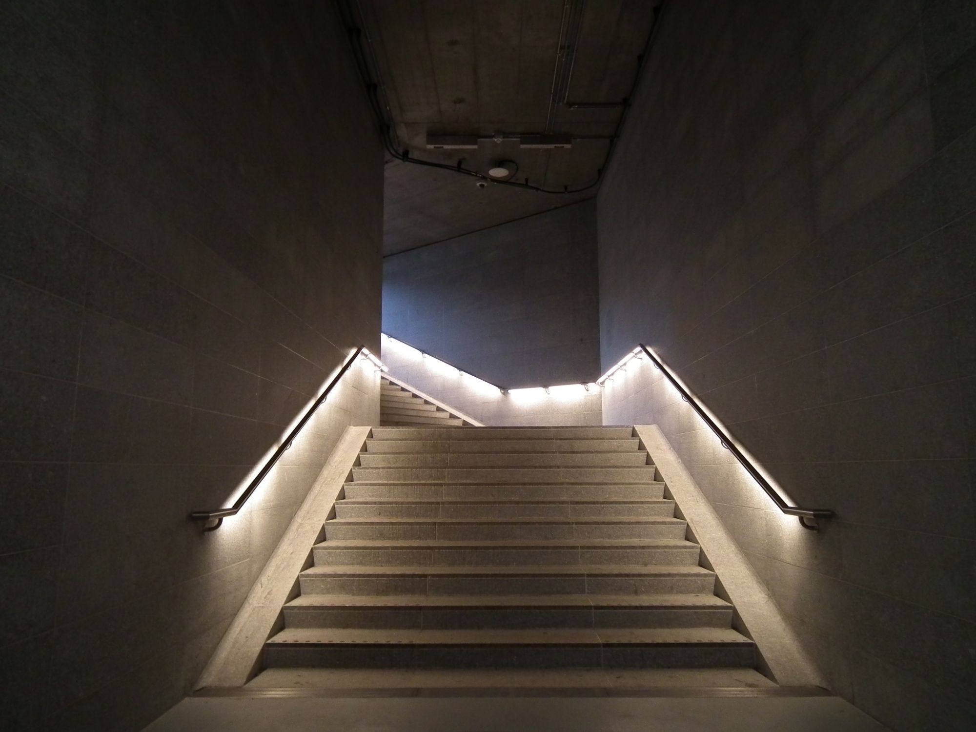
Apart from that it's the usual kind of layout, albeit with a slight kink in the corridor on the way out, if I remember correctly.
Trianglen
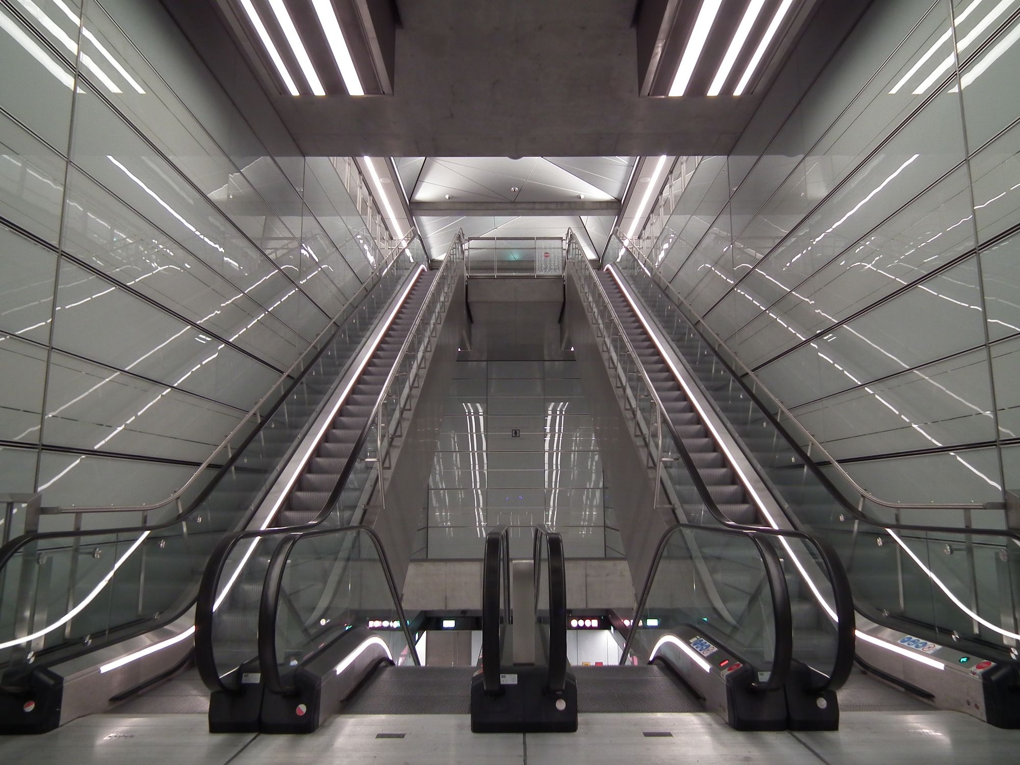
Light grey walls here, but they're shiny! What it lacks in colour, it makes up for in light:
No skylights here, though I'm not sure why, because there's loads of space on the surface, if I remember correctly. Weird.
Østerport
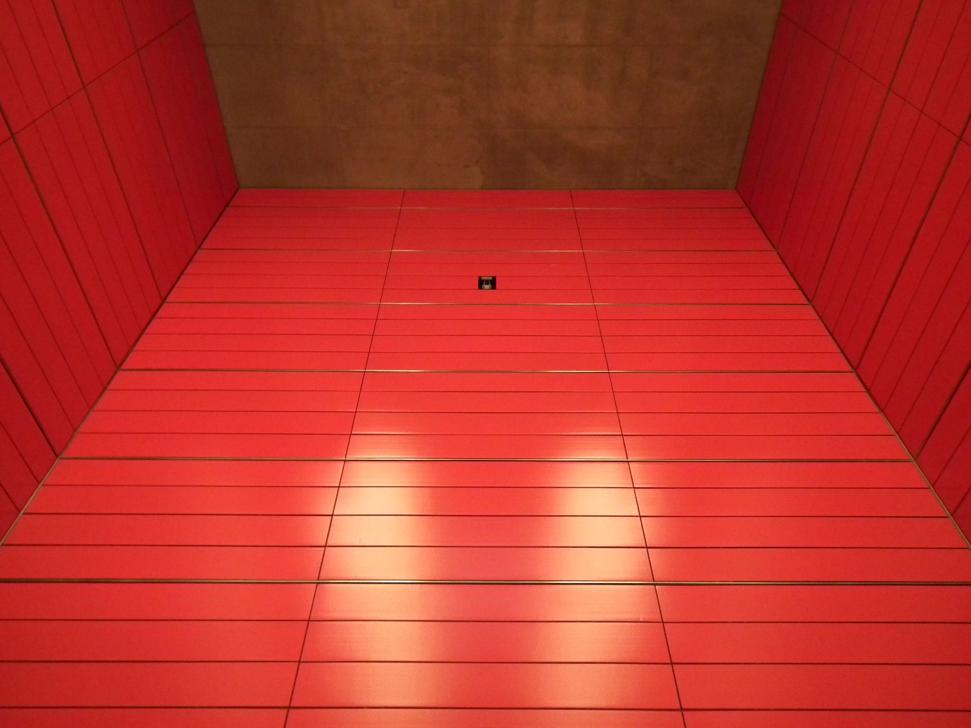
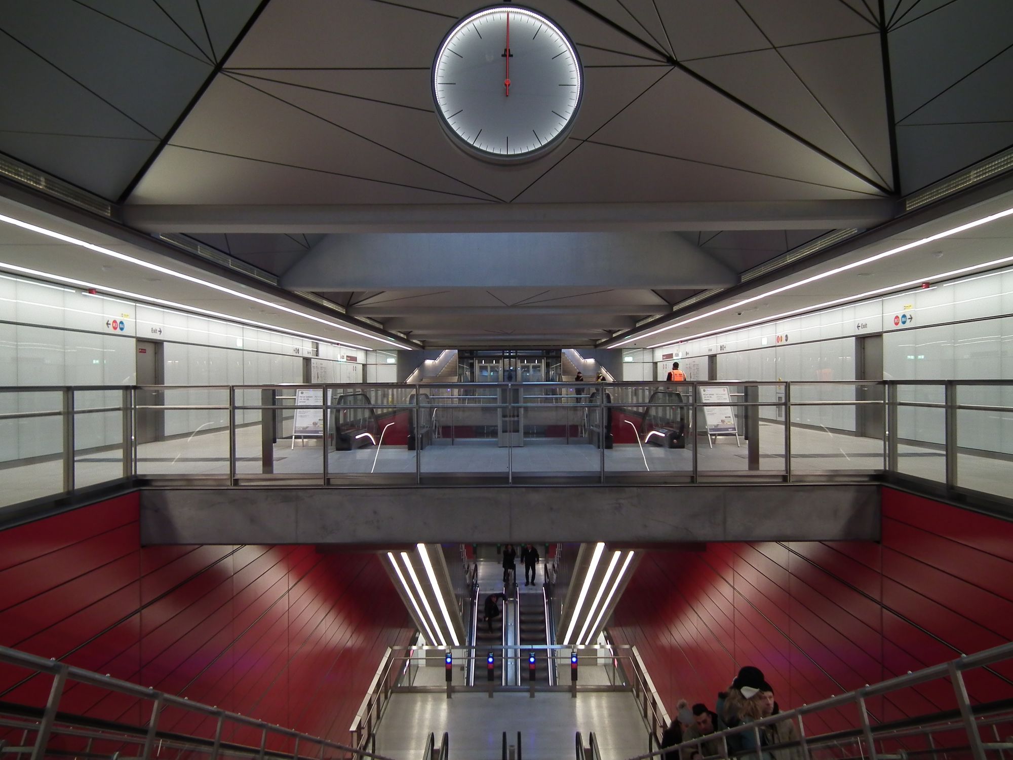
At Østerport we're back to BIG BOLD COLOUR:
The exit closest to Østerport main station is currently a rather temporary, rattly, noisy, and bouncy scaffolding staircase. It's actually quite disconcerting:
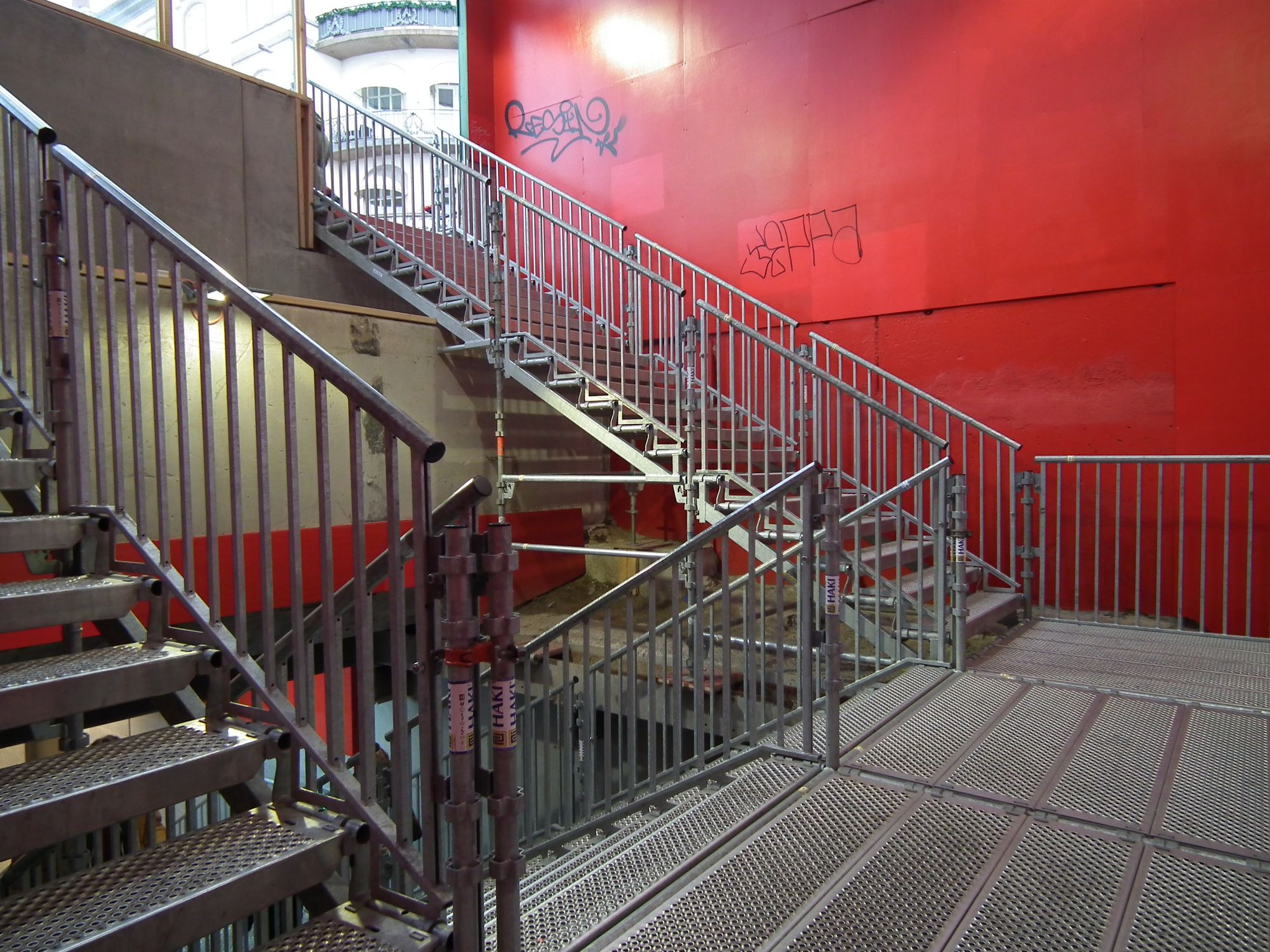
Hopefully before long they'll build a proper link between the two stations.
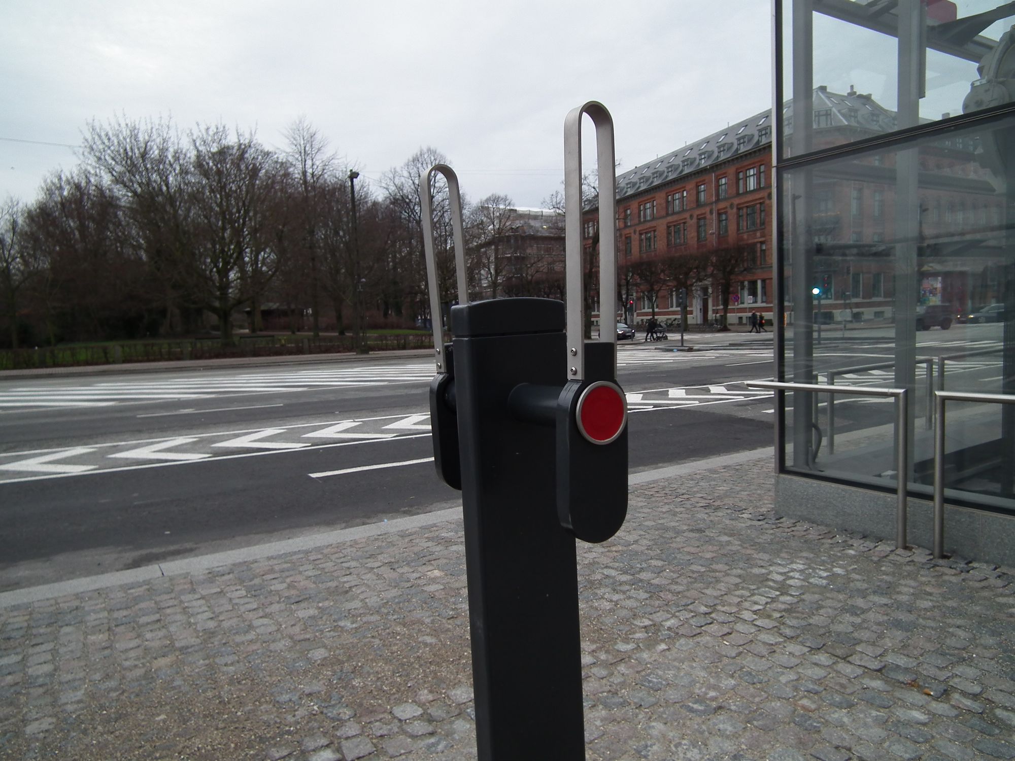
Meanwhile, a distraction: What are these? I keep seeing them but I don't know what they are:
Marmorkirken
On to Marmorkirken, which is well as being in perhaps the most spectacular setting of all the stations ...
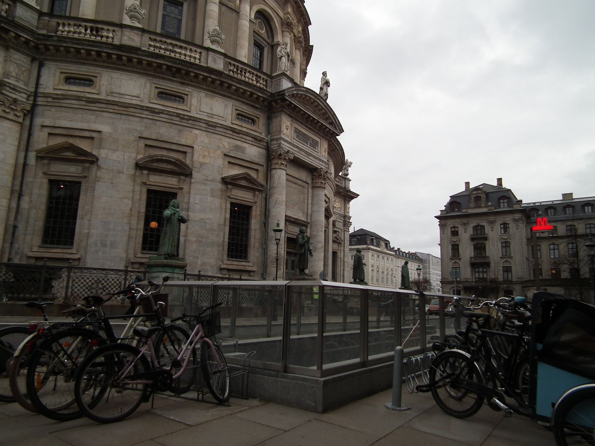
... is also of a very different structure to all the other stations. I'm guessing they didn't have much space to work in here, squeezing the whole station between the church and Store Kongensgade, not just on the surface, but subsurface too. The result is a station with a very different feel indeed.
The only long sightline here is immediately below the surface, along the bike storage / ticket hall area:
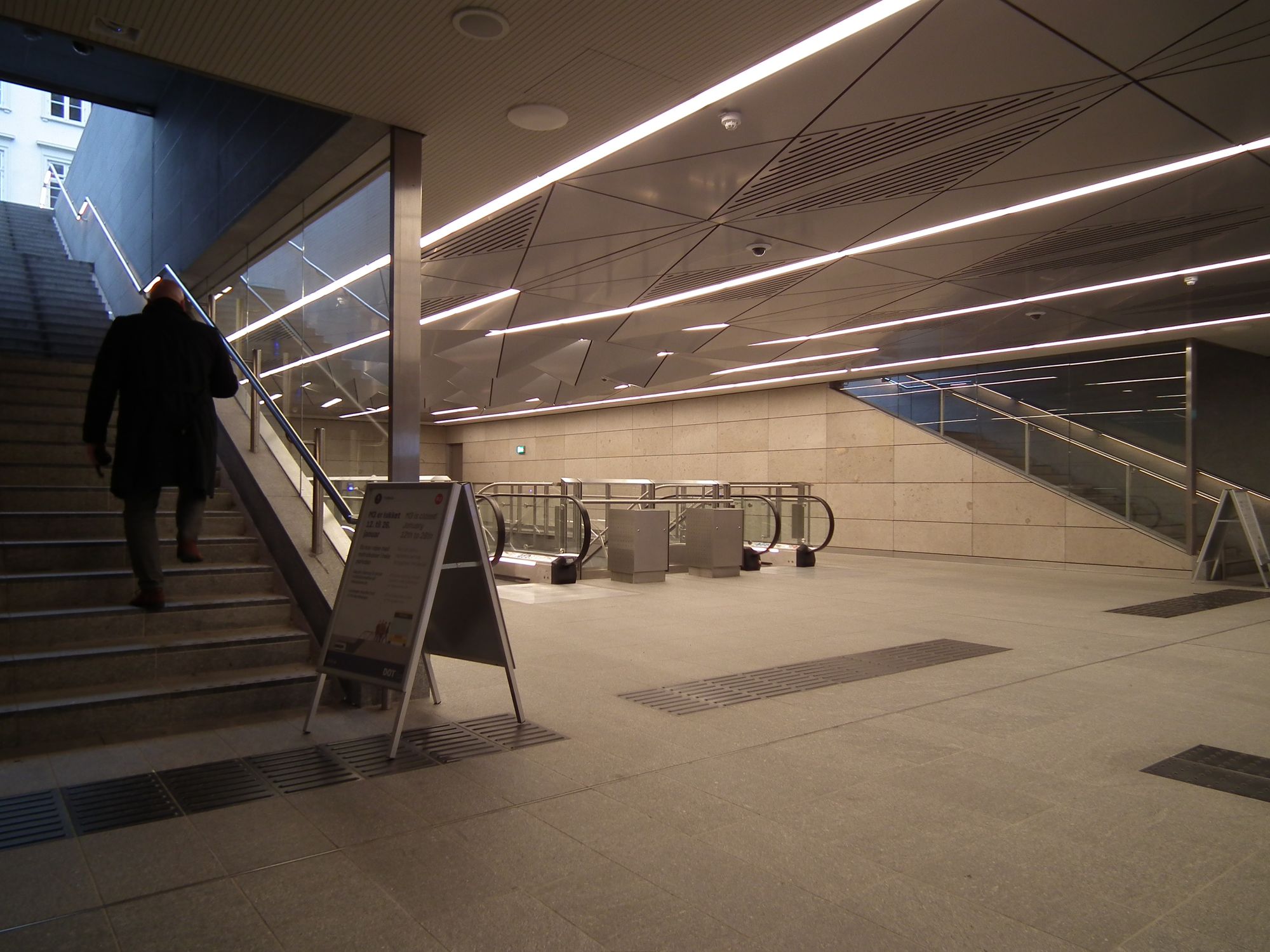
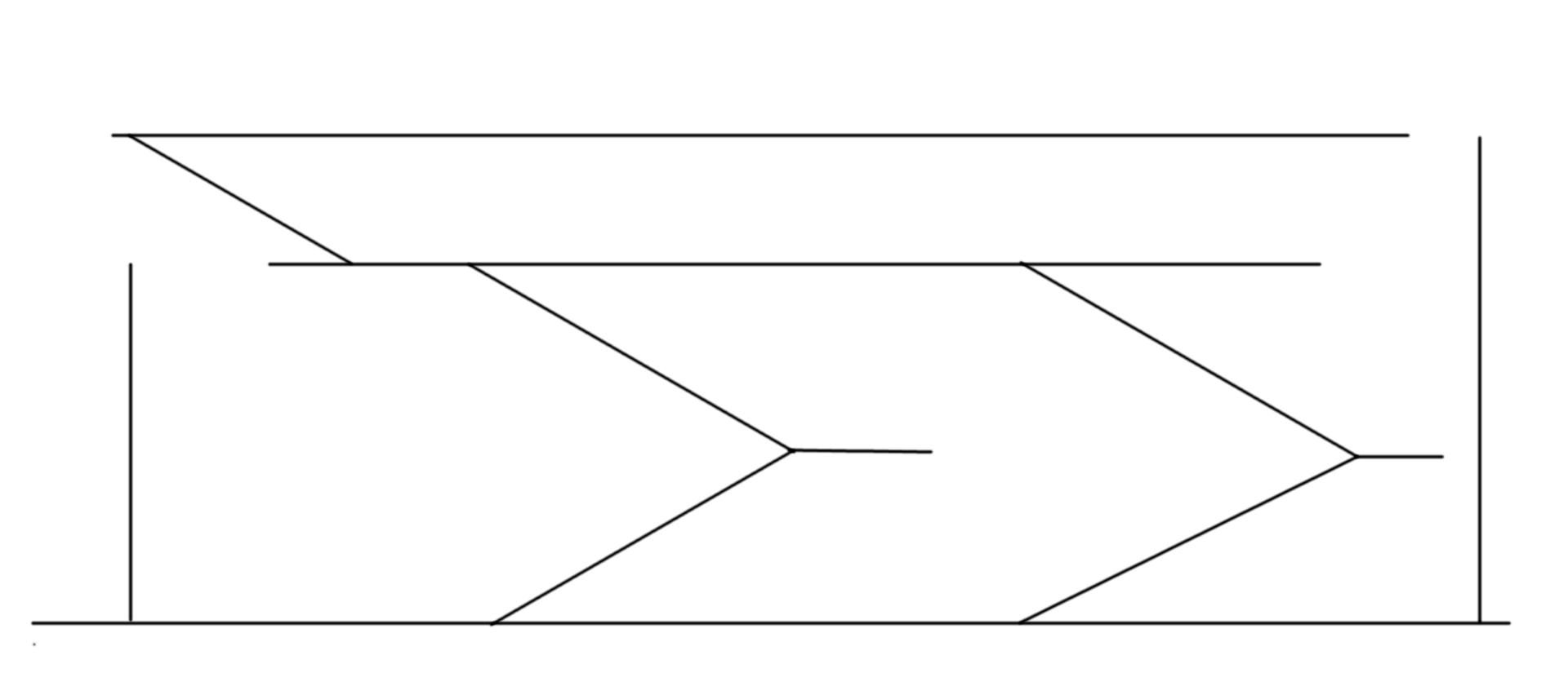
Deeper than that, though, things are rather different from everything else. The escalators, instead of being formatted like this, as they are in most stations:
are, in Marmorkiren, more like this (excuse the quick sketch):
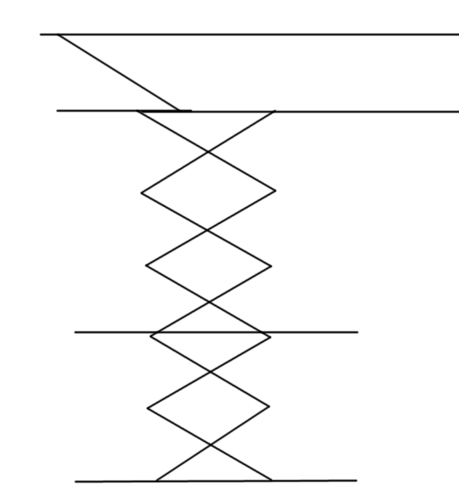
So the whole station has a very different feel: not so spacious, perhaps even a little claustrophobic.
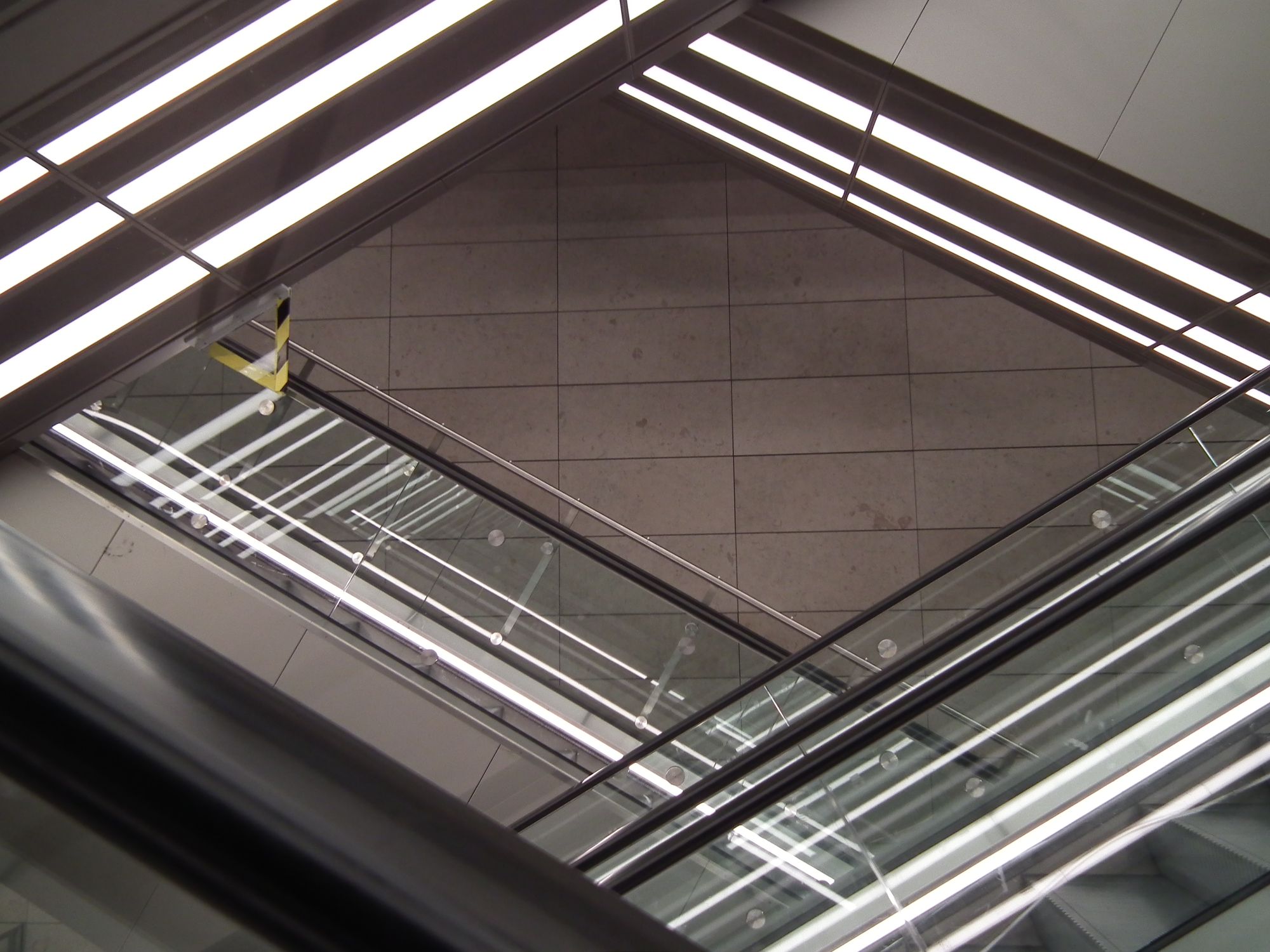
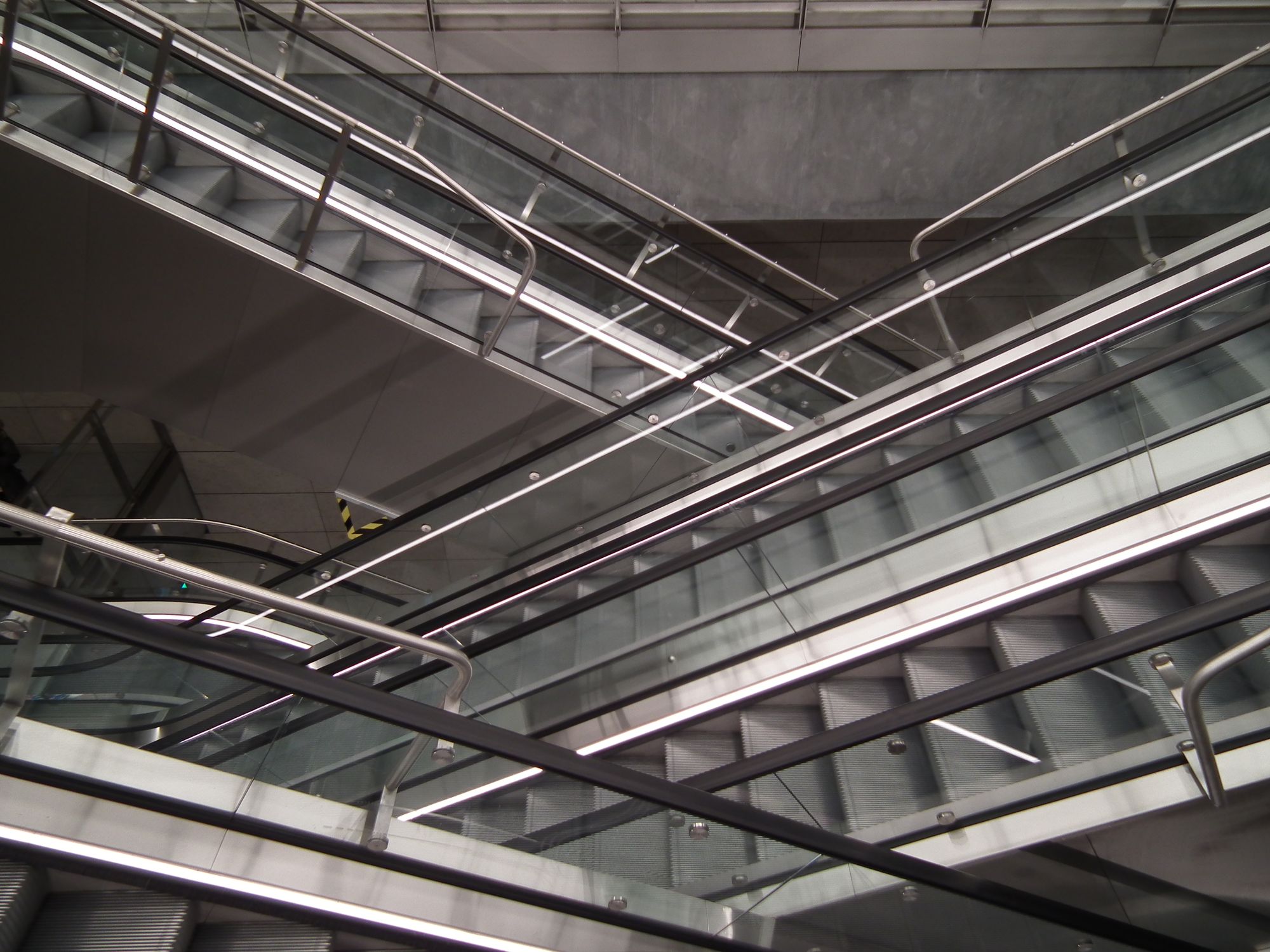
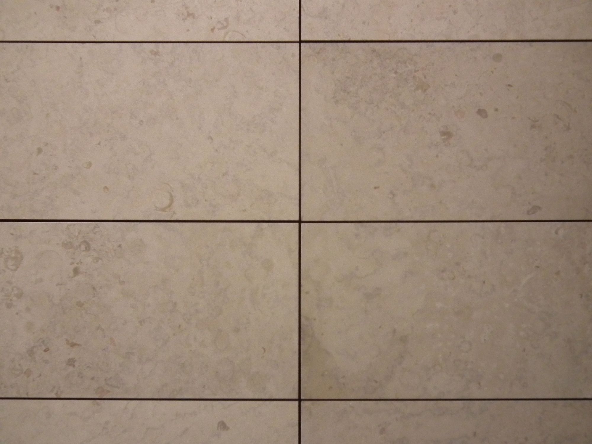
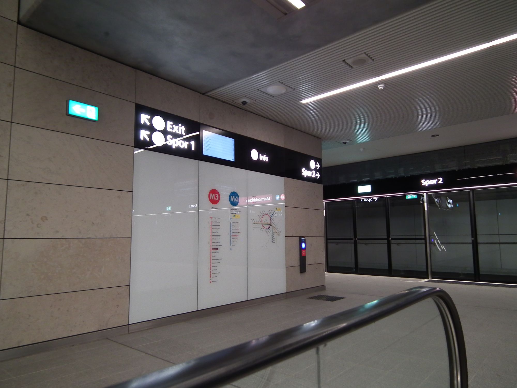
The walls have this rather attractive marbled pattern, echoing the church above:
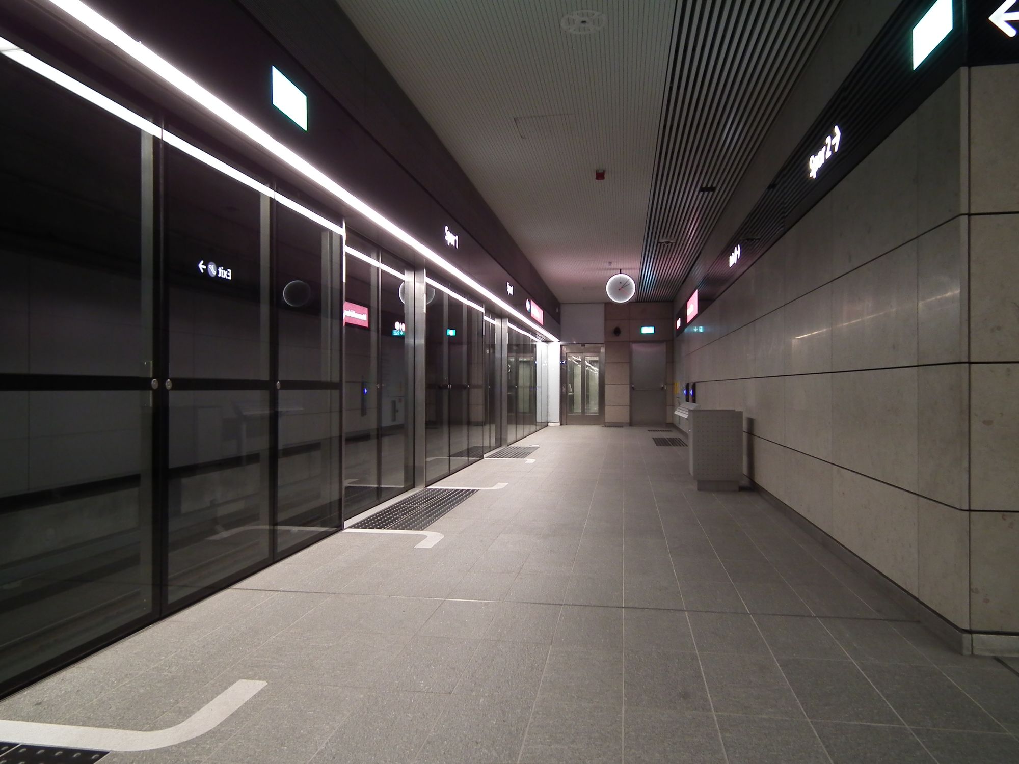
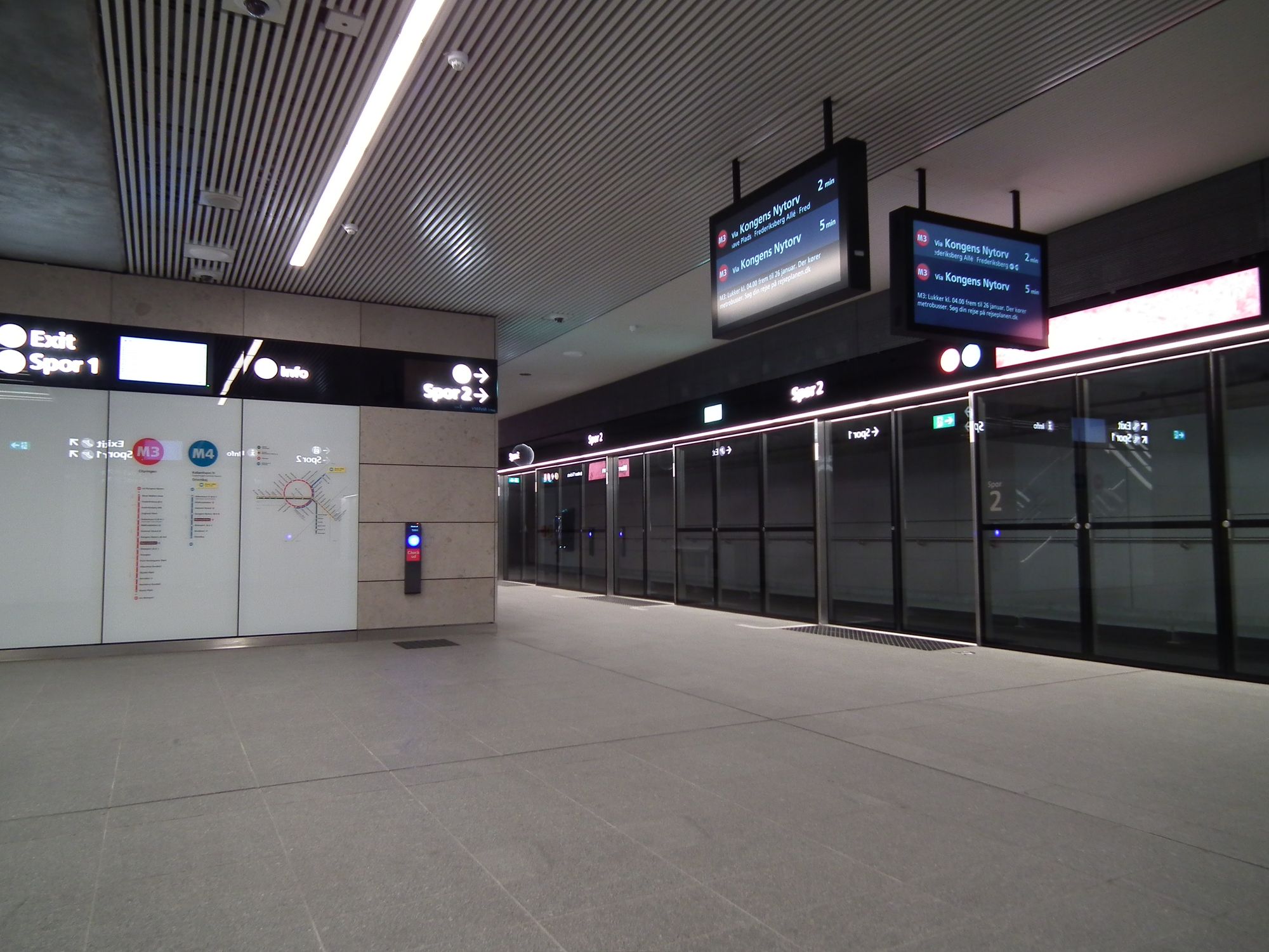
And down at platform level, the platform space is quite narrow, and not backing on to the other platform. This is platform 1, the higher platform; platform 2 is below this.
And right at the bottom, aaaaaaaall the way down, is platform 2:
Right. On we go.
Kongens Nytorv
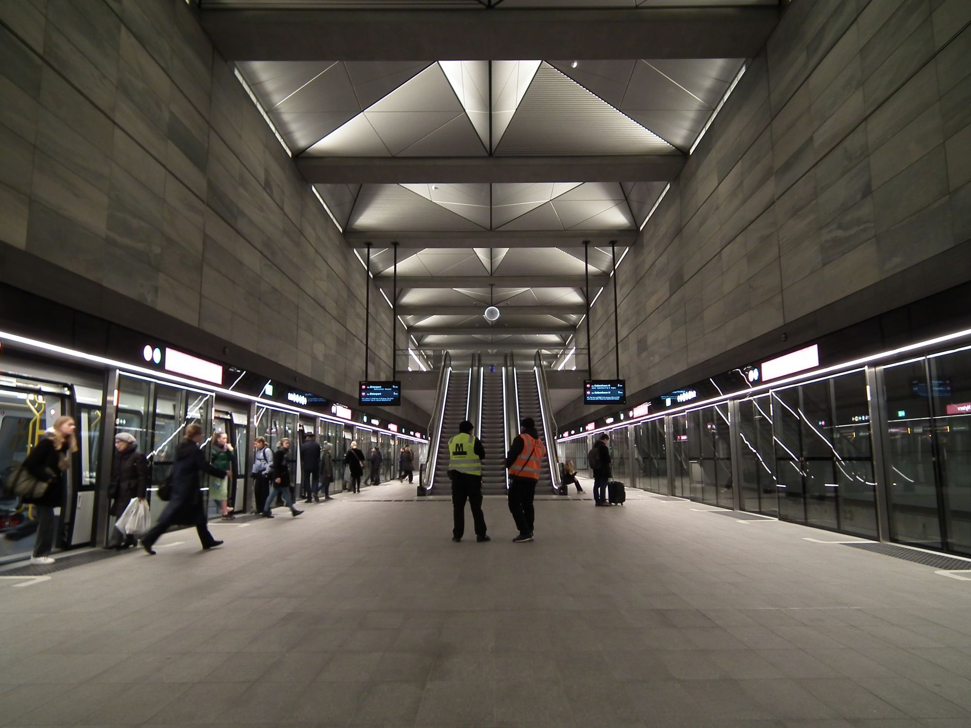
Along with Frederiksberg, Kongens Nytorv is the other interchange point with M1/M2 – the difference here being, because it's so central, this station is built to handle much more traffic. It's big (compared to the rest of the network).
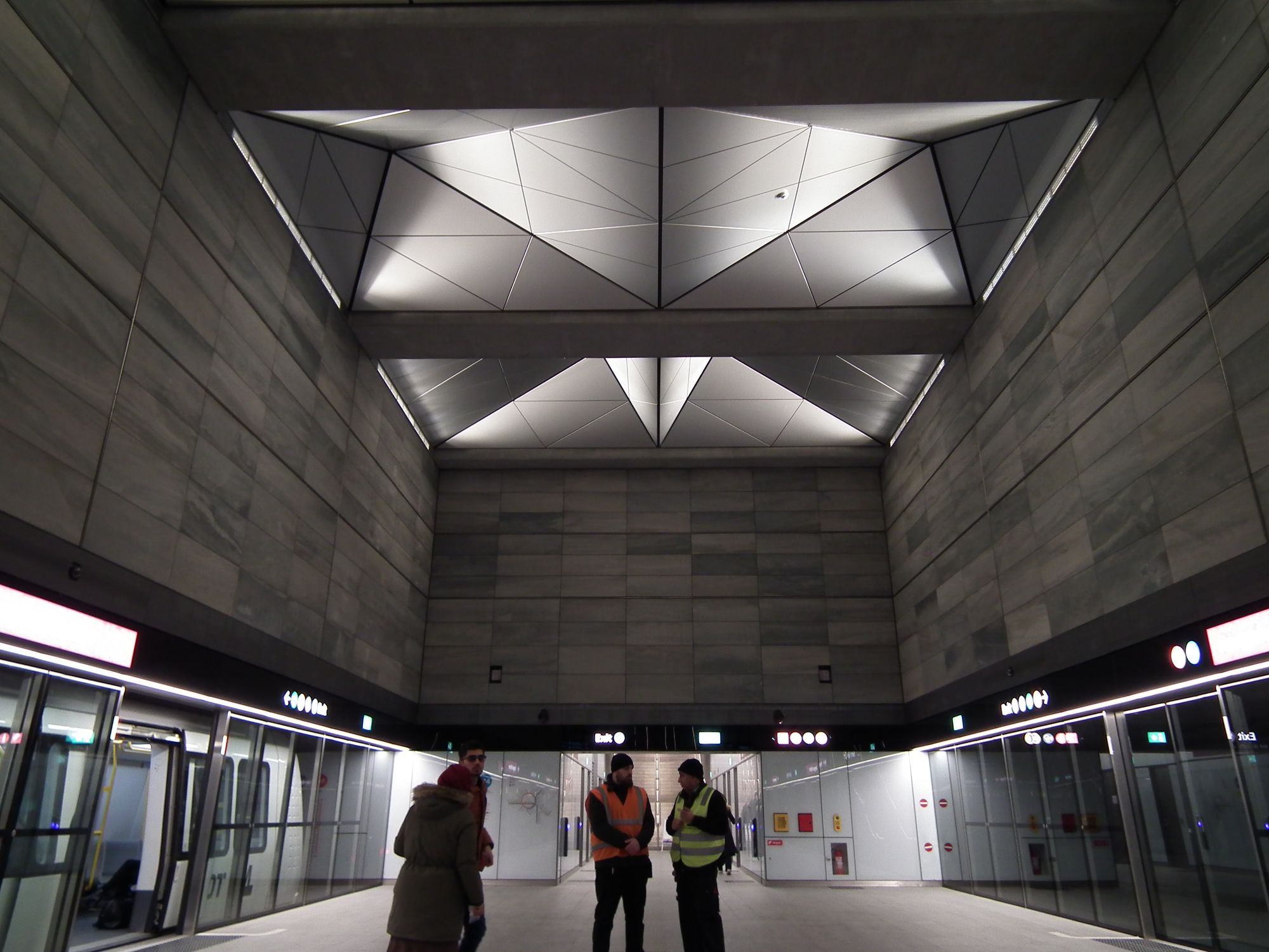
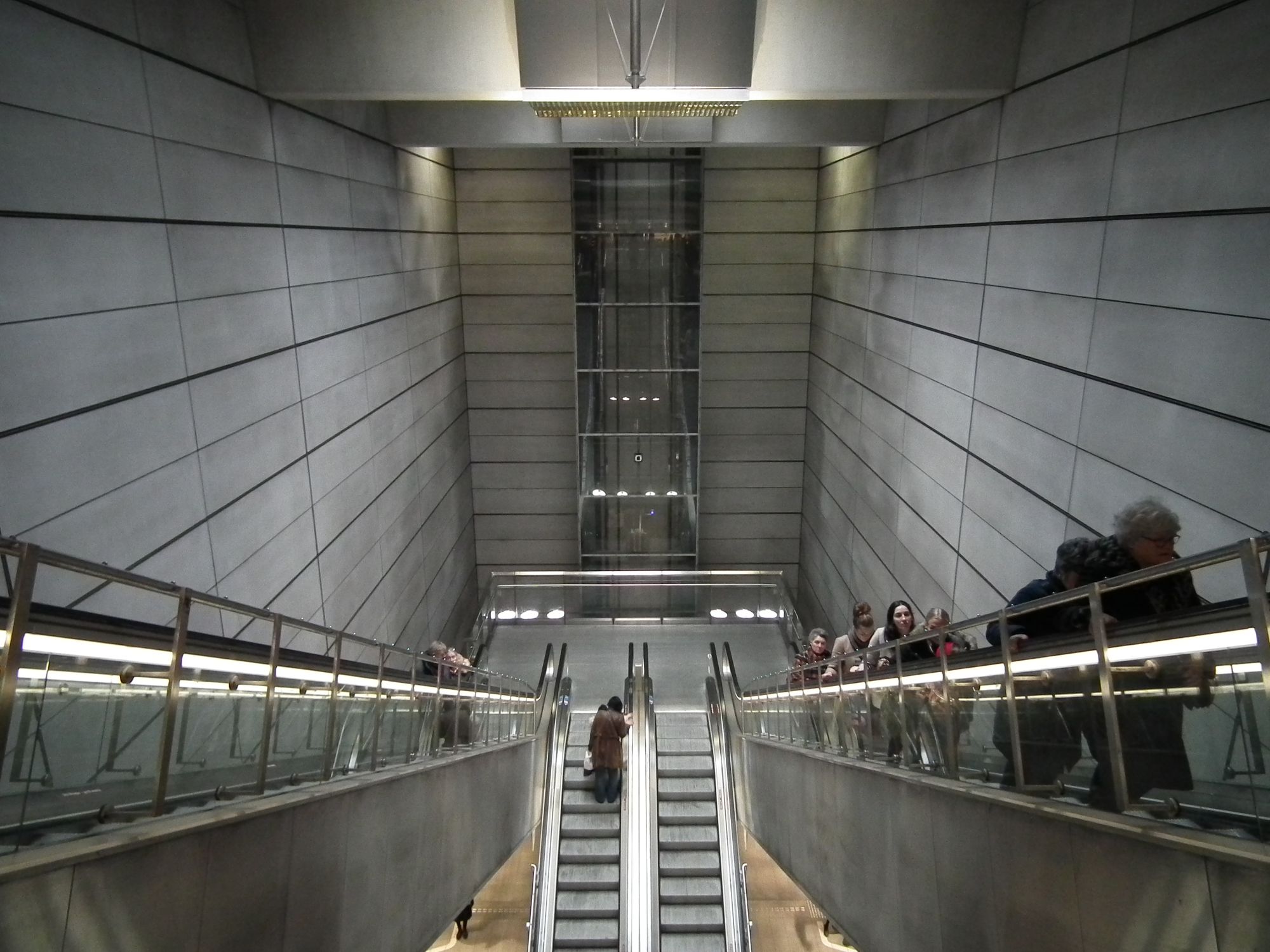
Straight away this feels bigger: the station is wider, there's more distance between the two platforms. The (fake) skylights are wider. The placement of the escalators is such that they don't take up as much space:
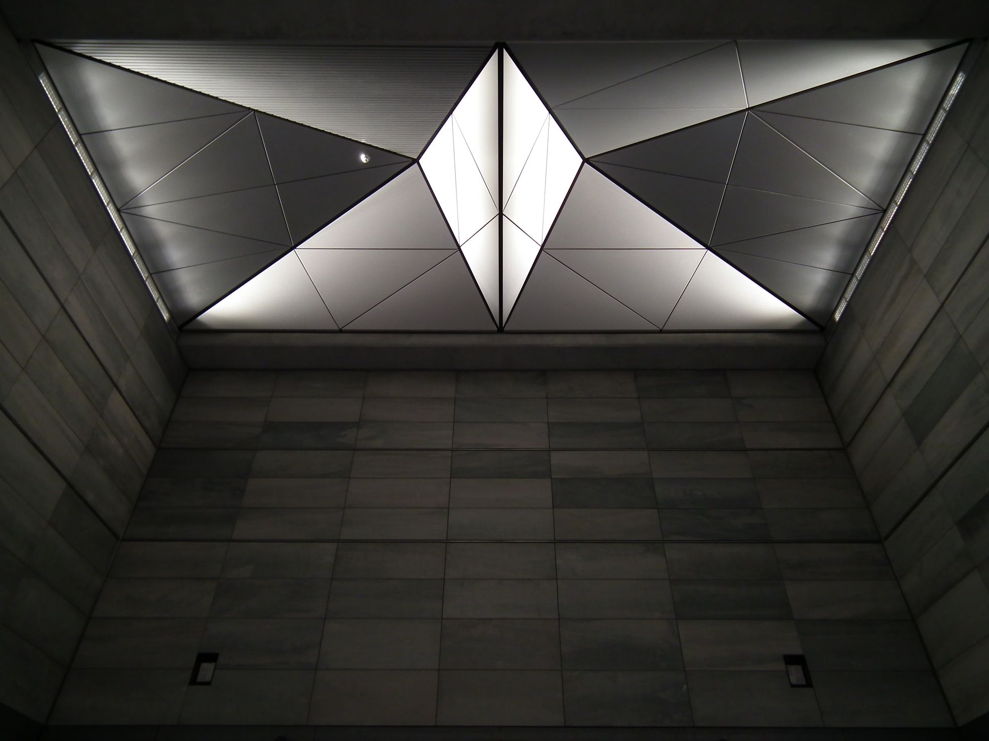
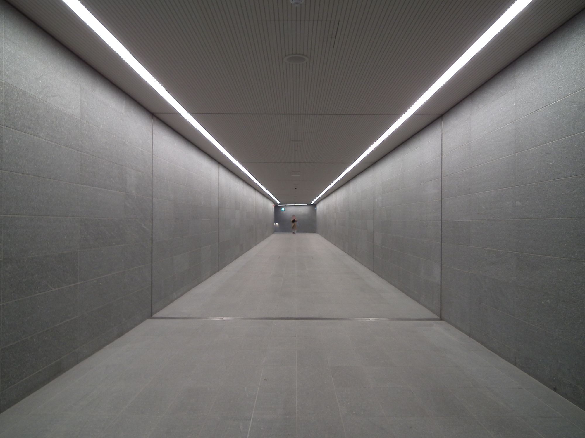
The corridor at one end of the M3 leads out, down a rather long corridor that doubles back on itself ...
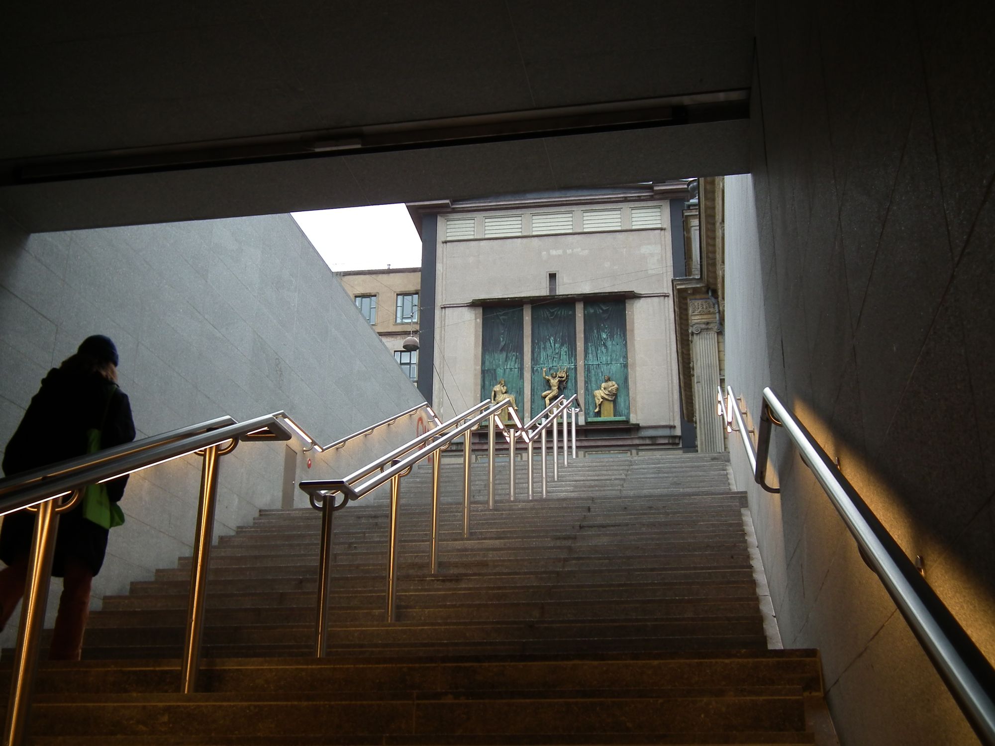
... and then out to Det Kongelige Teater:
The other way, if we take the escalators up from the M3, we get to the ticket hall area ...
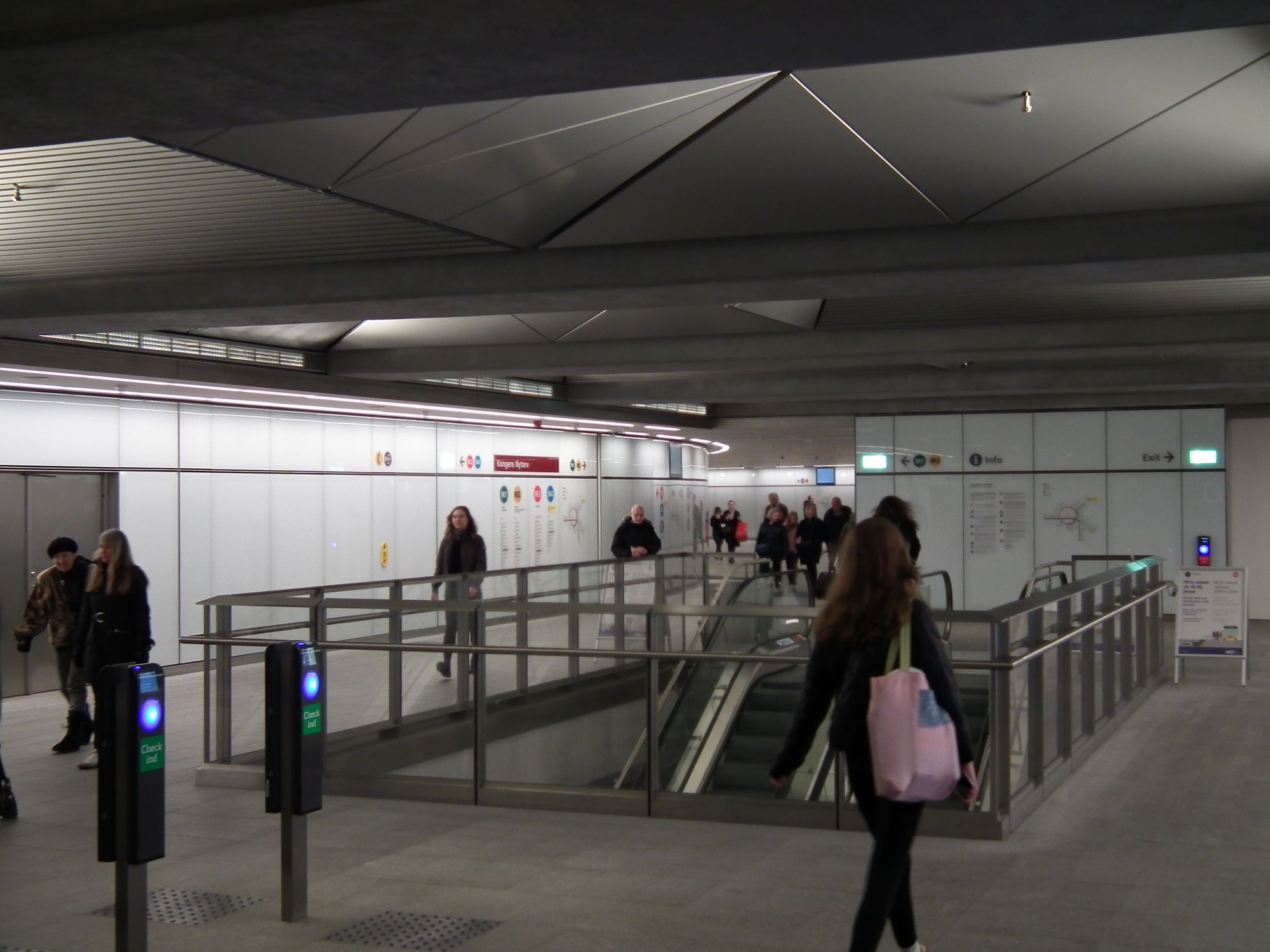
... which then leads into the impressively open interchange area:
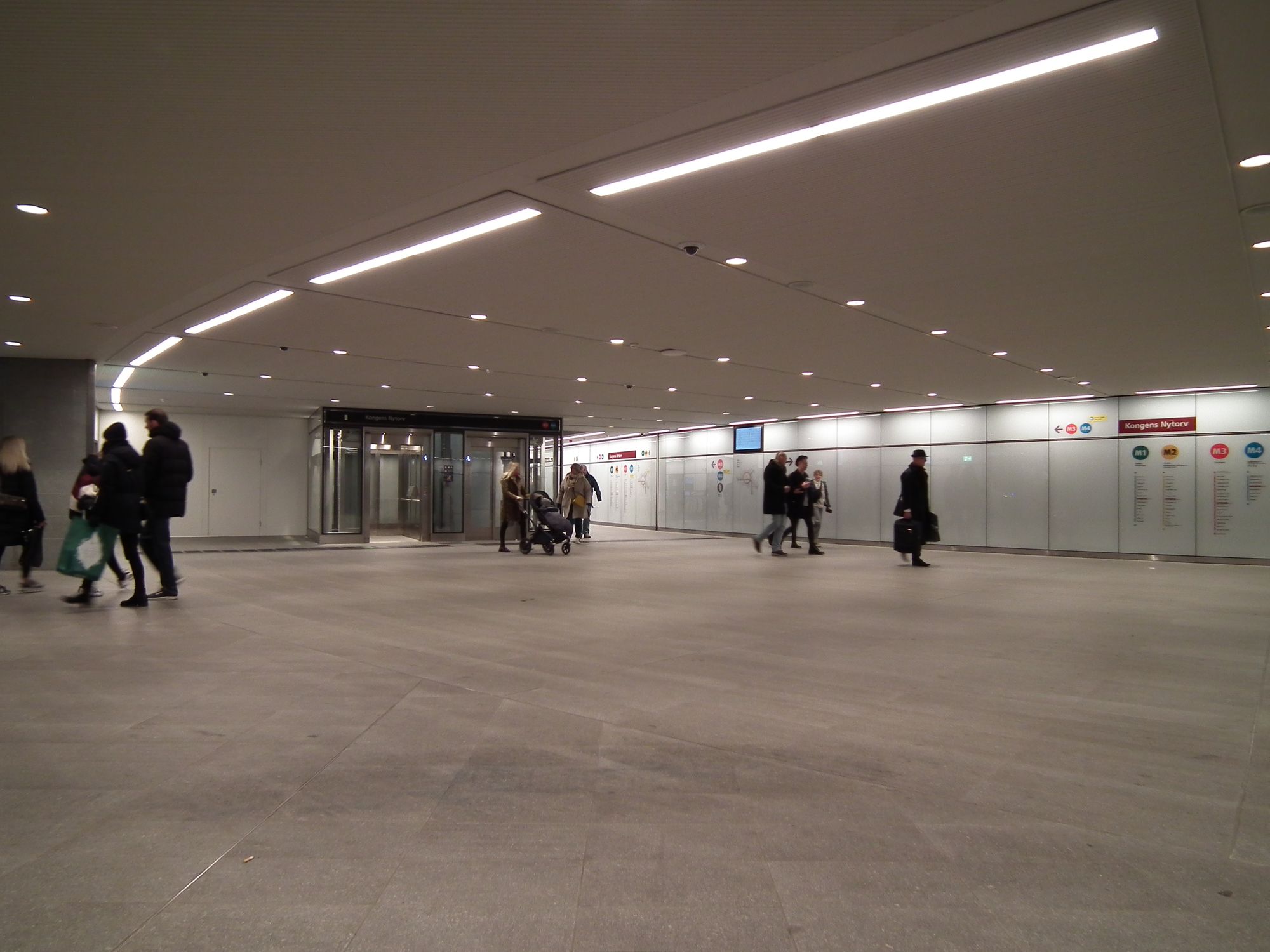
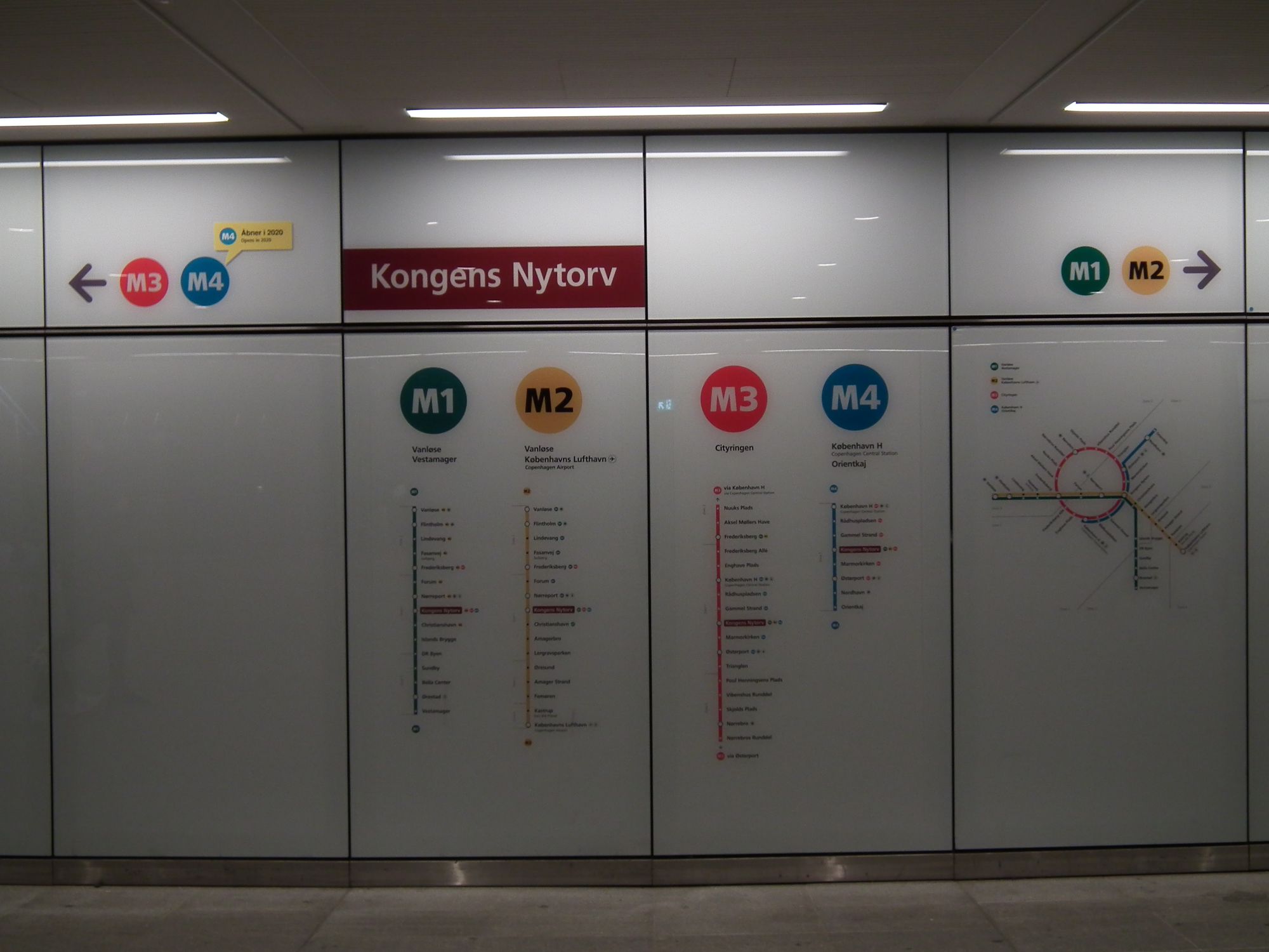
Y'all know I like patterns, textures and geometry by this point:
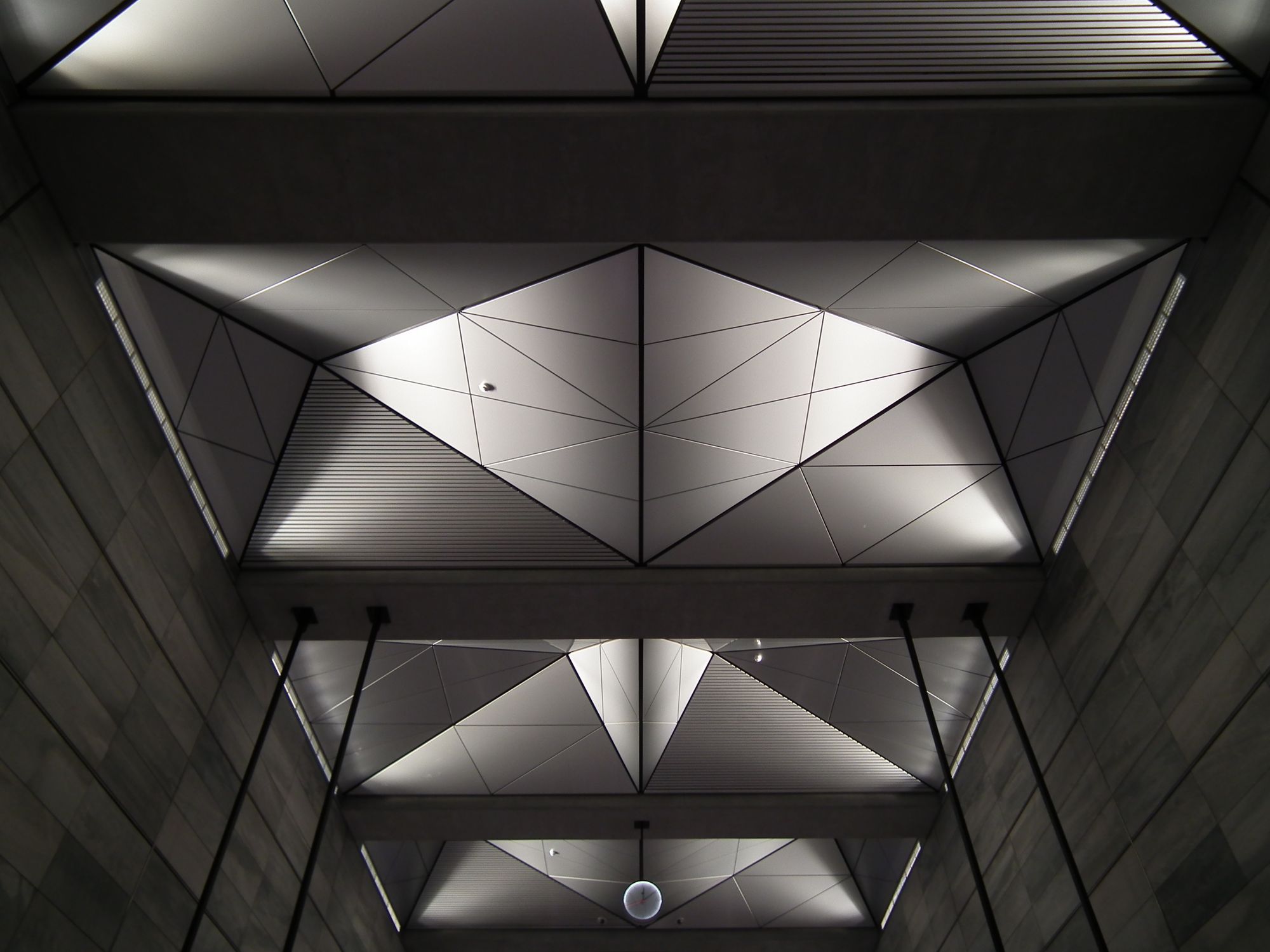
The main exit, to where Strøget meets Kongens Nytorv:
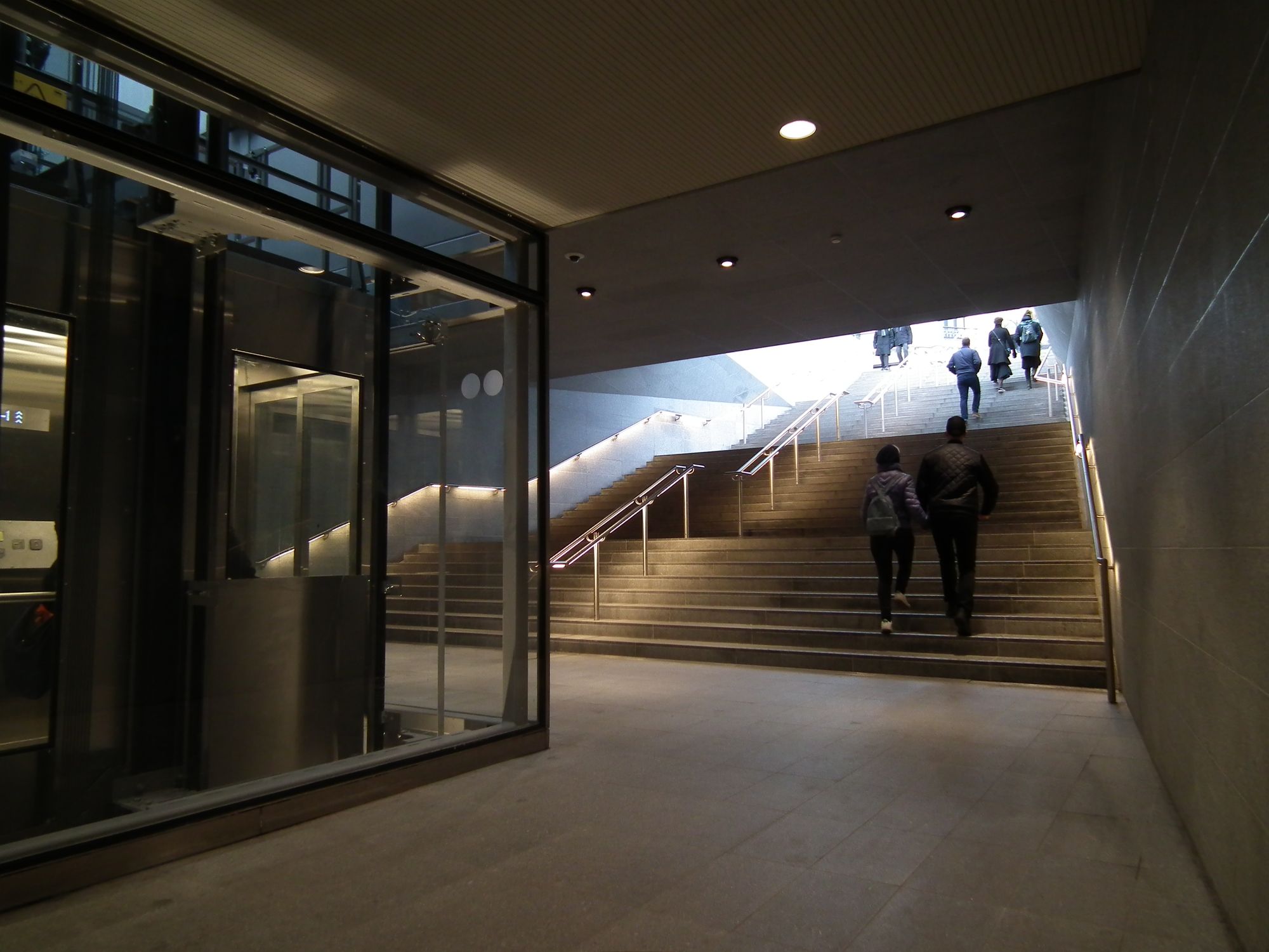
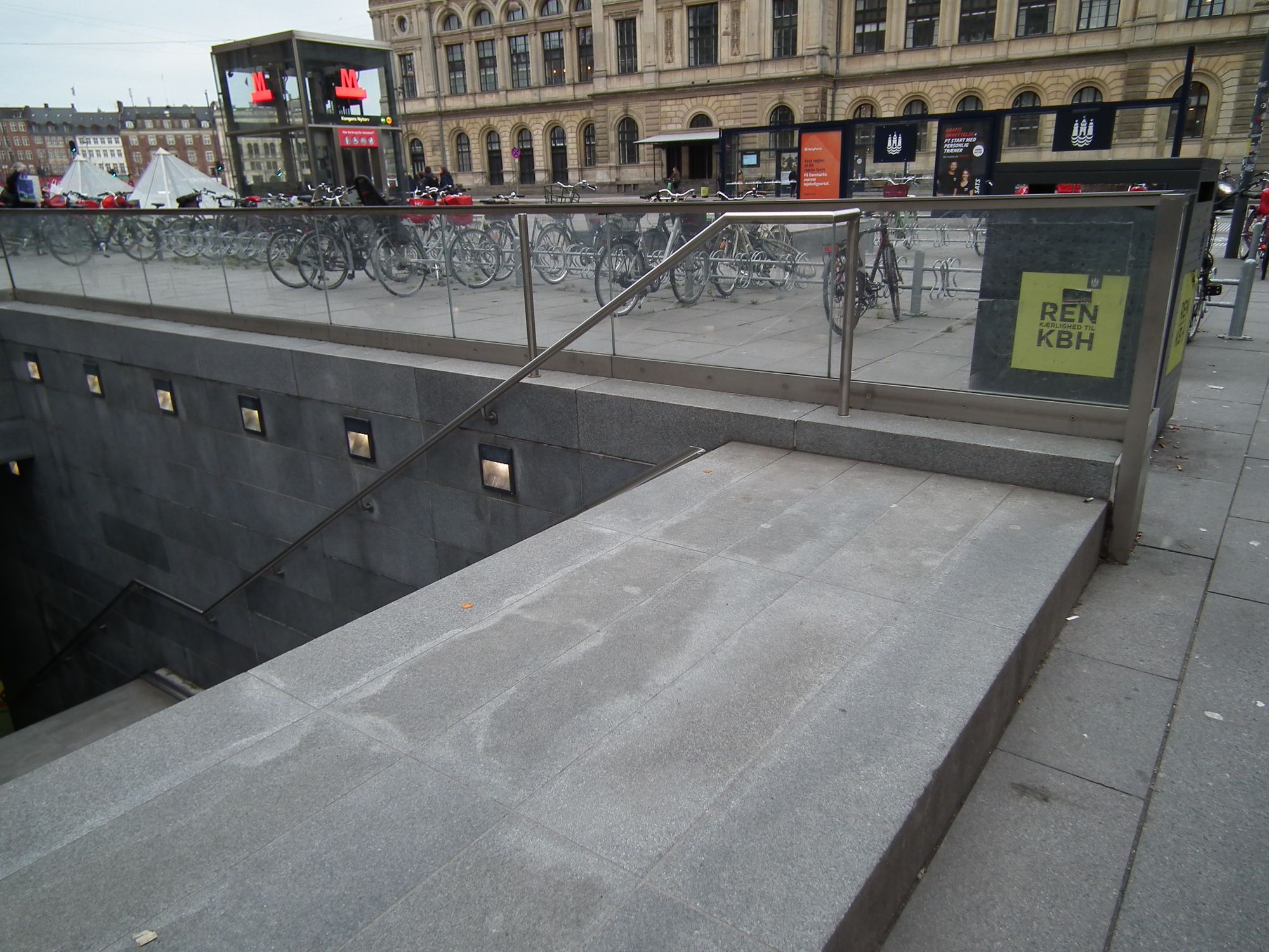
Meanwhile of course the old M1/M2 station is still there, though now with what I think are rebuilt entrances. It took me a while to figure out why there's a step up here, before you go down. I assume it's to stop too much rain flooding down the stairway:
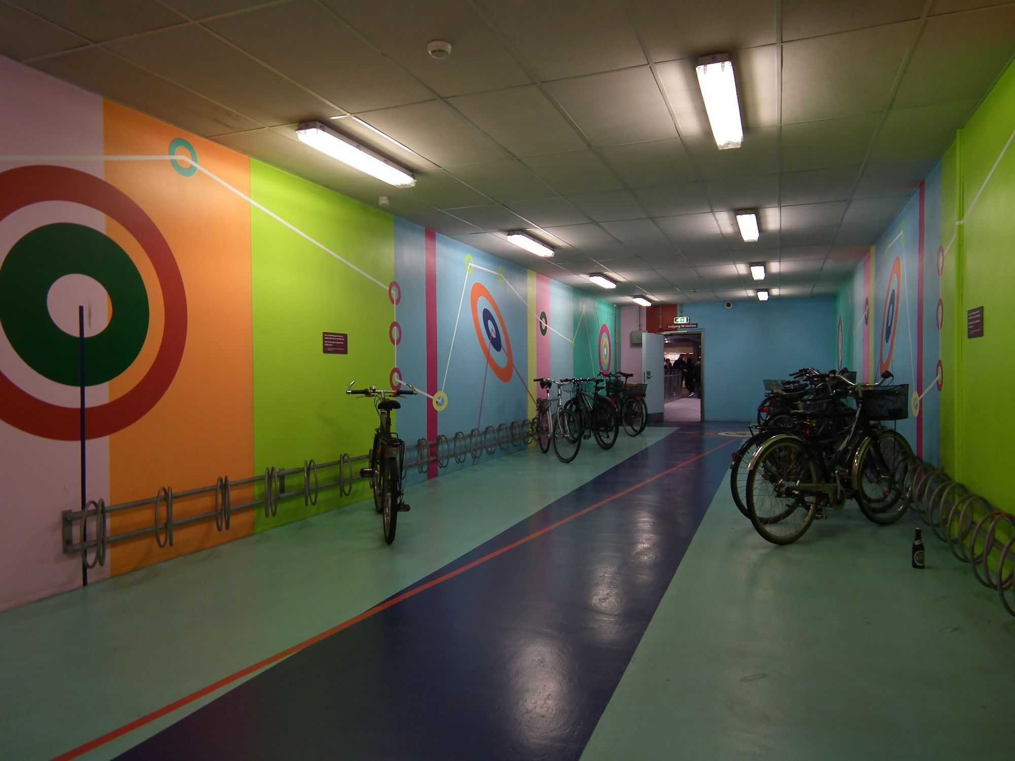
Meanwhile the bike area here – you remember I said they're nearly all orange? This is the exception. It features an artwork called "Fra sted til sted" (From place to place), by Pernelle Maegaard:
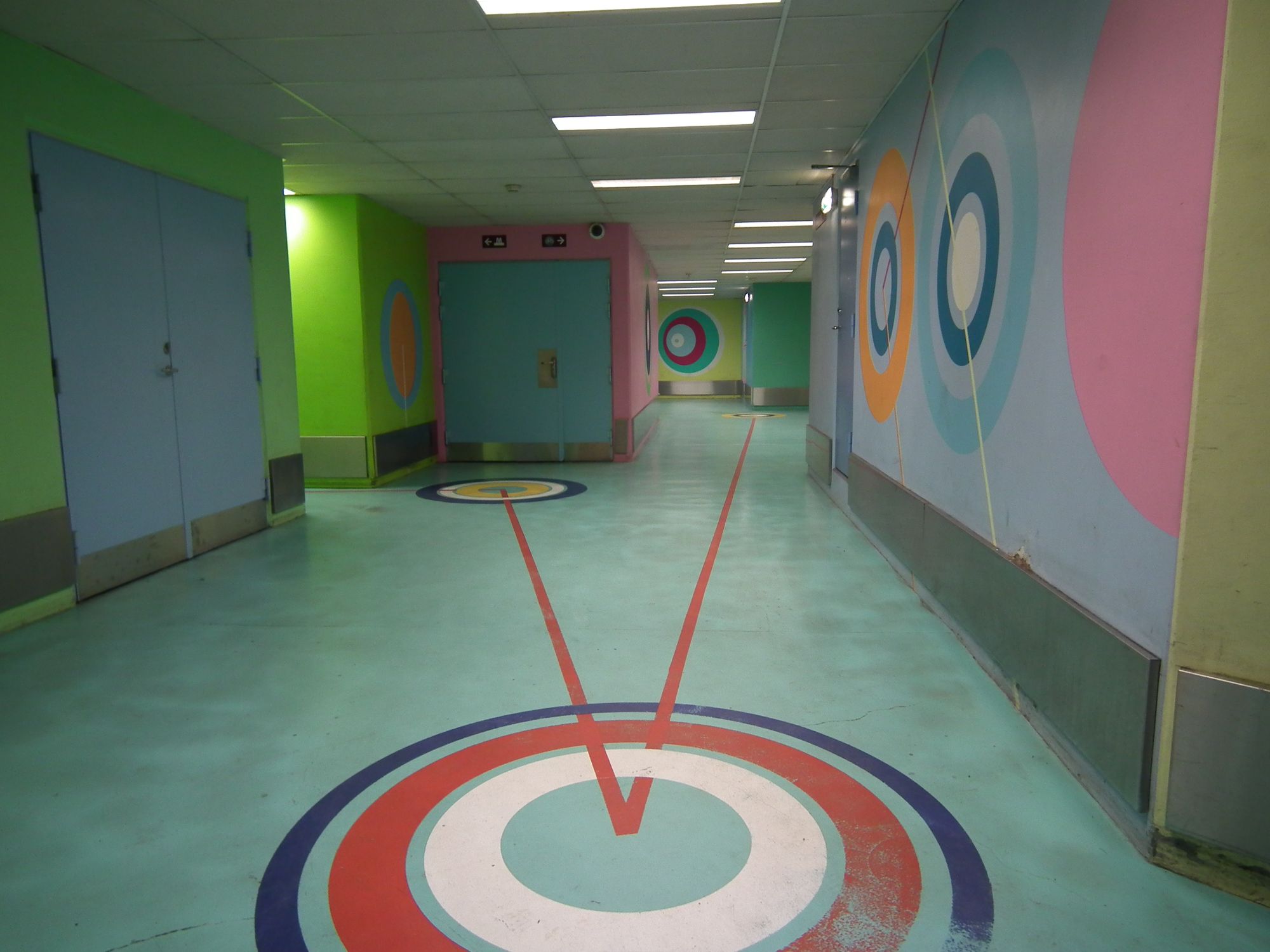
I have to say, in contrast to M3, M1/M2 looks very drab:
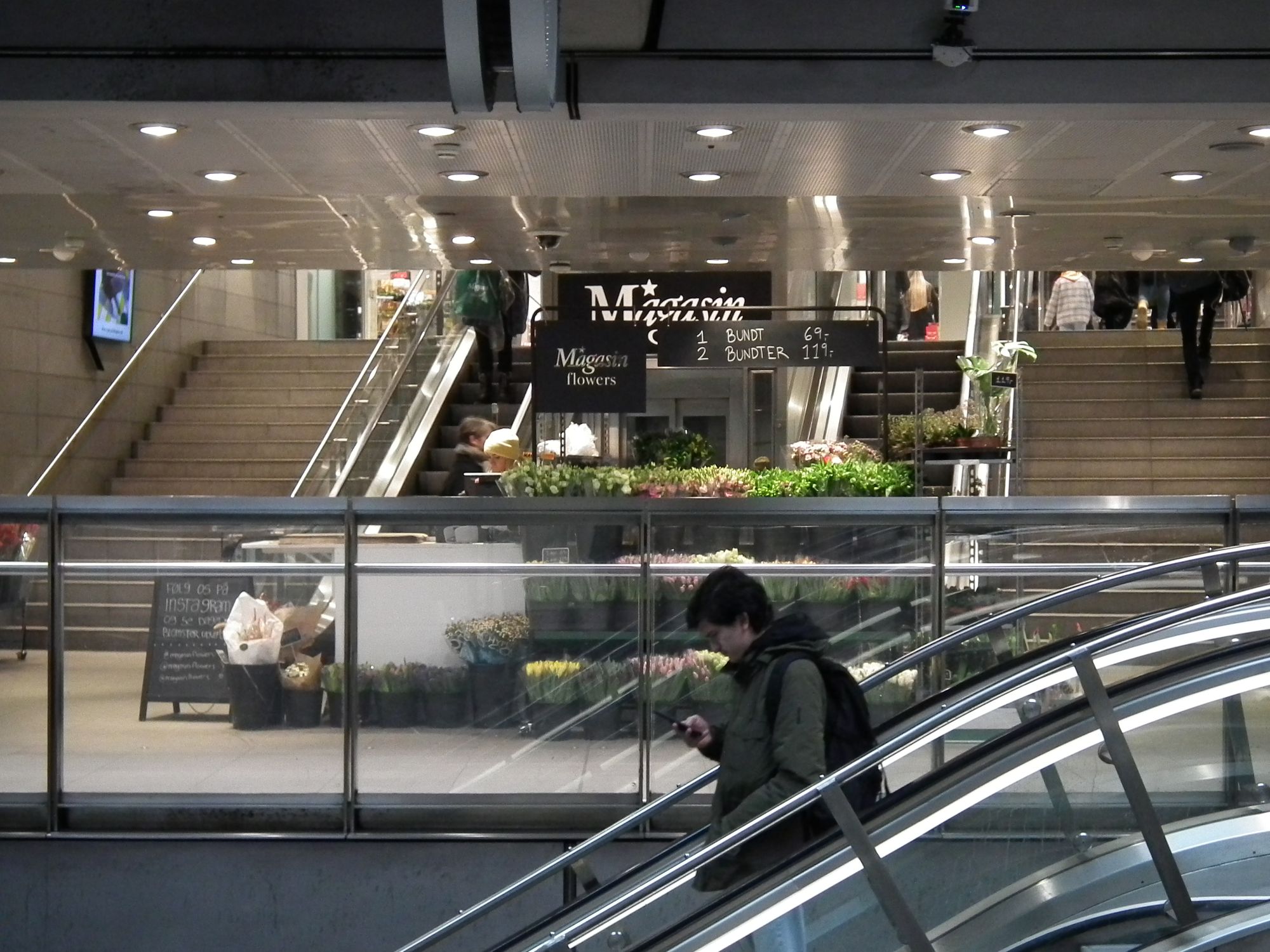
Again we have the exit direct to shopping, this time to Magasin:
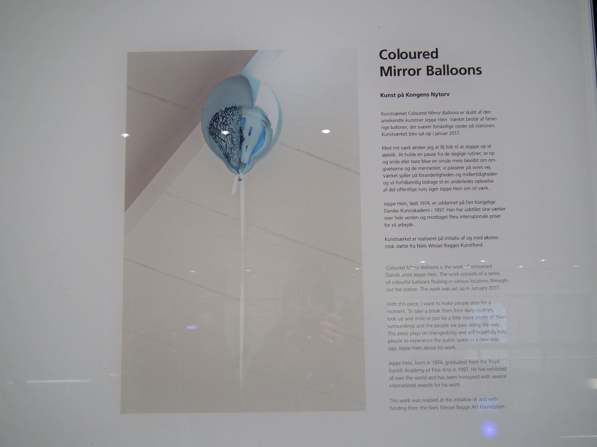
Last detail from Kongens Nytorv: another artwork. I've seen it before, but never realised it was an artwork:
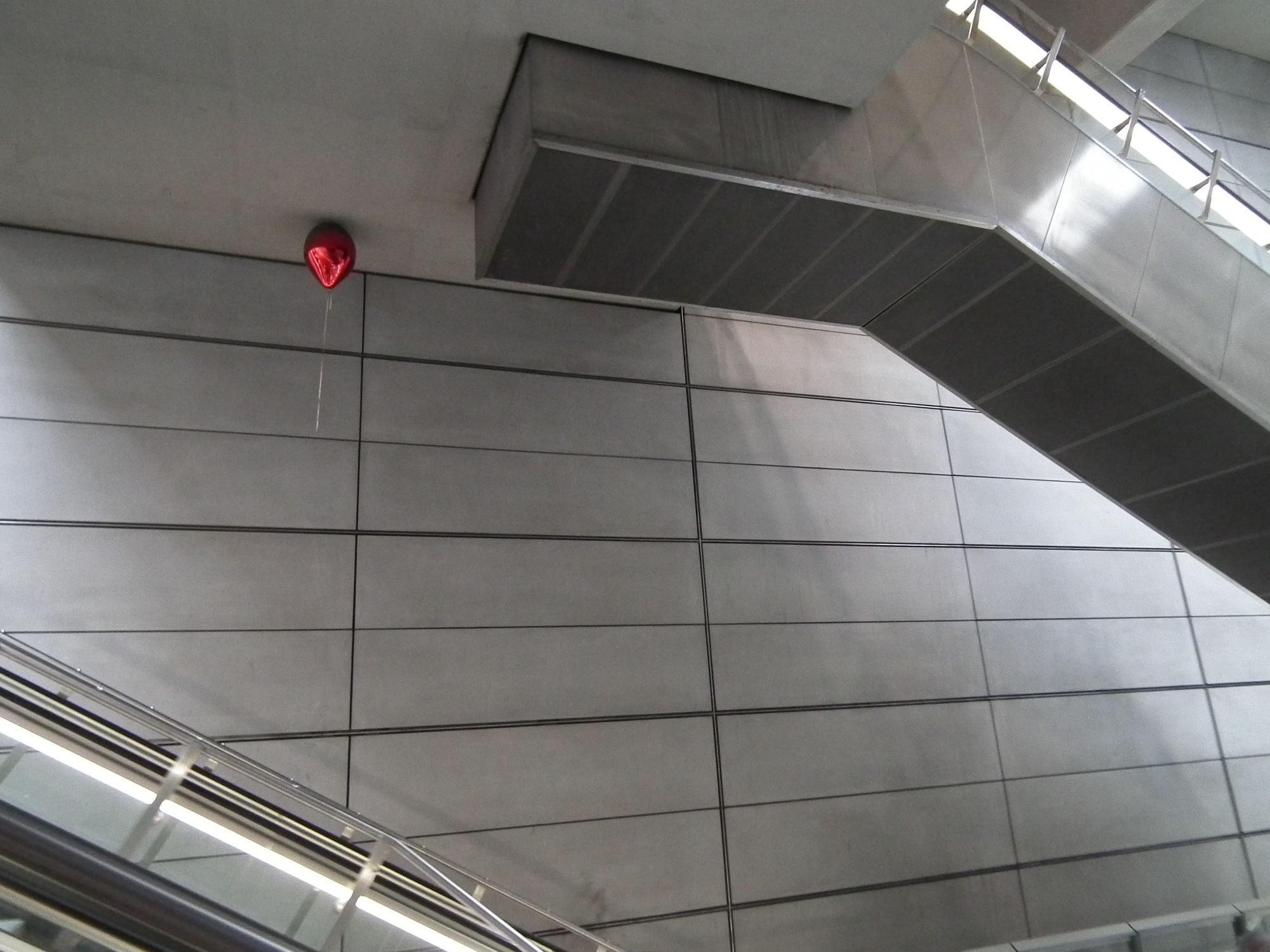
Gammel Strand
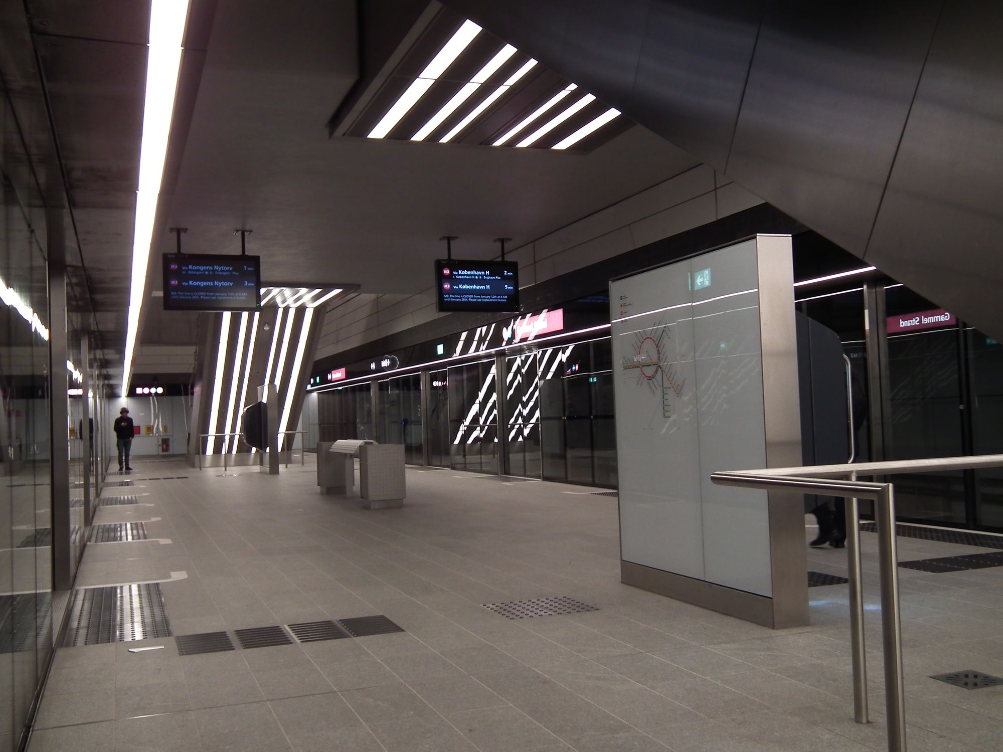
Alright, only four to go. Gammel Strand: another interesting one, and again, perhaps because of its placement: it's deep, and built below the canal.
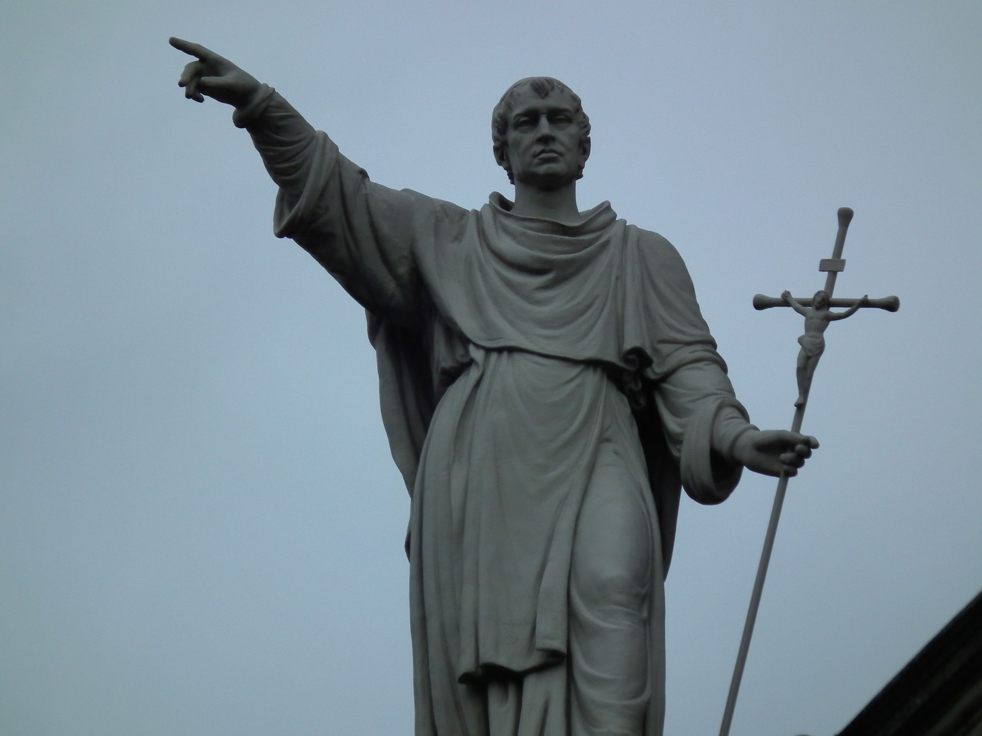
On the surface we've got the Fiskerkone statue back at last. Velkommen tilbage, fiskerkone:
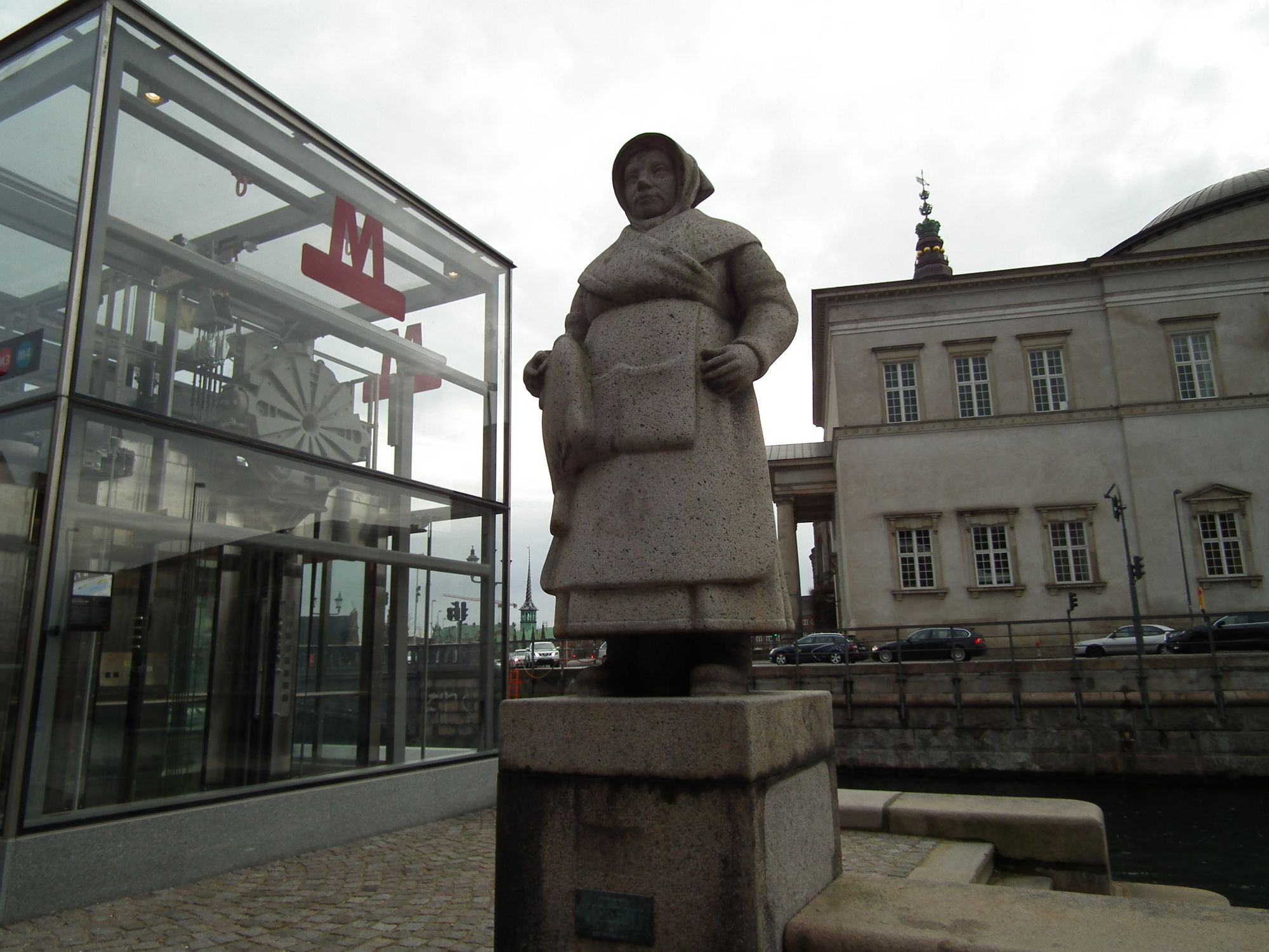
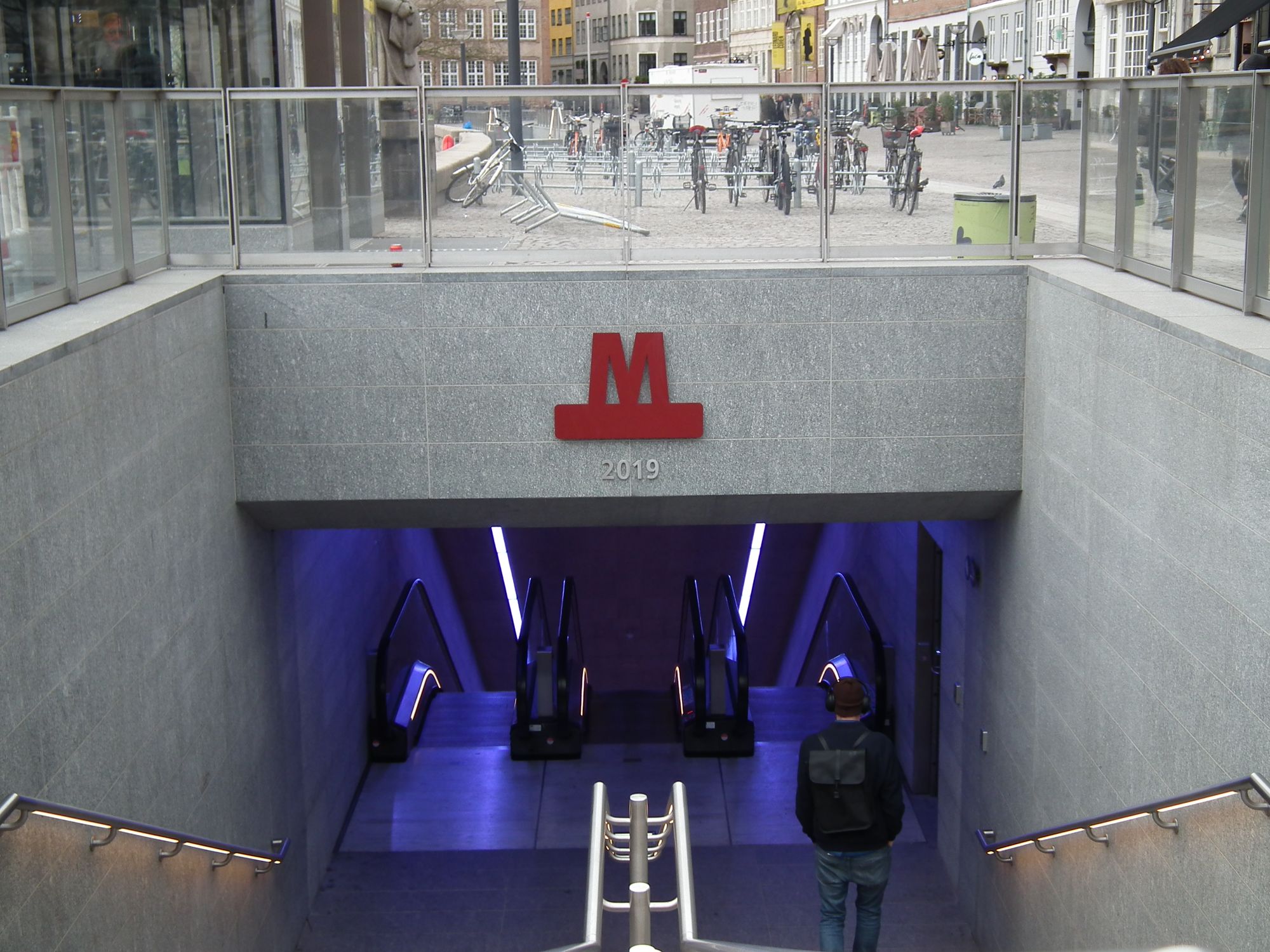
The bike entrance is out of action still, so it's down the escalator, or the main steps...
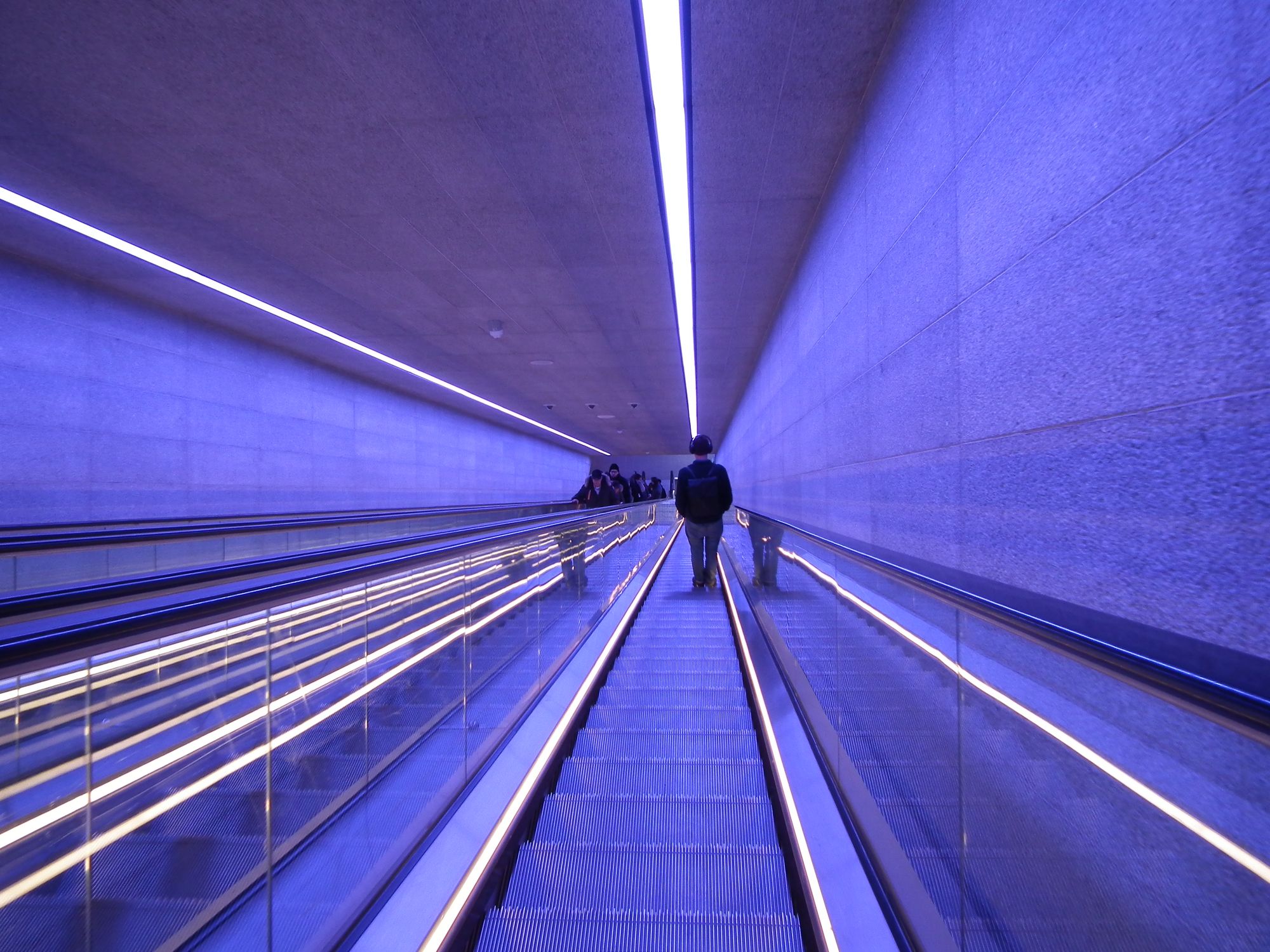
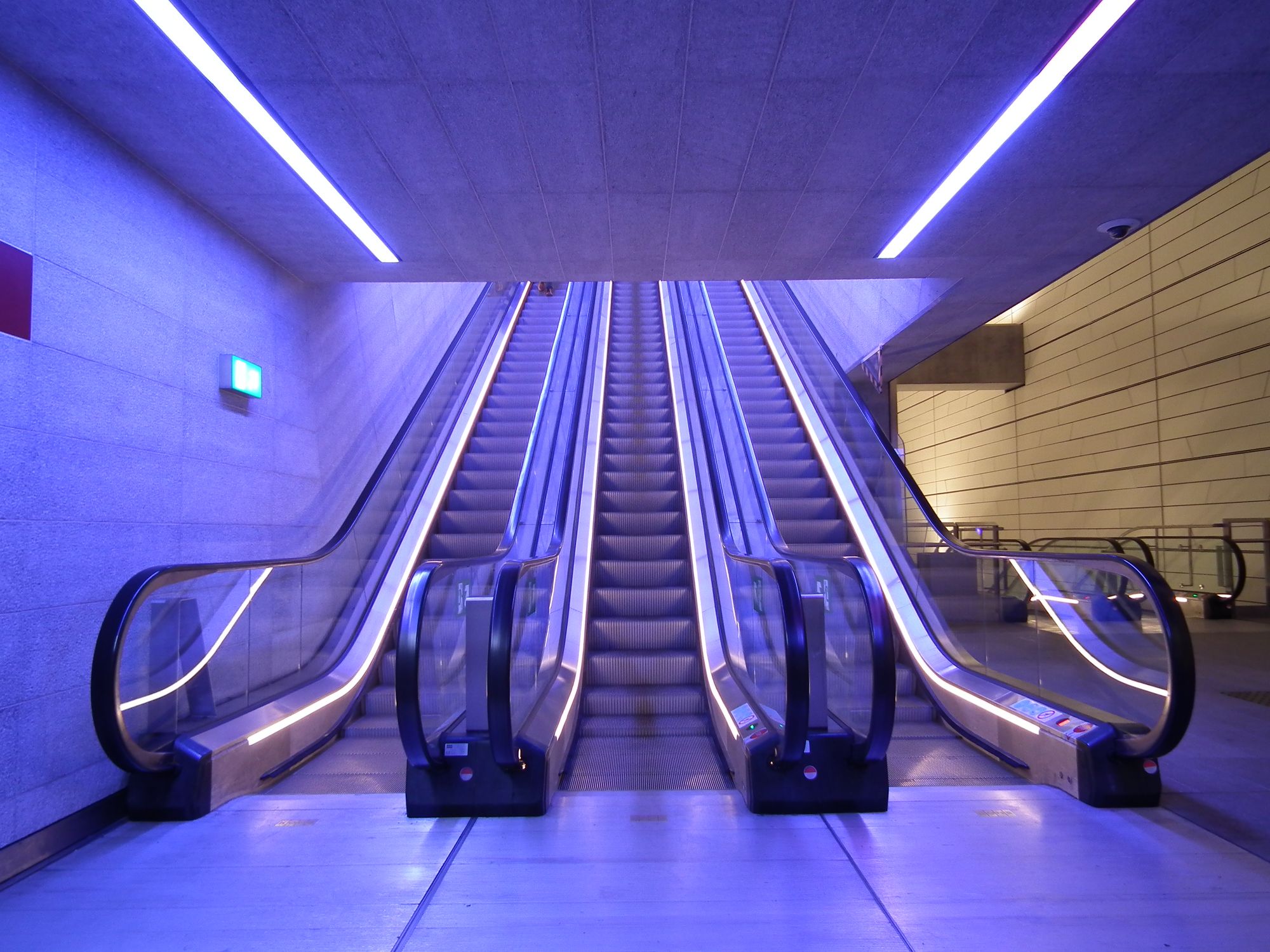
... and into a very long (by Copenhagen Metro standards) escalator, which is, for some reason, lit blue. Perhaps echoing the fact that it's taking us below the waterline.
At the "ticket hall" level, we can stand and admire the engineering, deep below the canal (hence, no proper skylights here):
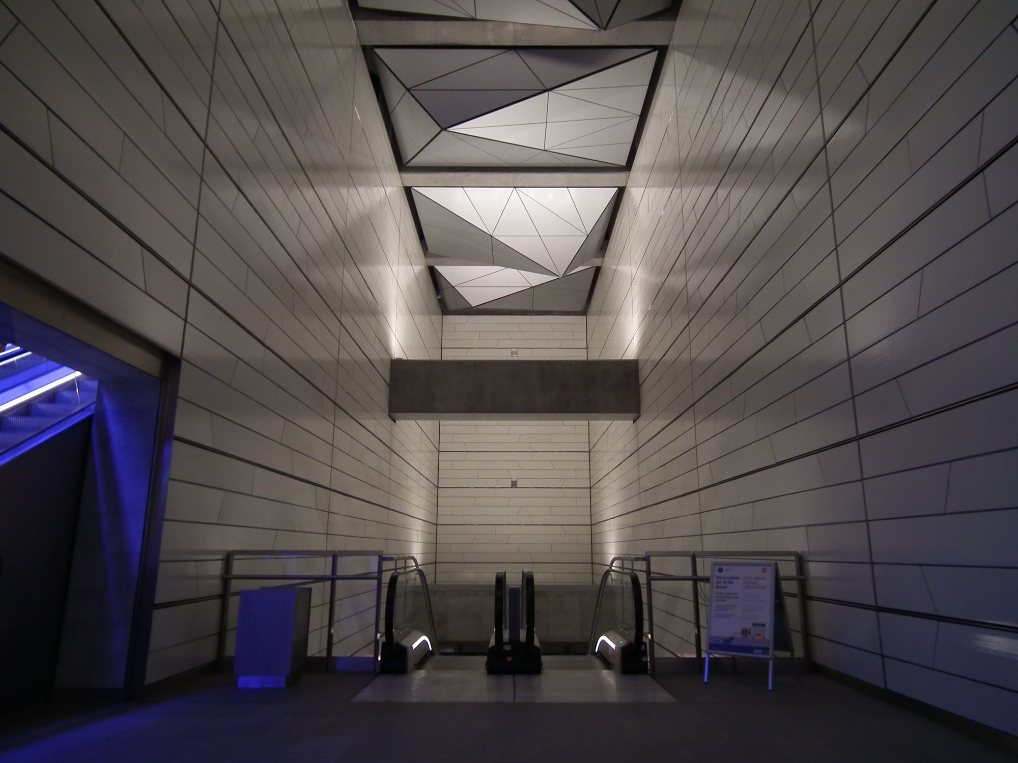
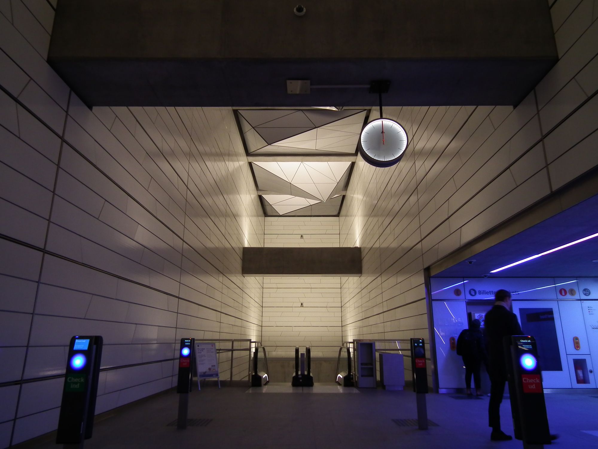
The curious thing here is ... when the bicycle area opens, is it meant to link in to the main station? I can't see where/how that might happen, if so.
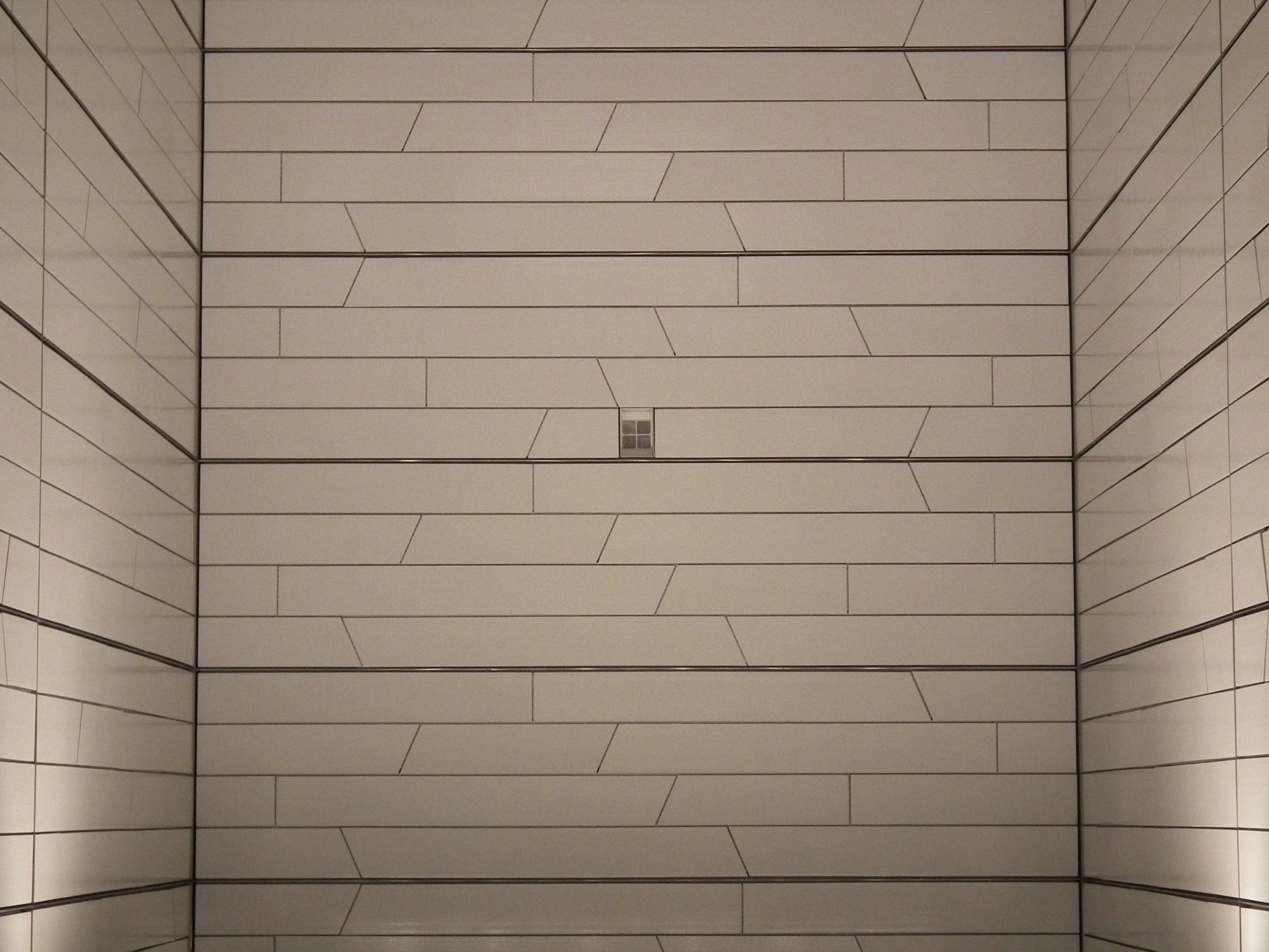
Again the station has a rather unusual escalator layout, adding to the space available at the platform level:
Rådhuspladsen
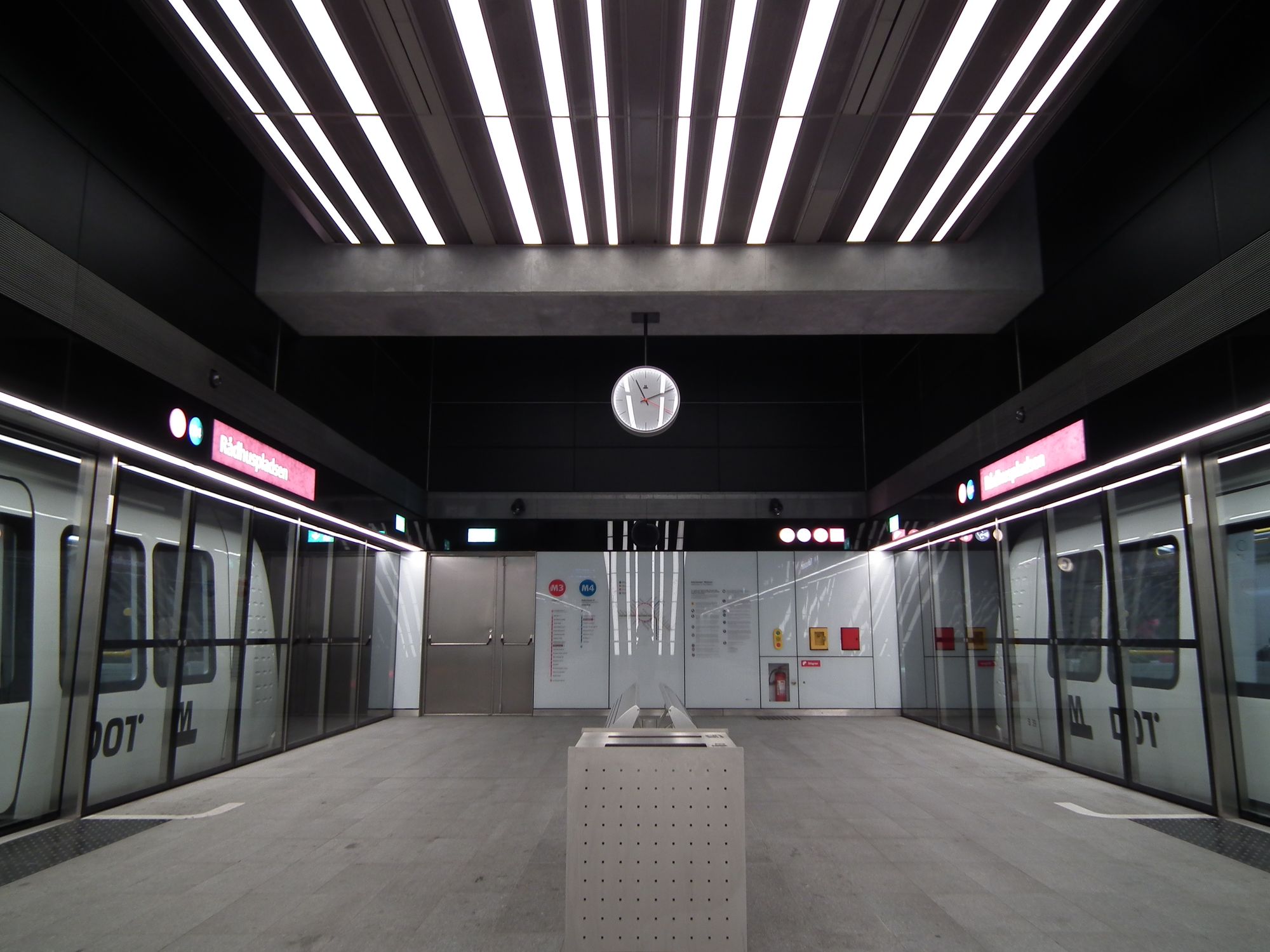
When I first came to Copenhagen, probably about two-thirds of the city square was shut off, as a building site. Quite the revelation, when in September 2019, it finally opened up, and the square was suddenly bigger! :-)
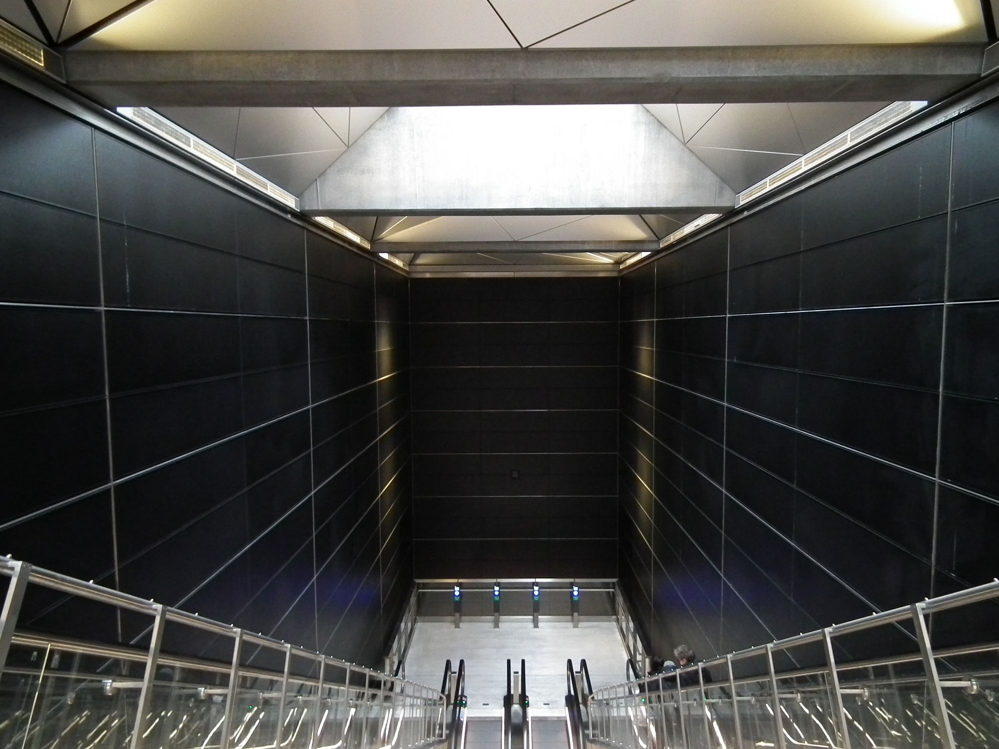
Rådhuspladsen's colour scheme is a rather bold black, adding more than ever to the idea that this is actually a Death Star, and you should be humming the Imperial March tune:
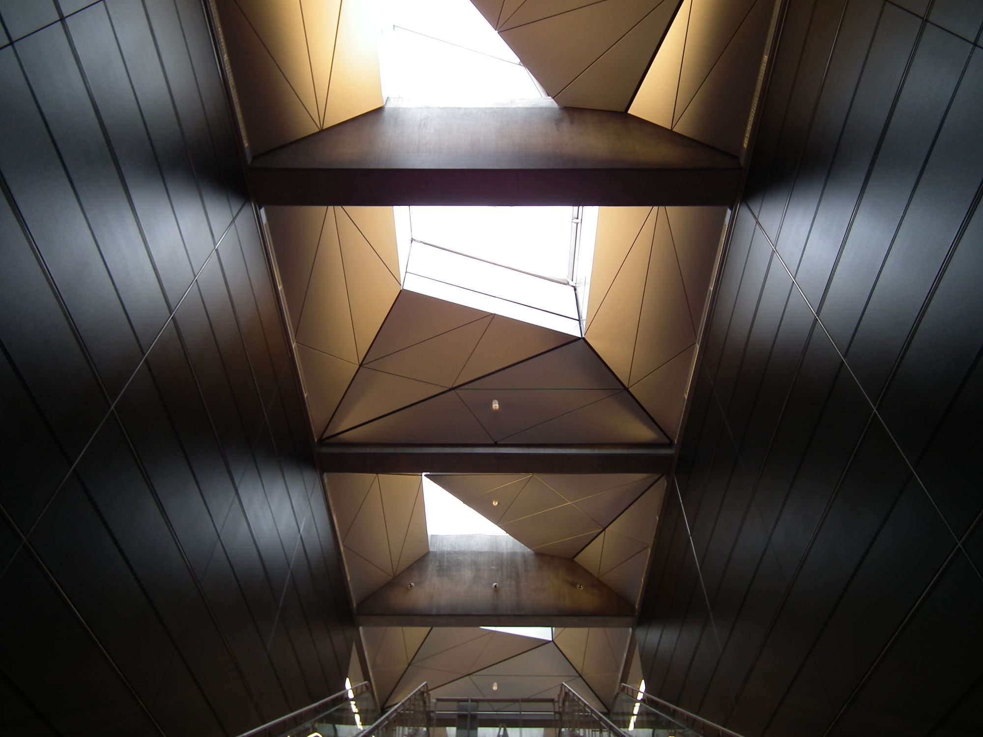
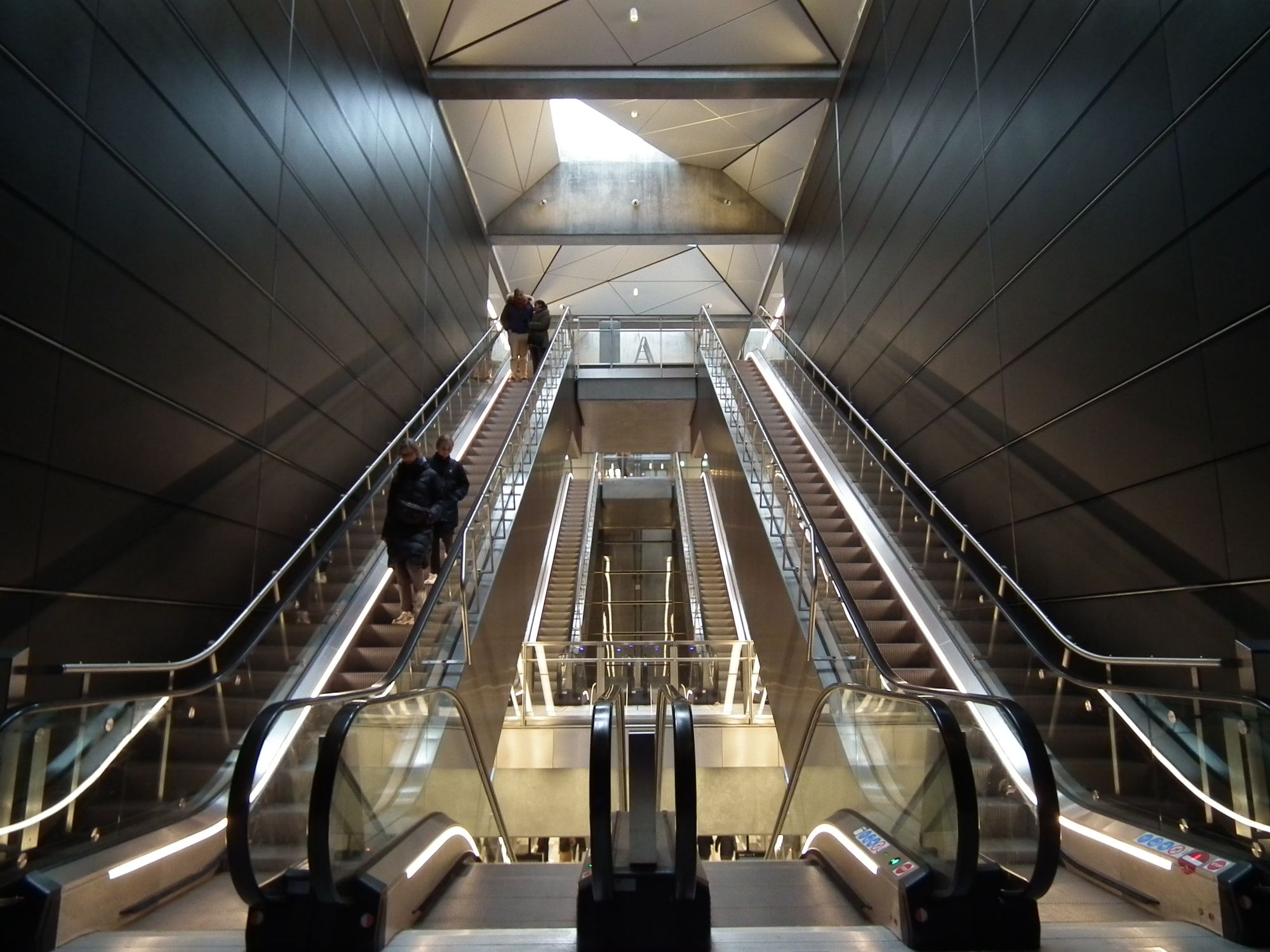
Meanwhile at the surface, there's something funny afoot. There are two sets of steps in, as normal (main entrance, and bike entrance), and there are also two elevators ... but one of them is out of action:
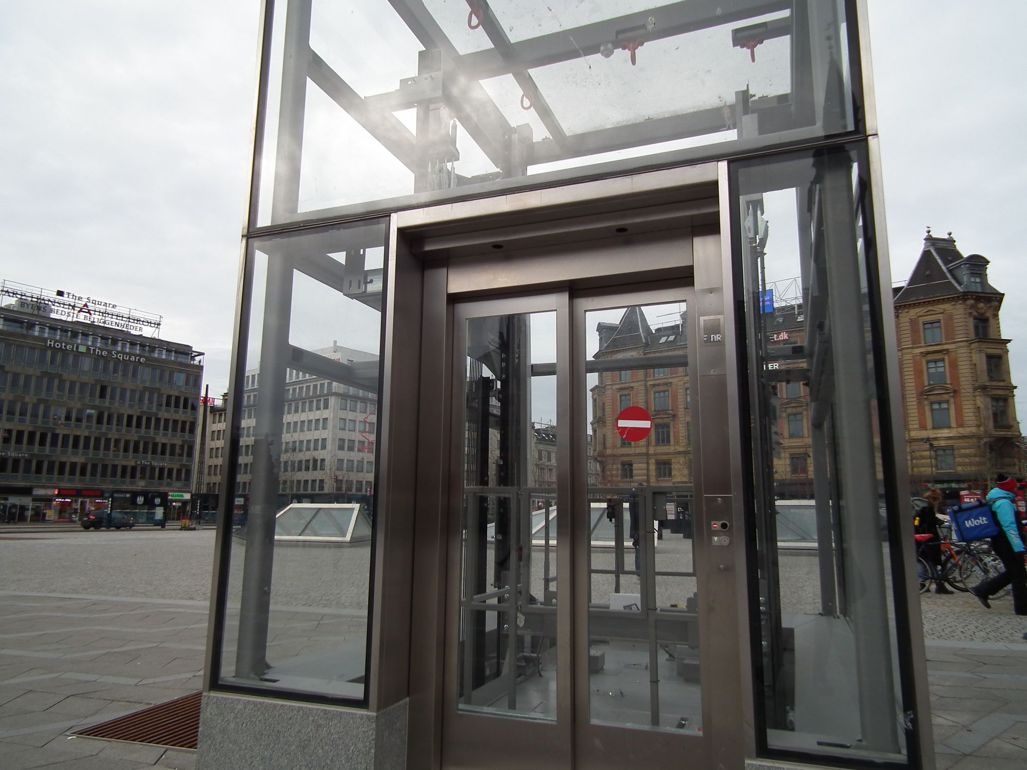
Here's the main entrance, with that out-of-action elevator next to it:
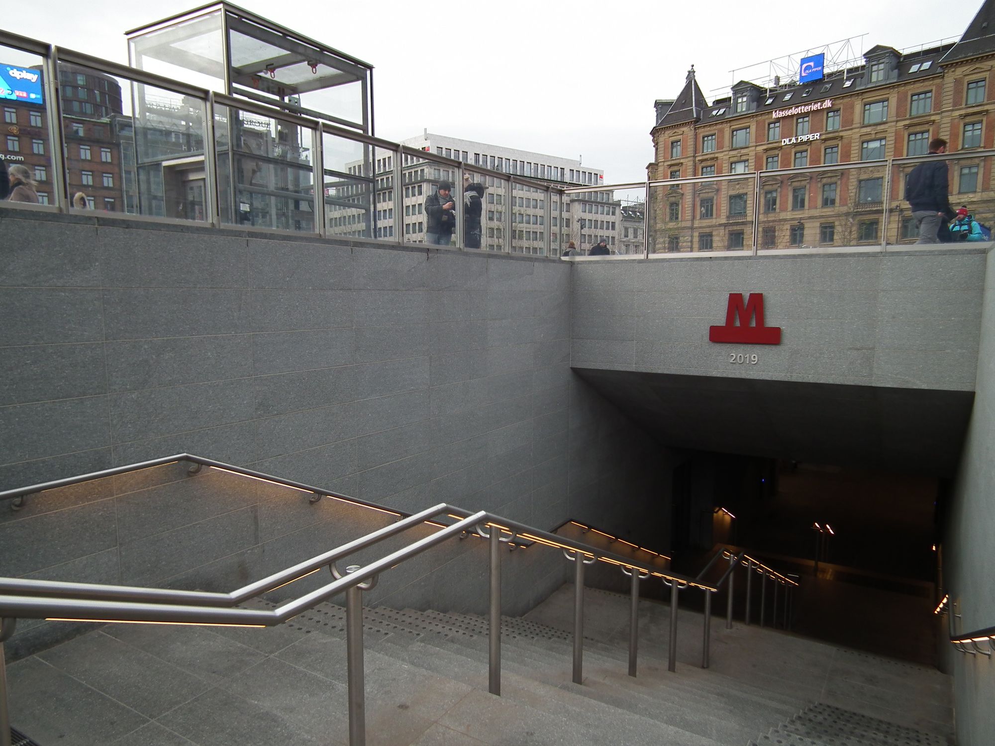
and here's a little further down those same steps:
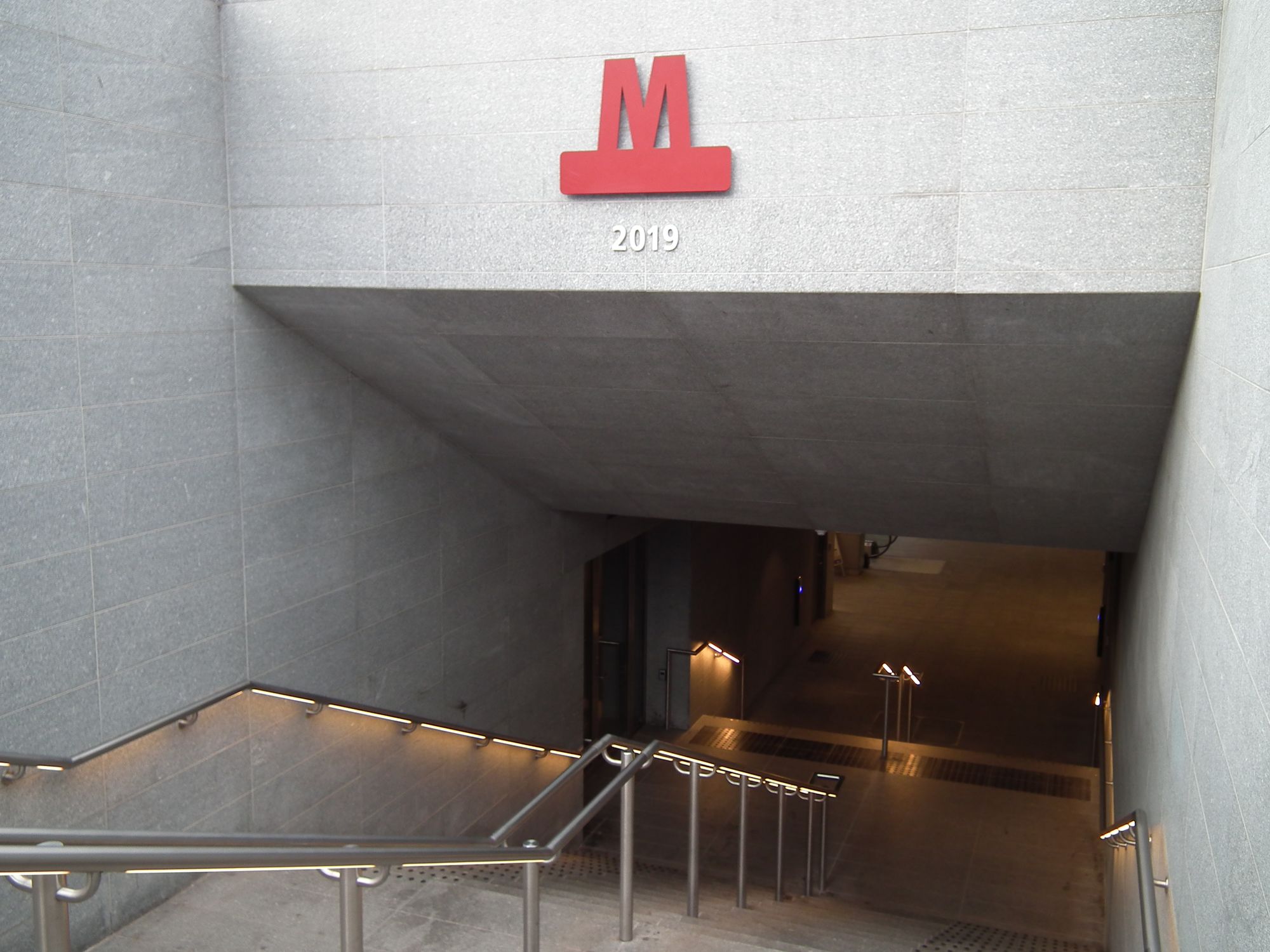
so now I want to know: where does that door on the left go, and where does that elevator go? (Probably to the same place). The door doesn't look like a regular service door – it's too fancy for that, and it doesn't have service-door-type-labelling (you know: code numbers, voltages, warning signs, etc). No, it's just a glass door, locked, and blacked out. What is going on there?
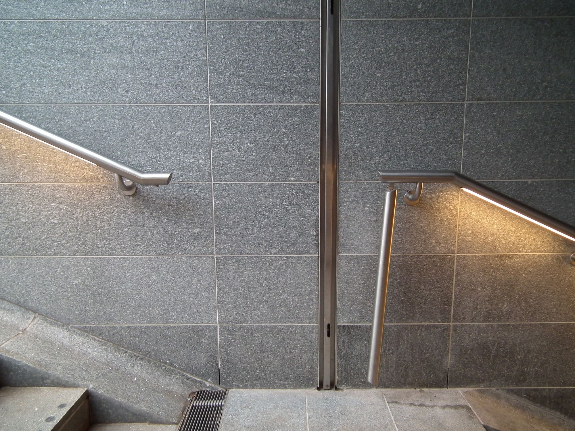
Little detail: at the entrance to every station, there's a door, which I've not yet seen shut (I don't know if it's only shut for emergencies, or maybe it shuts every night. No idea). The silver handrail, when necessary, clicks out of position to allow the door mechanism to shut:
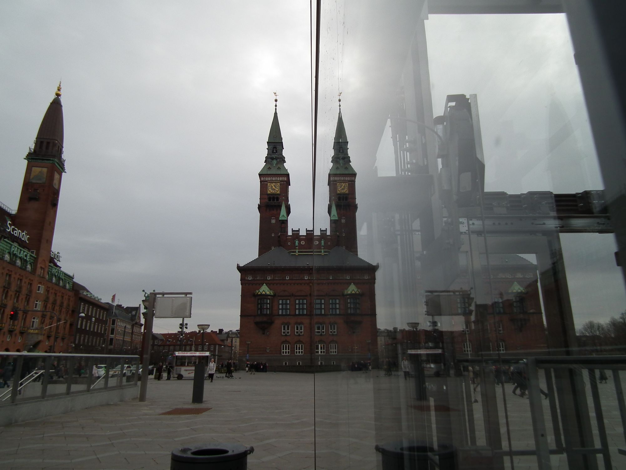
Of course to fit the station in, they had to get space from somewhere, so they made city hall, Rådhuset, smaller. But at least they added an extra tower, so that's nice:
Københavns Hovedbanegård
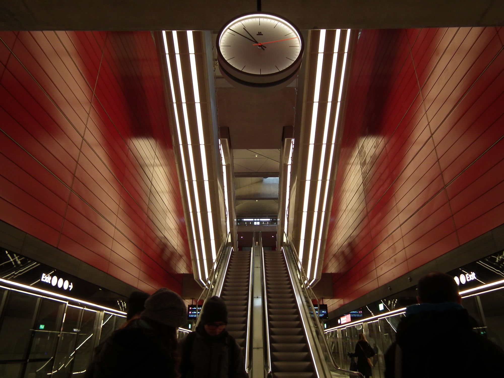
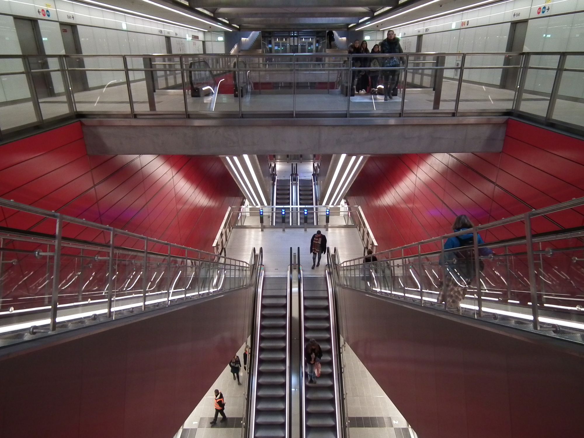
Almost there. Two to go. At København H, we're back to red:
At the surface, there's still lots of building work going on:
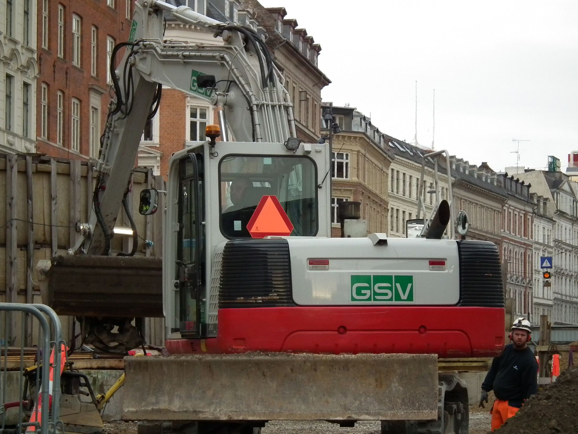
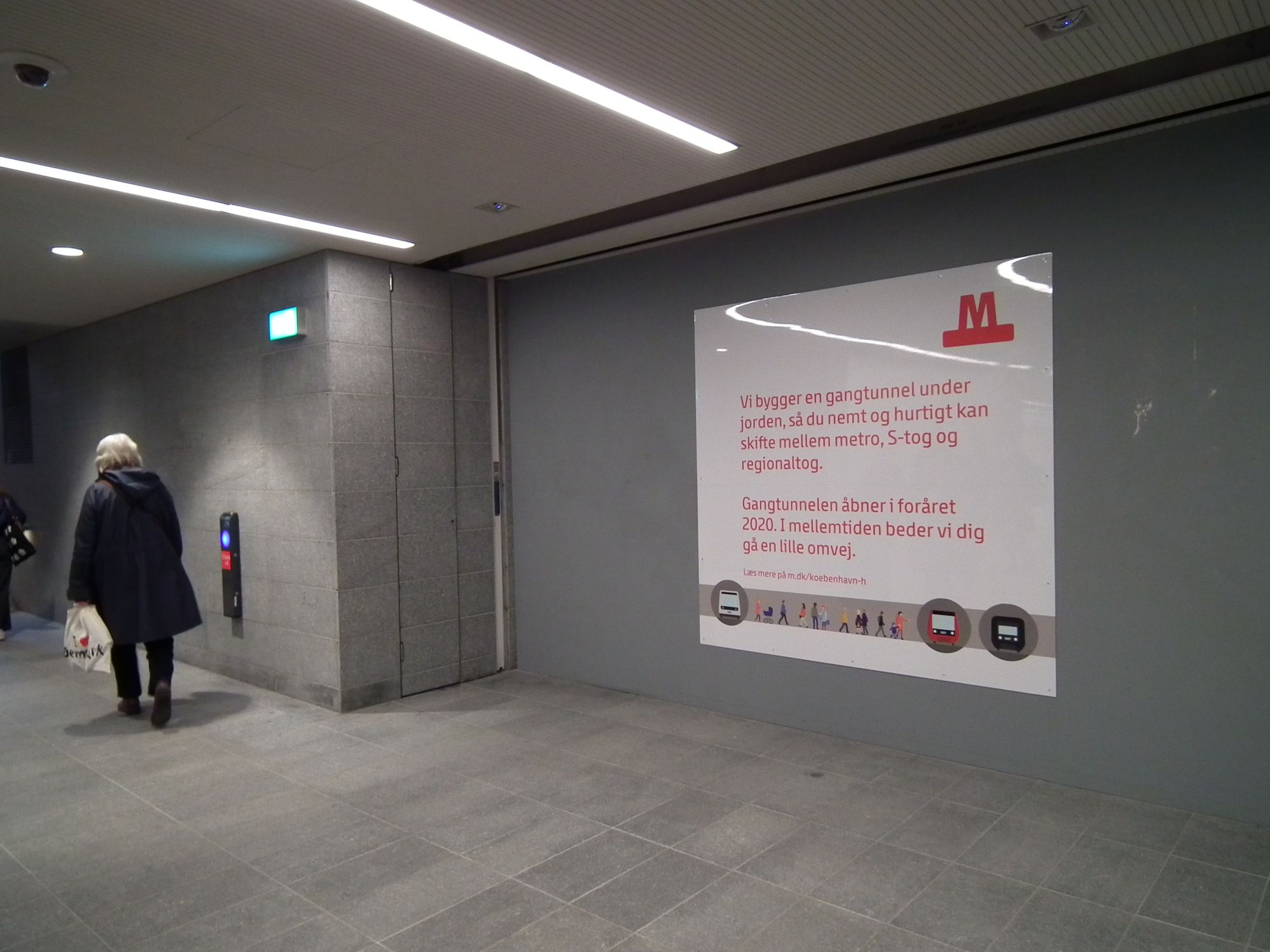
and apparently in future we'll have a slightly slicker tunnel route between the main station and the metro:
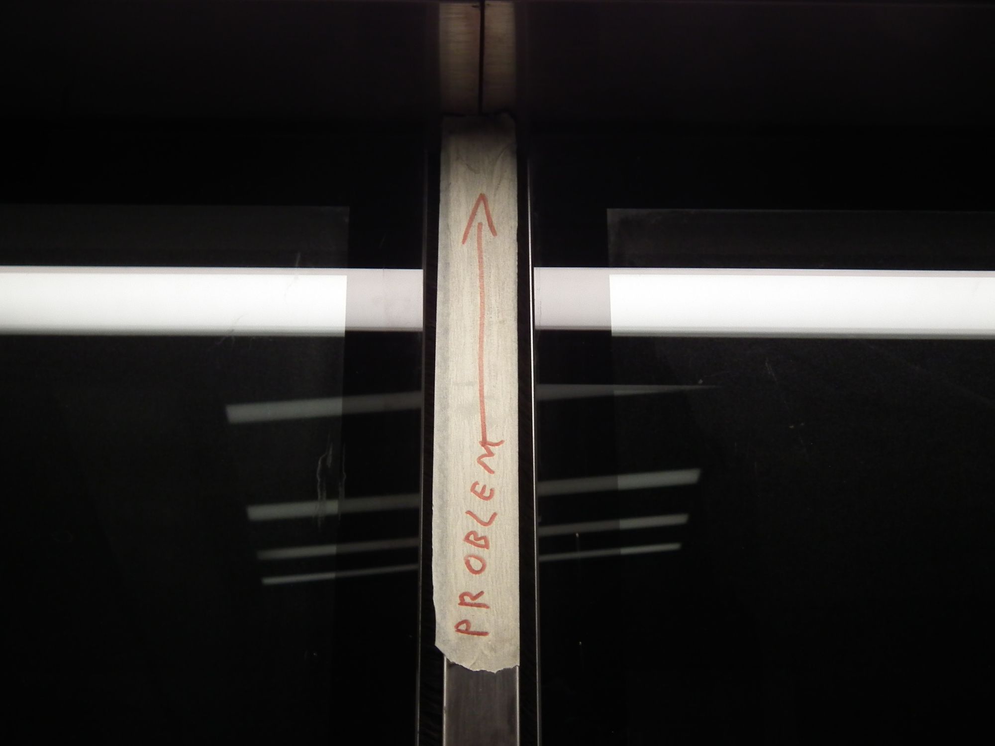
Mostly, these stations are very new, and still in very good condition, and almost everything works. Very Danish. Therefore, this amused me:
Enghave Plads
So, finally, we complete our tour with Enghave Plads:
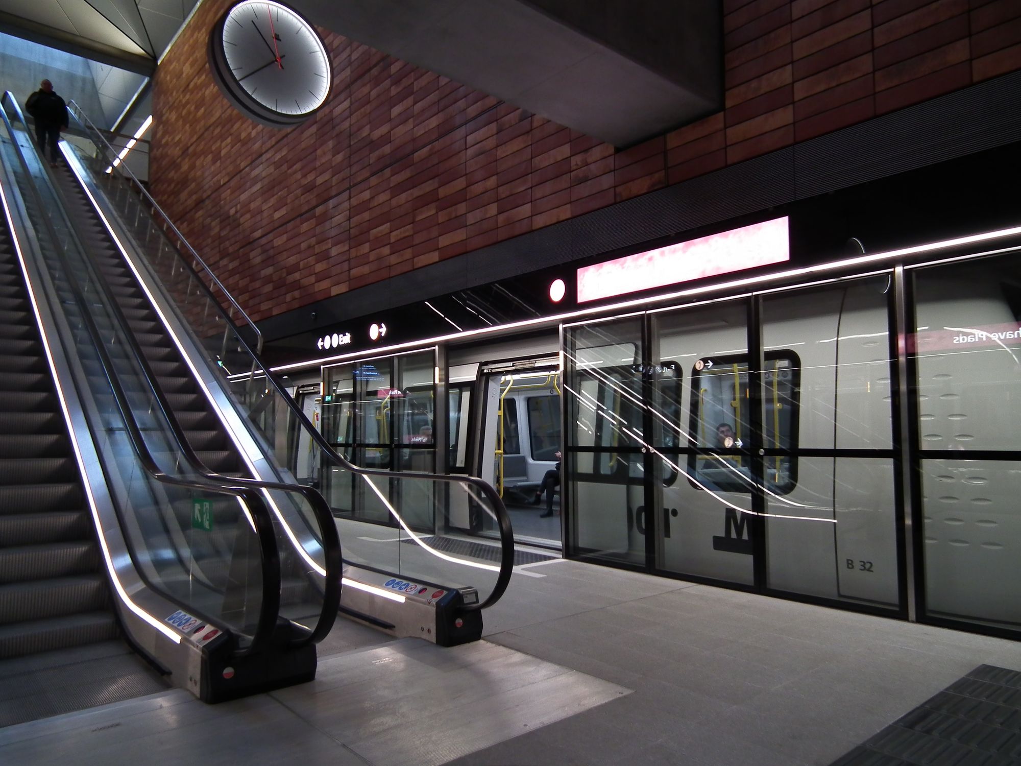
It's a familar style, but no worse for it.
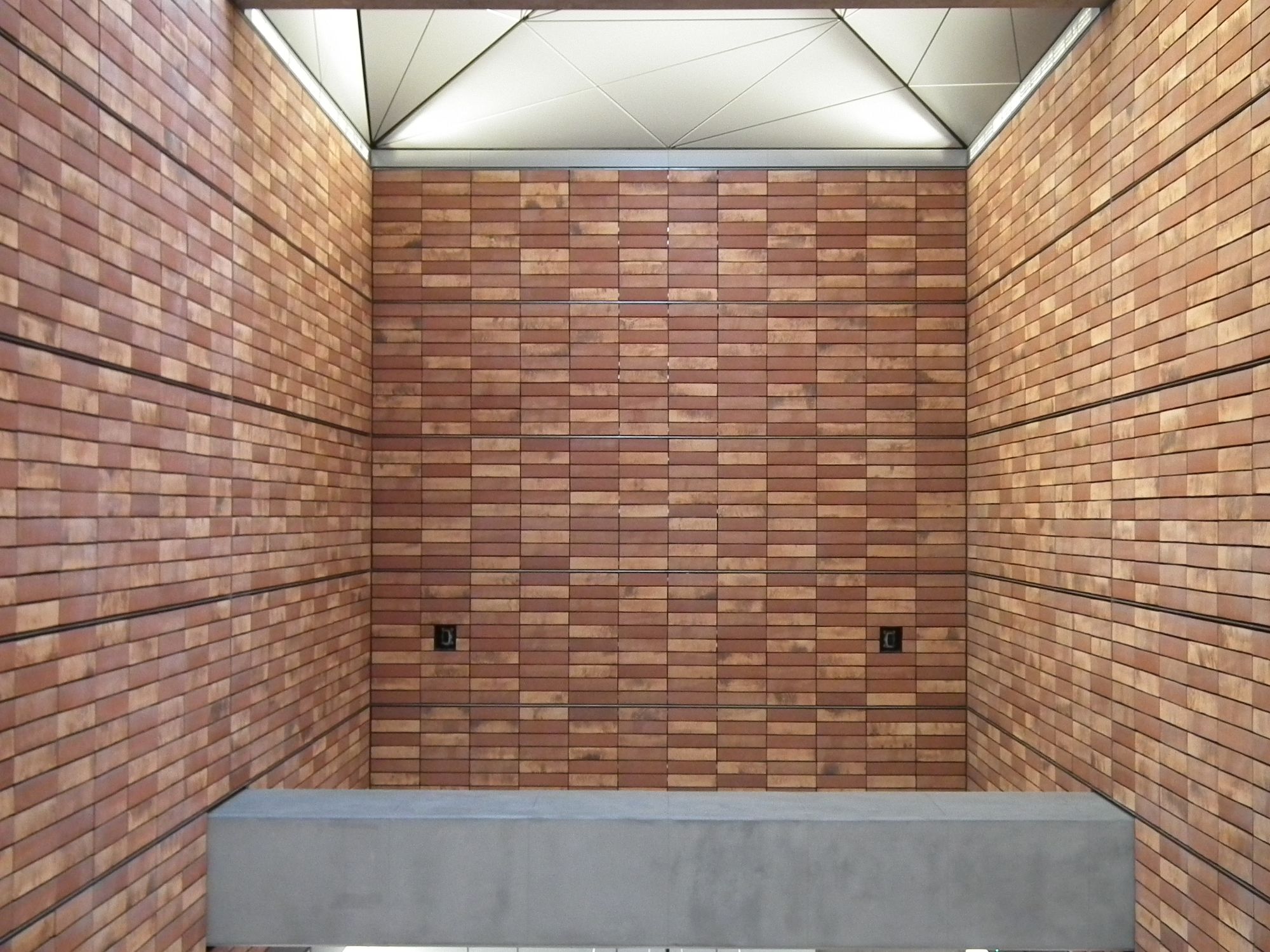
The bicycle entrance here was, again, shut off, so hopefully that'll be open some time.
So that's basically it. I hope you enjoyed this little tour of M3 Cityringen! Now if you'll excuse me, I really need to get out more.
Sources for the two map images: Metroselskabet DK; Transport for London
